We’re All Publishers
People are ‘content creators’ these days; not just in the social media sense either. They’re publishers too - in the traditional sense of writing and publishing their own stories. Websites with easy drag-and-drop interfaces ensure the process is simple, and print-on-demand (POD) definitely offers affordability. It’s loads of work, but the printed results are impressive.
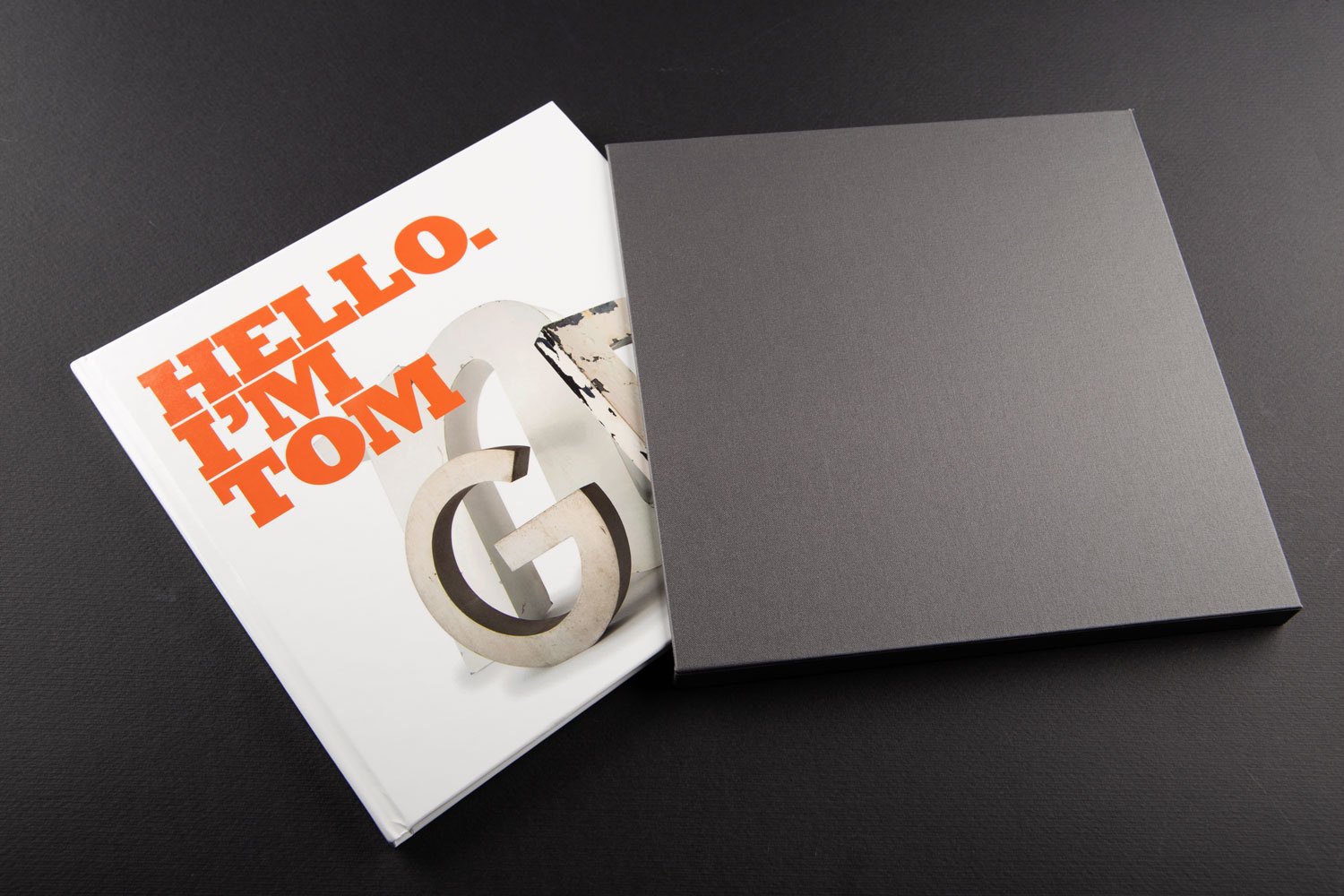
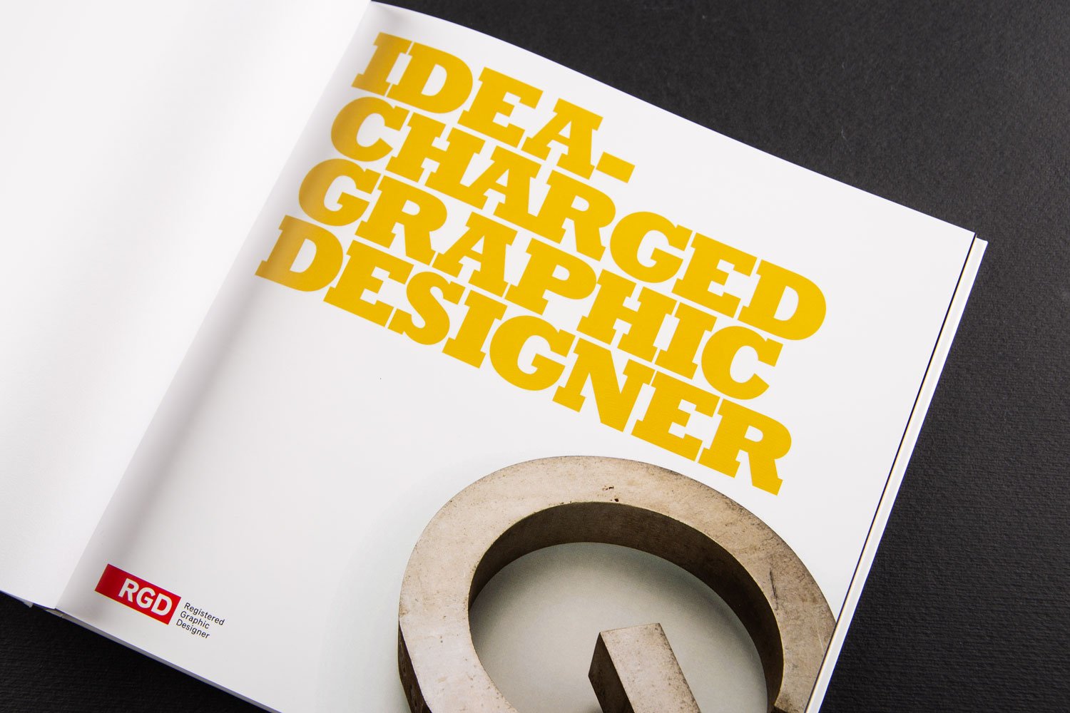
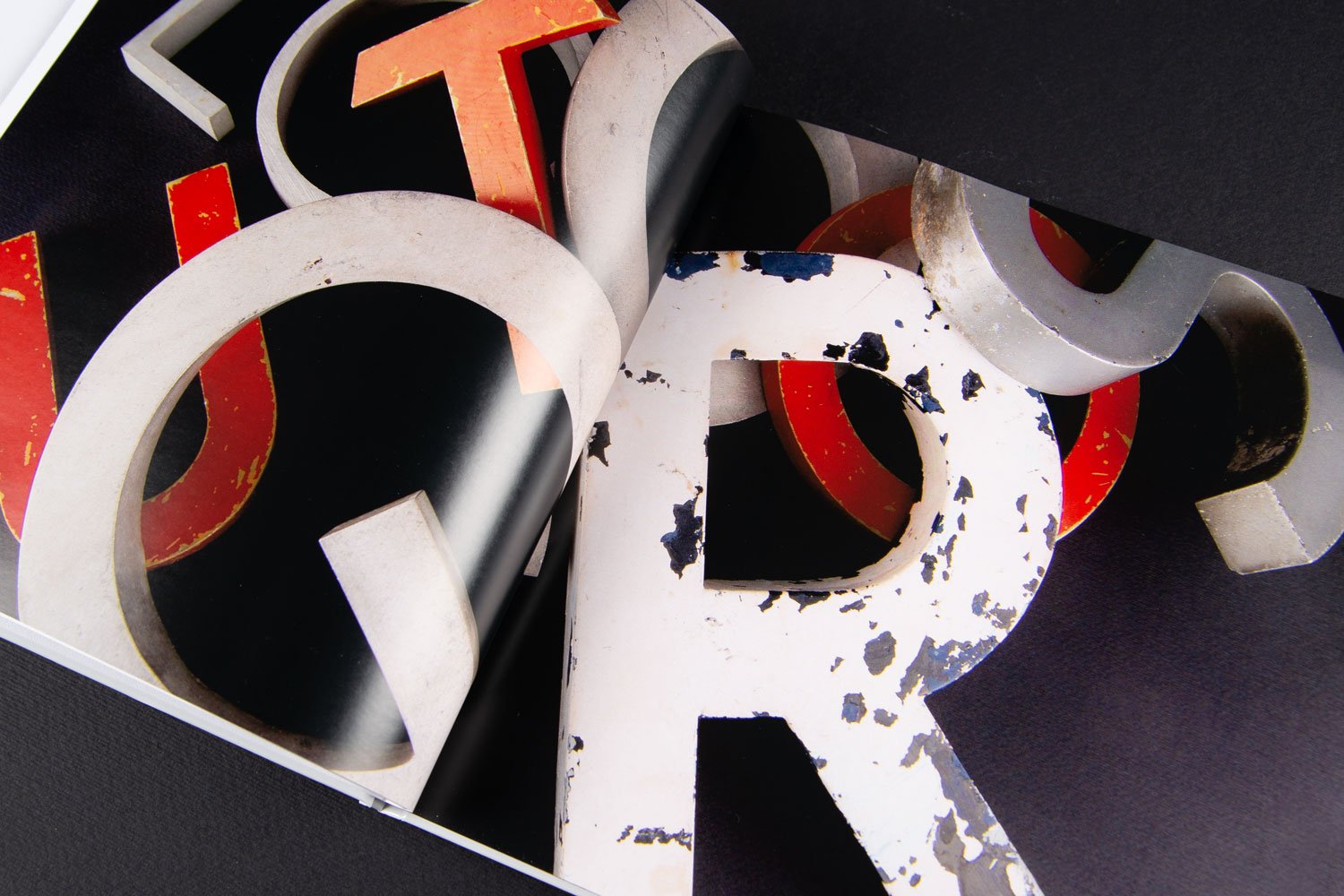
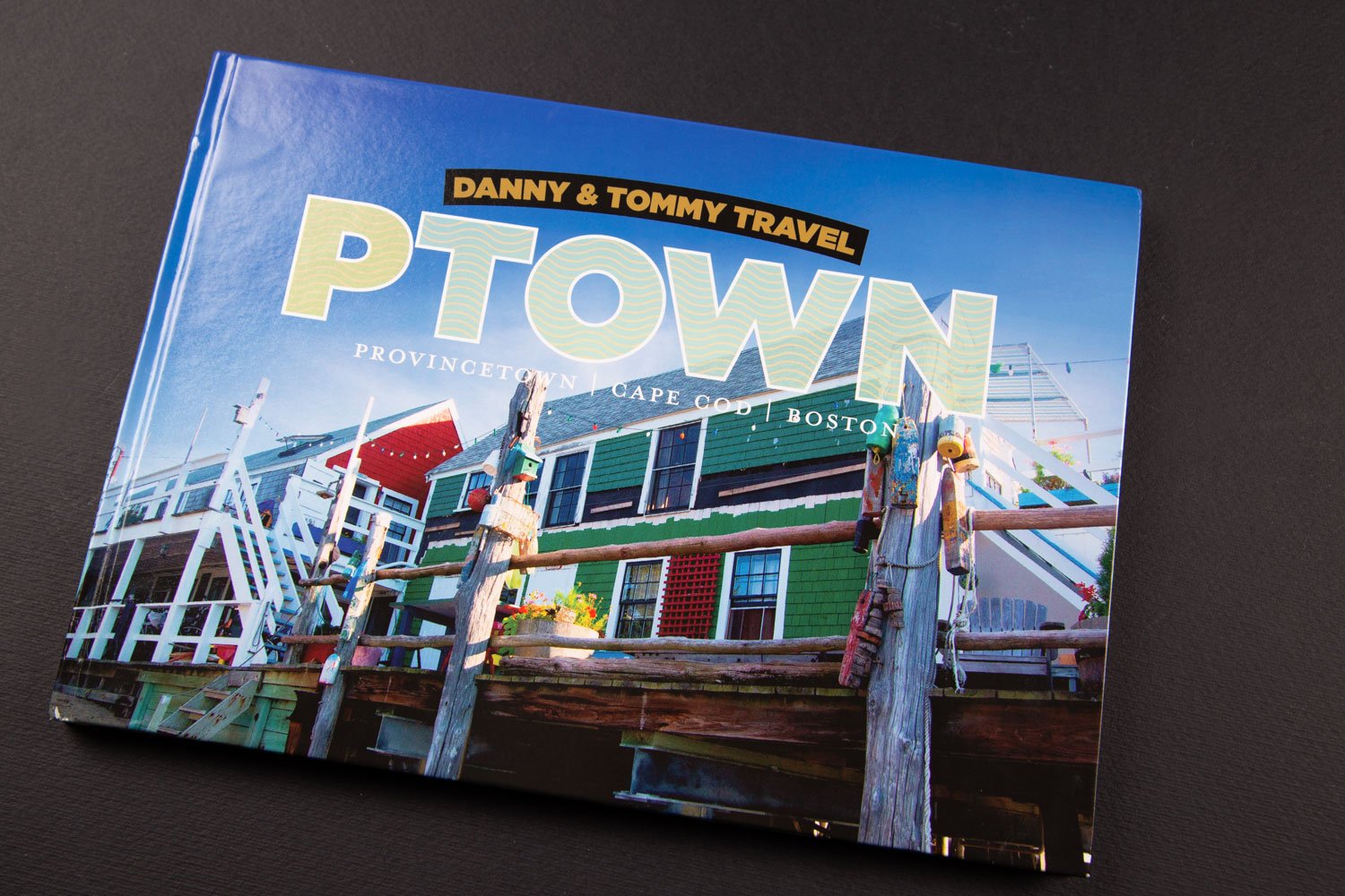
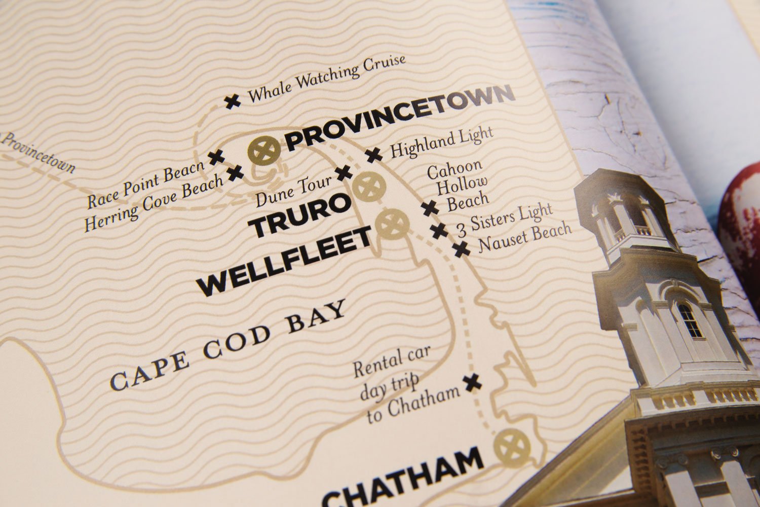
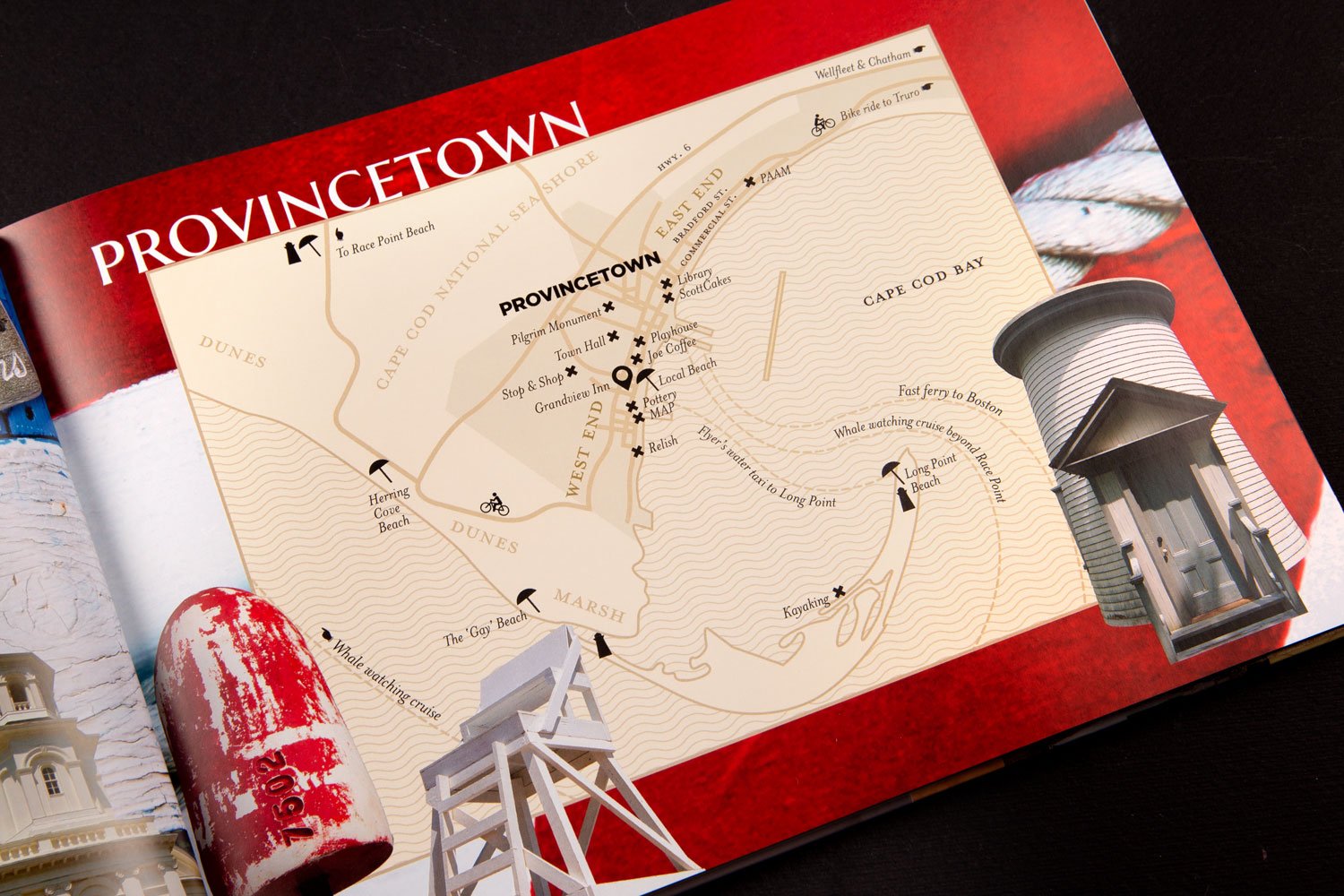
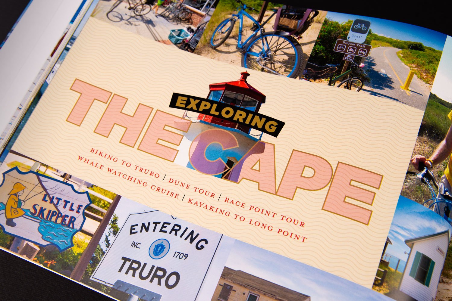
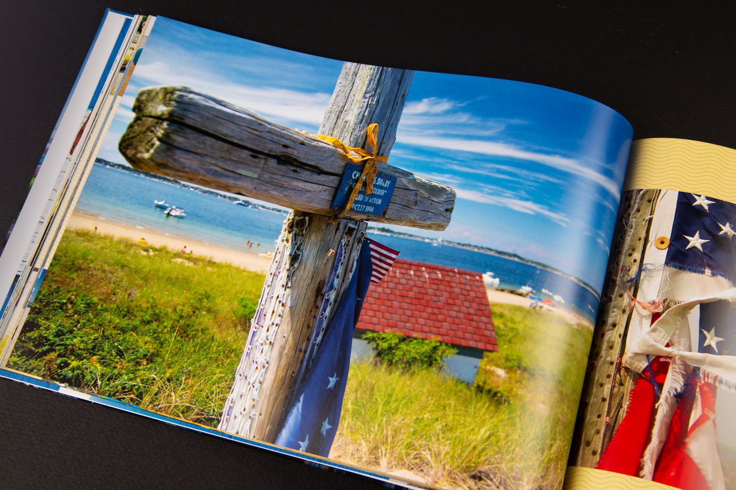
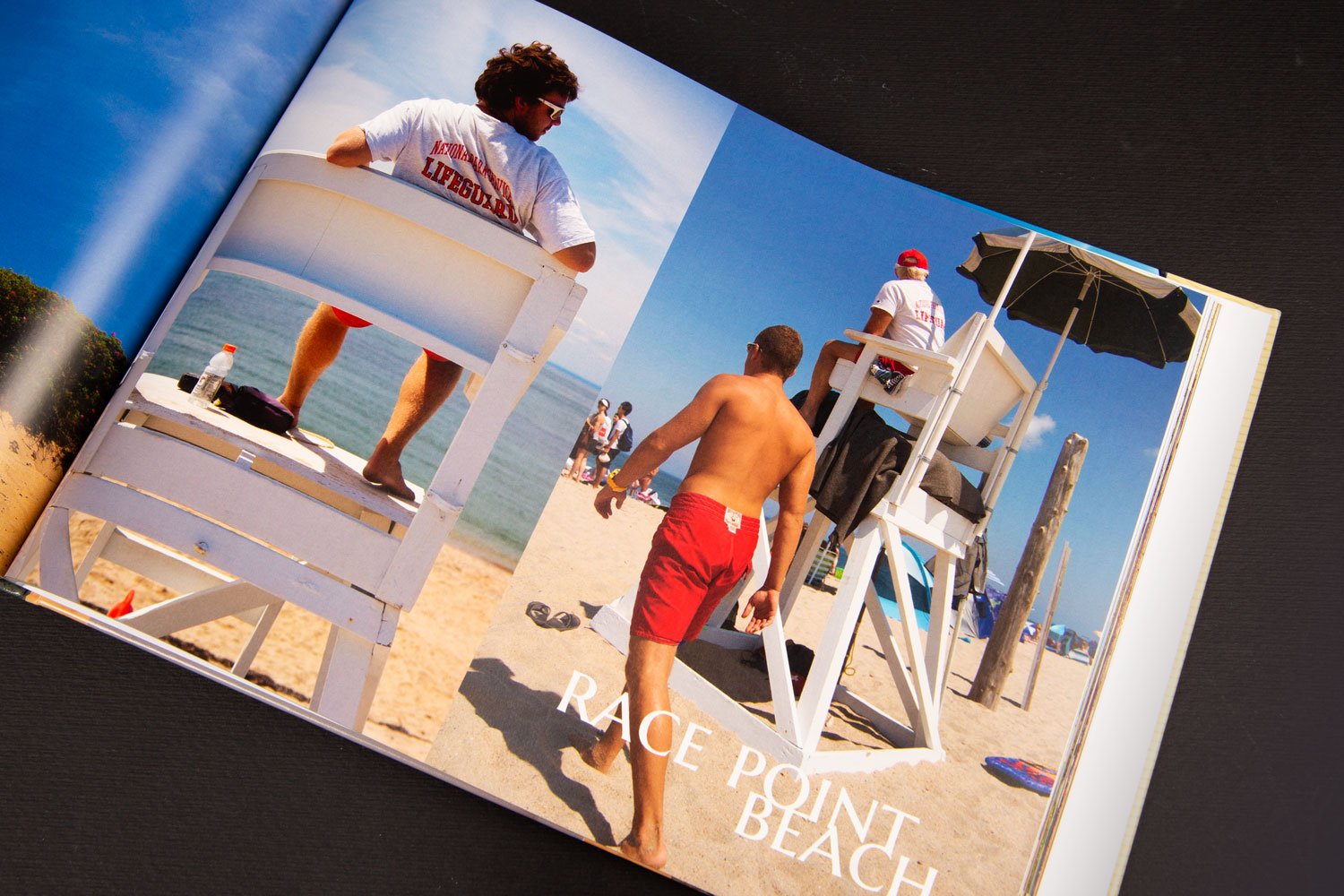
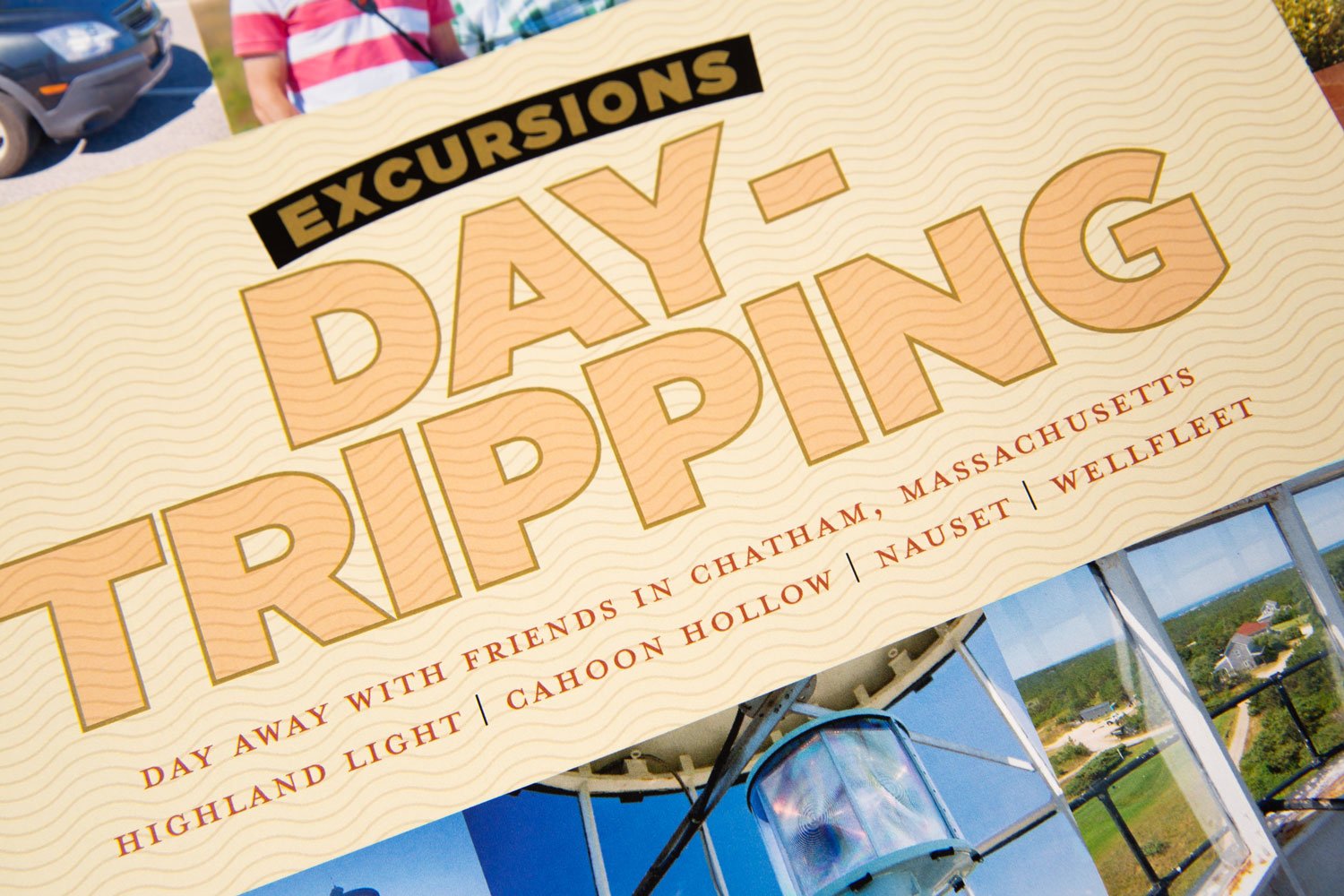
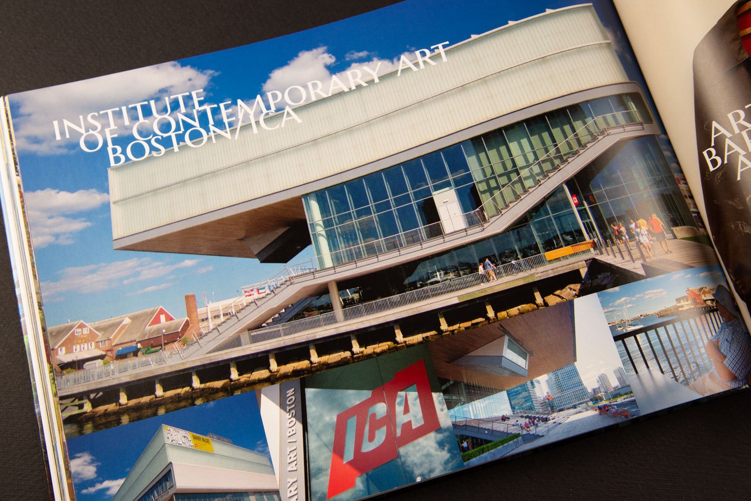
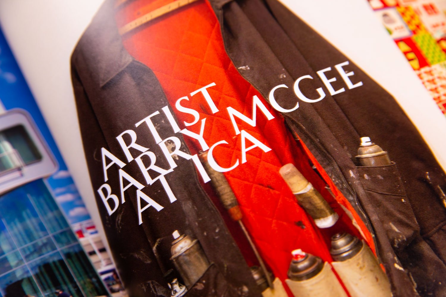
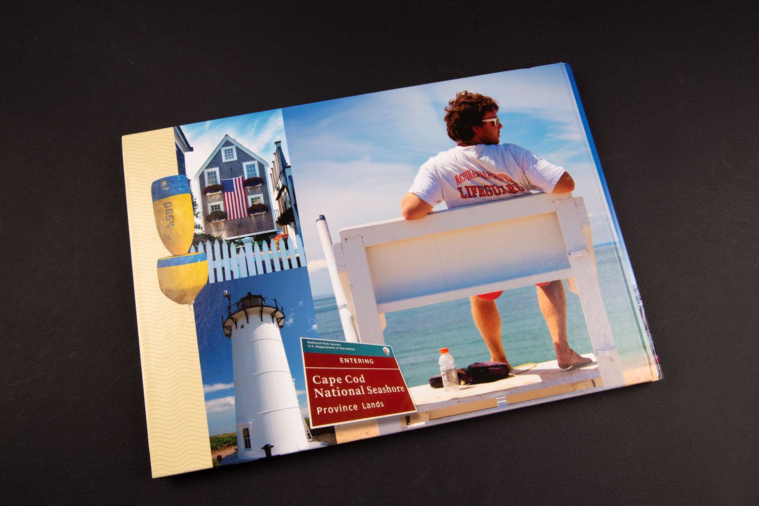
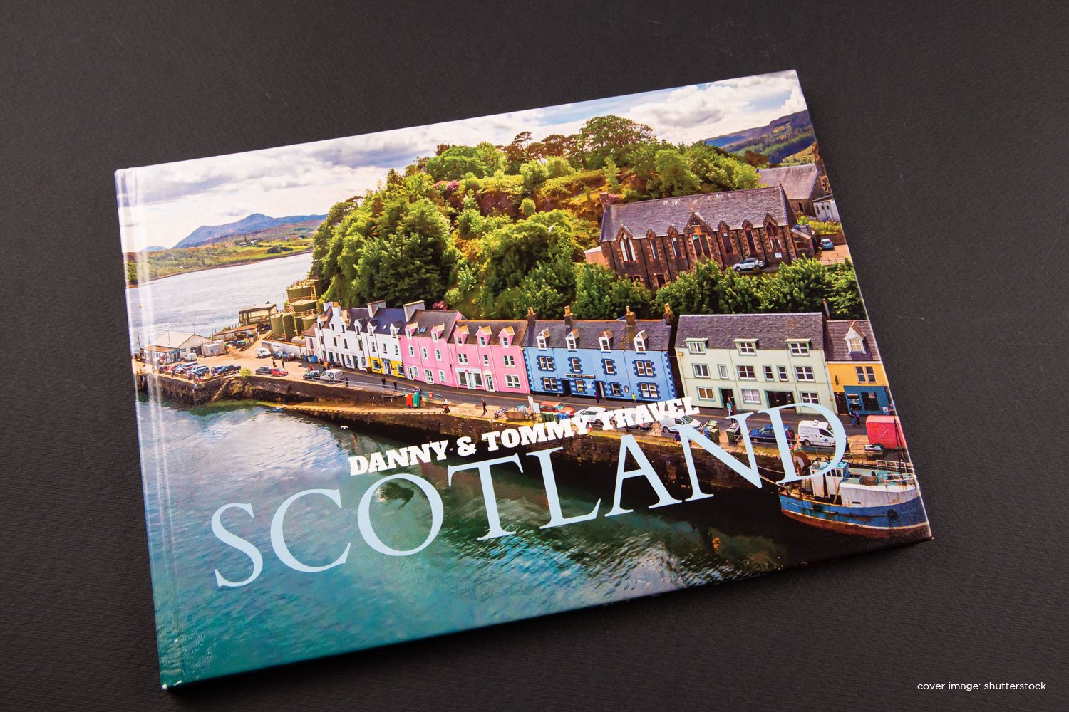
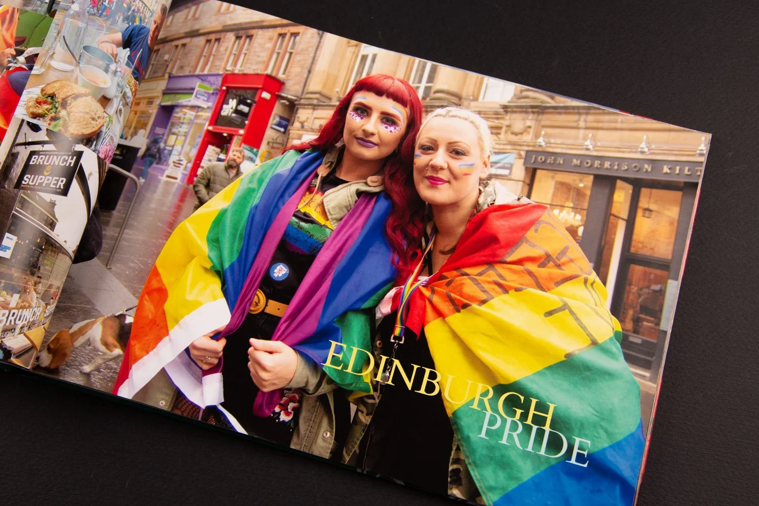
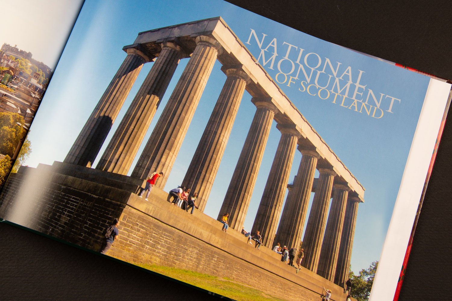
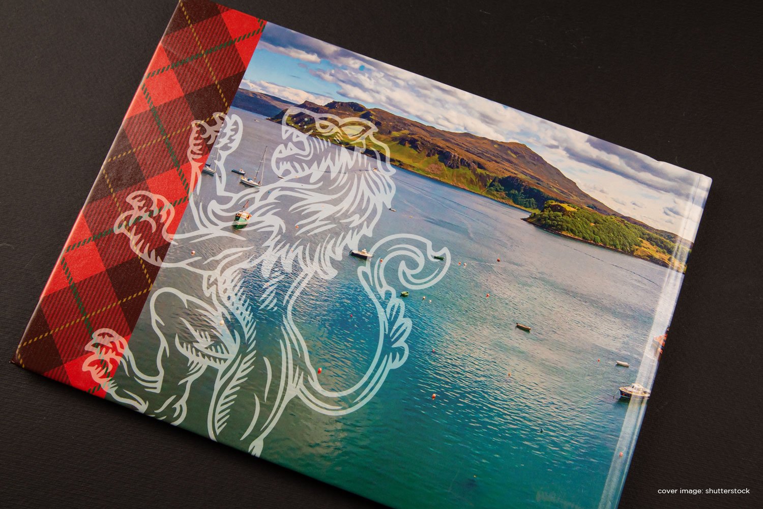
When not designing posters in the recent lockdown of 2020, I jumped into self-publishing. Digital photo libraries are very convenient; but sometimes I just prefer to hold a solid book - somehow it makes the experience meaningful and memorable. I’ve published a few books recently that turned out well: a portfolio of design work over my years in the communication and design industry, and a couple of vacation books. I used online resource www.photobookcanada.com. (Yes, you’re on a Canadian site, but the actual production of their photobooks are completed and shipped overseas.) With loads of options for page size and format, paper finish, binding, and extras - like engraving and slipcases - the task may seem daunting; but this site keeps it simple with drag-and-drop options and quick video support to guide users. I opted for the ‘blank page’ option and created my own page grids and title artwork, although you can use their preset templates.
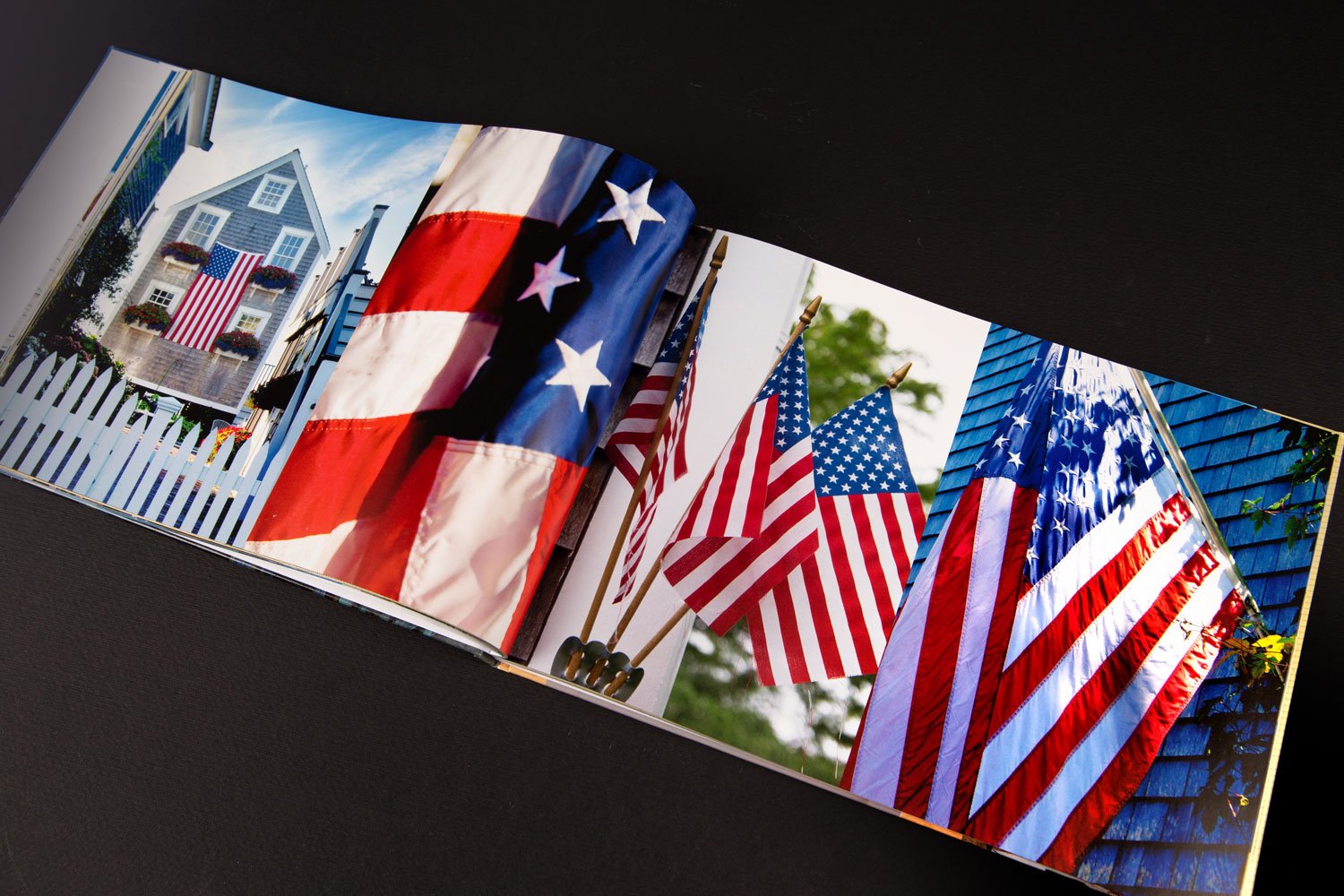
The results? Image and colour reproduction are excellent. Paper finish feels great and images really pop. Binding is excellent and my photobooks felt solid, like a book from any bookstore. Want more? The site offers many solutions from stationery to totes, to seasonal greeting cards. Overseas shipping is very prompt and their production rates are good; qualify for a ‘pro code’ and save more.
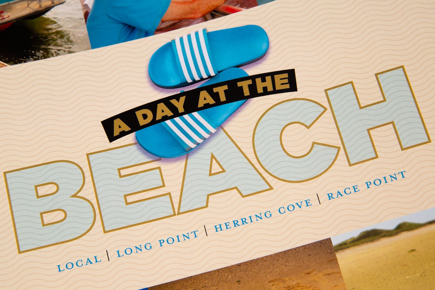
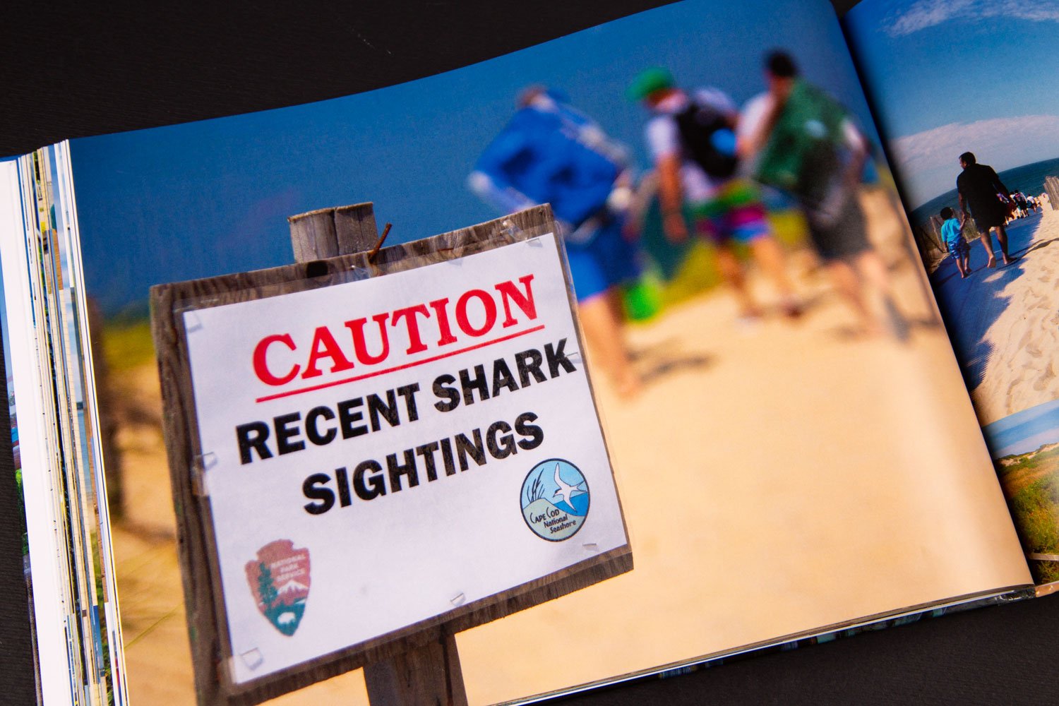
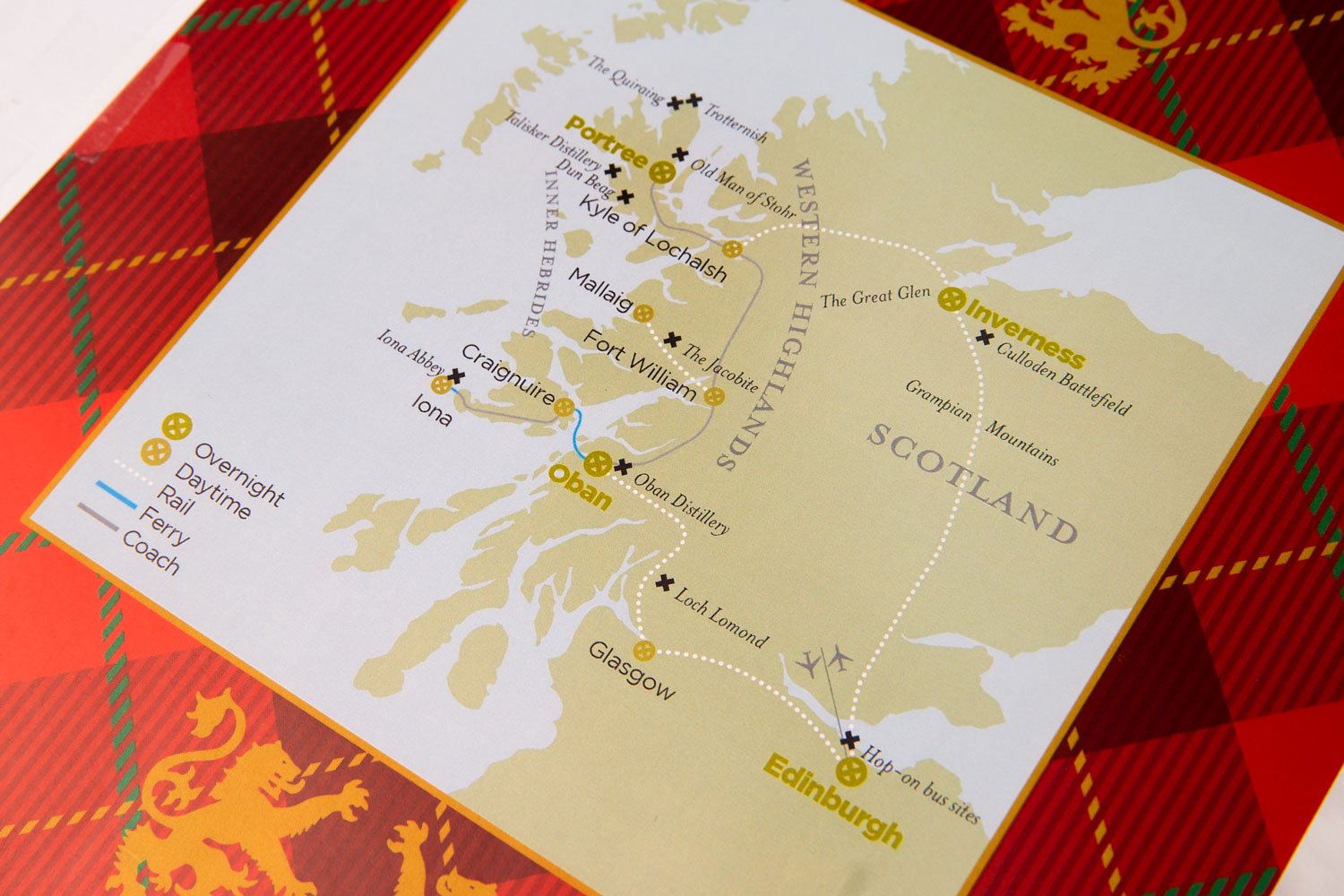
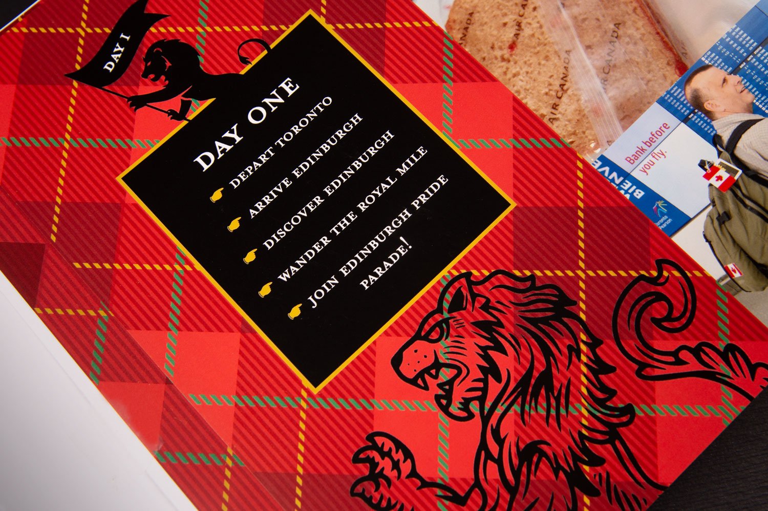
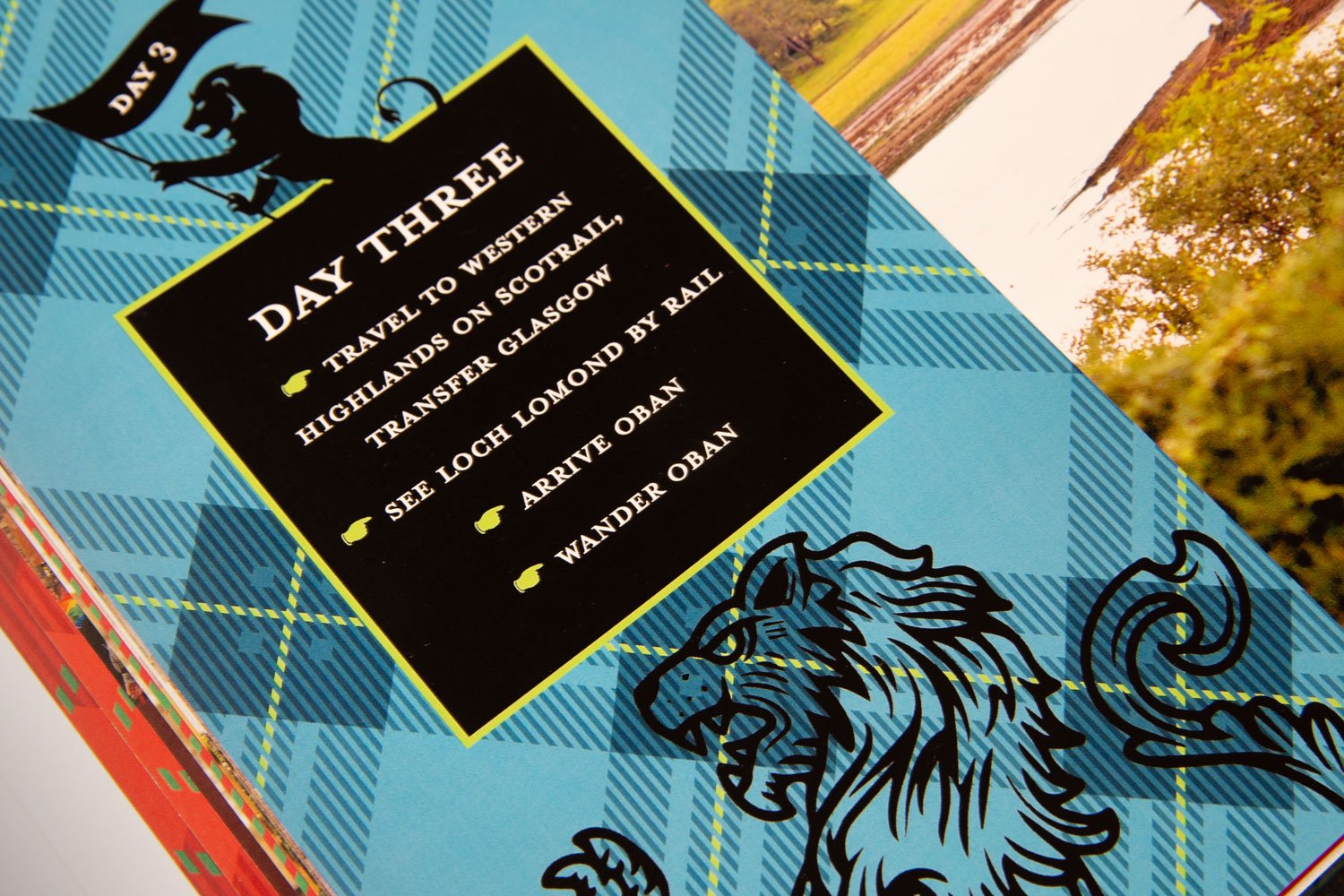
My approach? I determined the visual direction of my books by theme, chronology, or itinerary; for vacation books, basically a day-by-day format, or an appropriate theme like ‘Daytripping’. I designed maps, cover and title pages, and graphics to enhance the visual narrative; lots of plaid for a trip to the UK! Managing image files is a lot of work; but it’s definitely worth the back-end effort to keep things ordered - the finished results will definitely keep you coming back to relive meaningful memories.


New Posters for 2021
New posters are here!
Working on these posters has been loads of fun over the past year. Gotta keep the creativity flowing even in lockdown! Response has been favourable too.
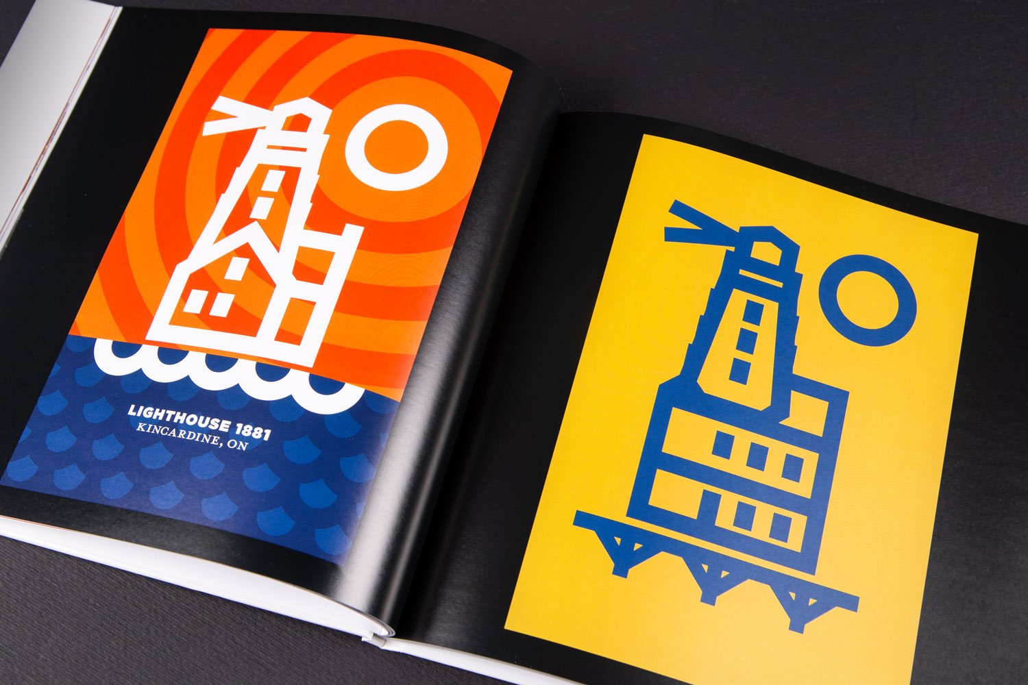
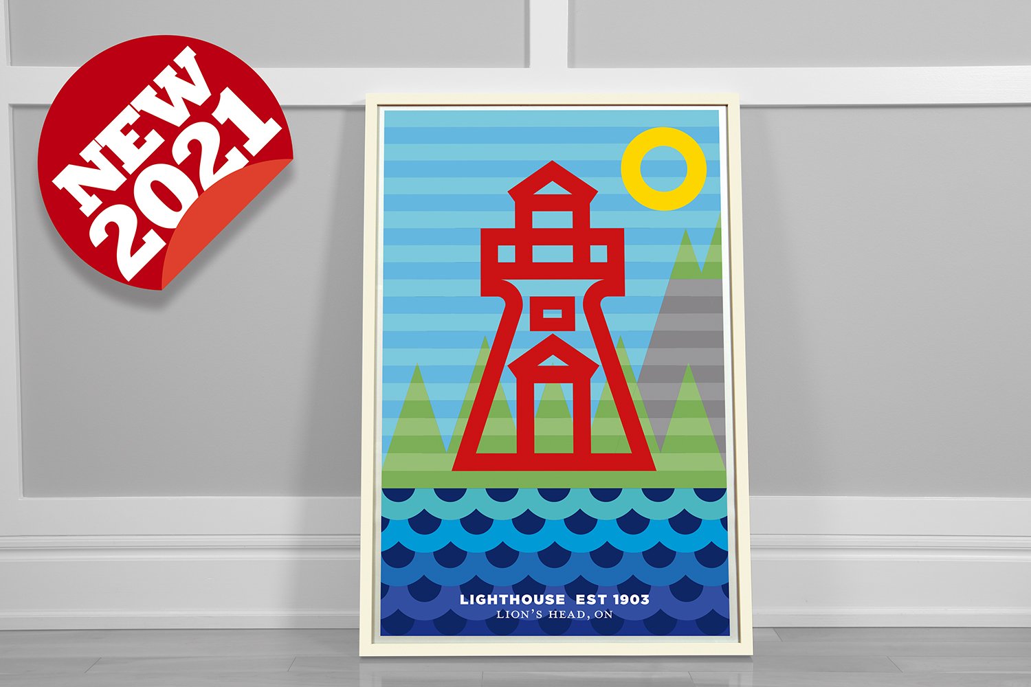
It’s been interesting exploring new content for the posters while also considering design direction. The lighthouse series is now expanded to five with the addition of the range light in Lion’s Head, Ontario. Over the years this poor light has endured a lot of stormy Georgian Bay weather; it was destroyed in 2020 but rebuilt by local volunteers. The poster’s background hints at the famous nearby escarpment.
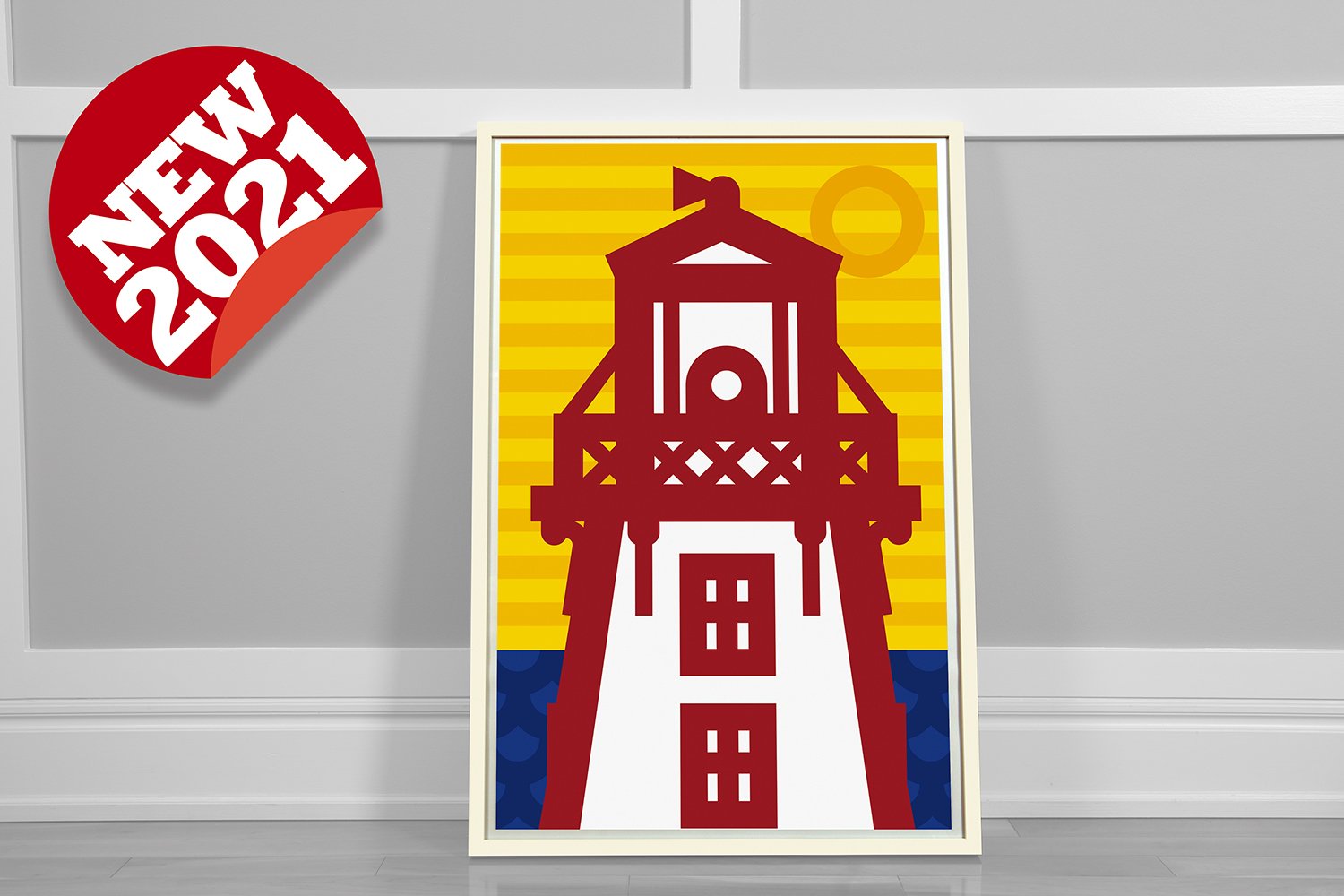
Kincardine, Ontario’s famous landmark lighthouse was the first poster I designed in 2019. I’ve got a new poster that focuses on more design details of the tower’s lantern.
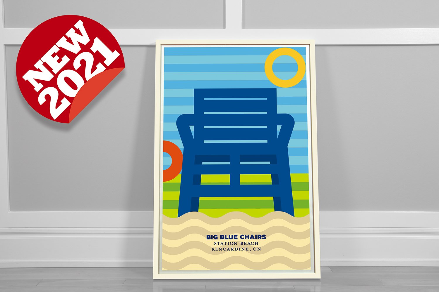
Nearby on Station Beach in Kincardine beside the local marina, sunbathers - especially kids - enjoy climbing and sitting on blue over-sized chairs. They’re perfect spots for selfies. Very Intstagrammable.
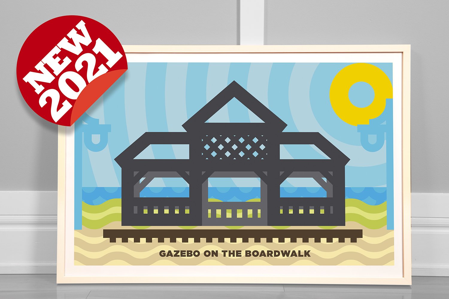
Down the beach along the garden boardwalk, following the path of the former railway tracks, sits a gazebo. It’s weathered over the years, but still stands strong among the beachgrass and sand.
I think the blue chairs and gazebo posters form a nice pair, they’re colourful and evoke memories of beautiful summers on the beach.
The five-part lighthouse series has been an interesting exploration too; each poster employs design elements that are expressive and reflect the environment of each light.
Watch for more posters in the coming months.
You can find the full poster series here.

Design Takes On COVID Part 2: Proudly Vaccinated
T-shirt design to inspire vaccinations
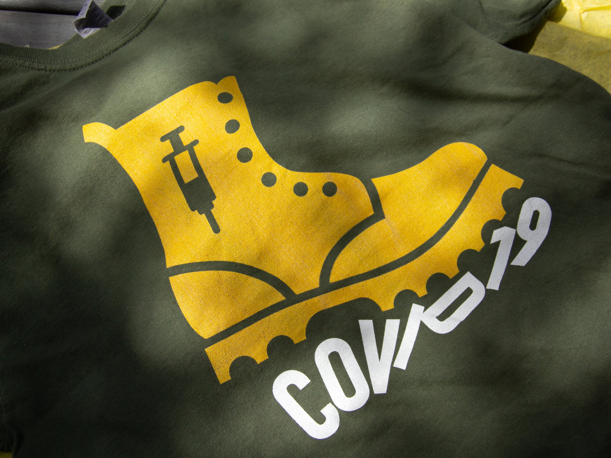
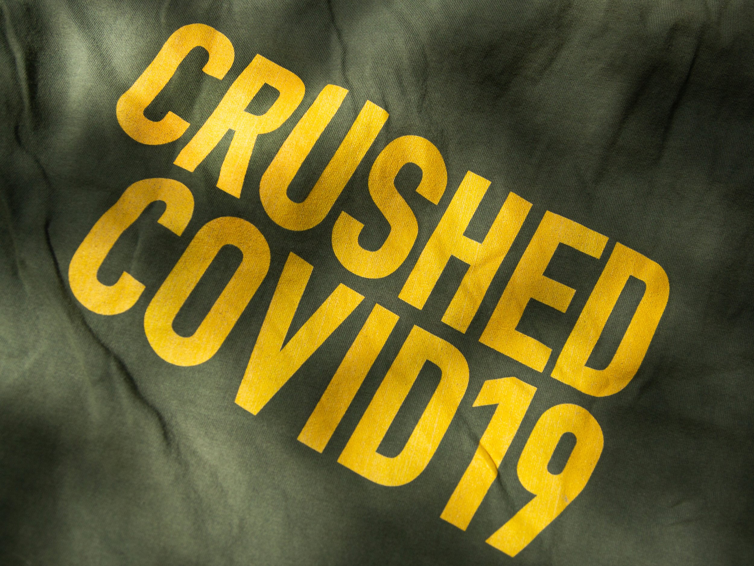
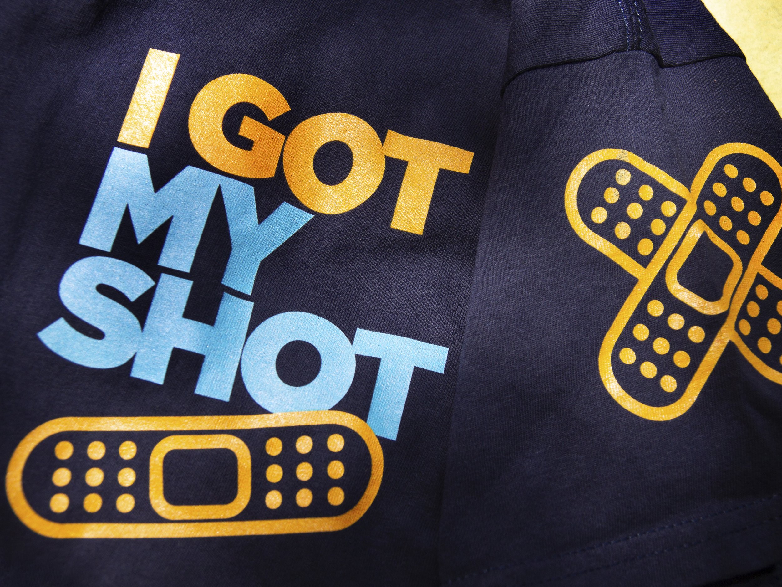
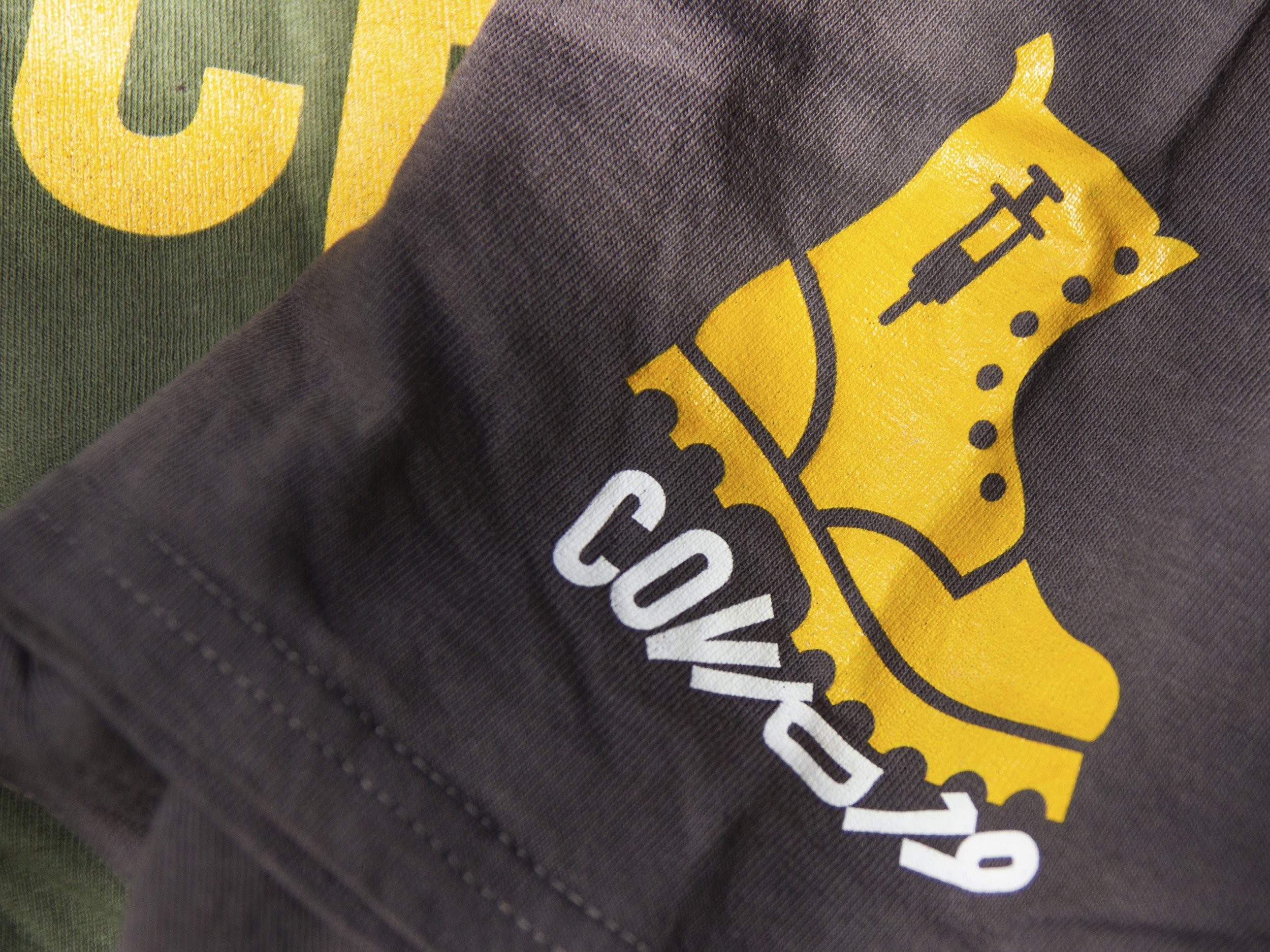
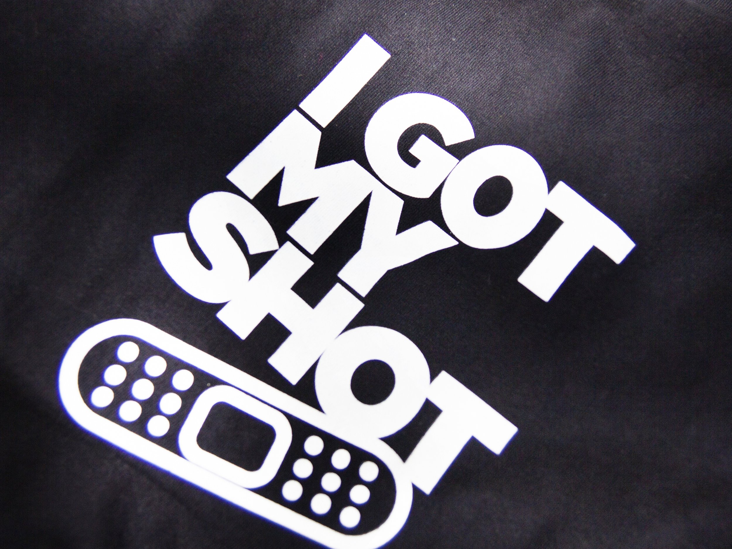
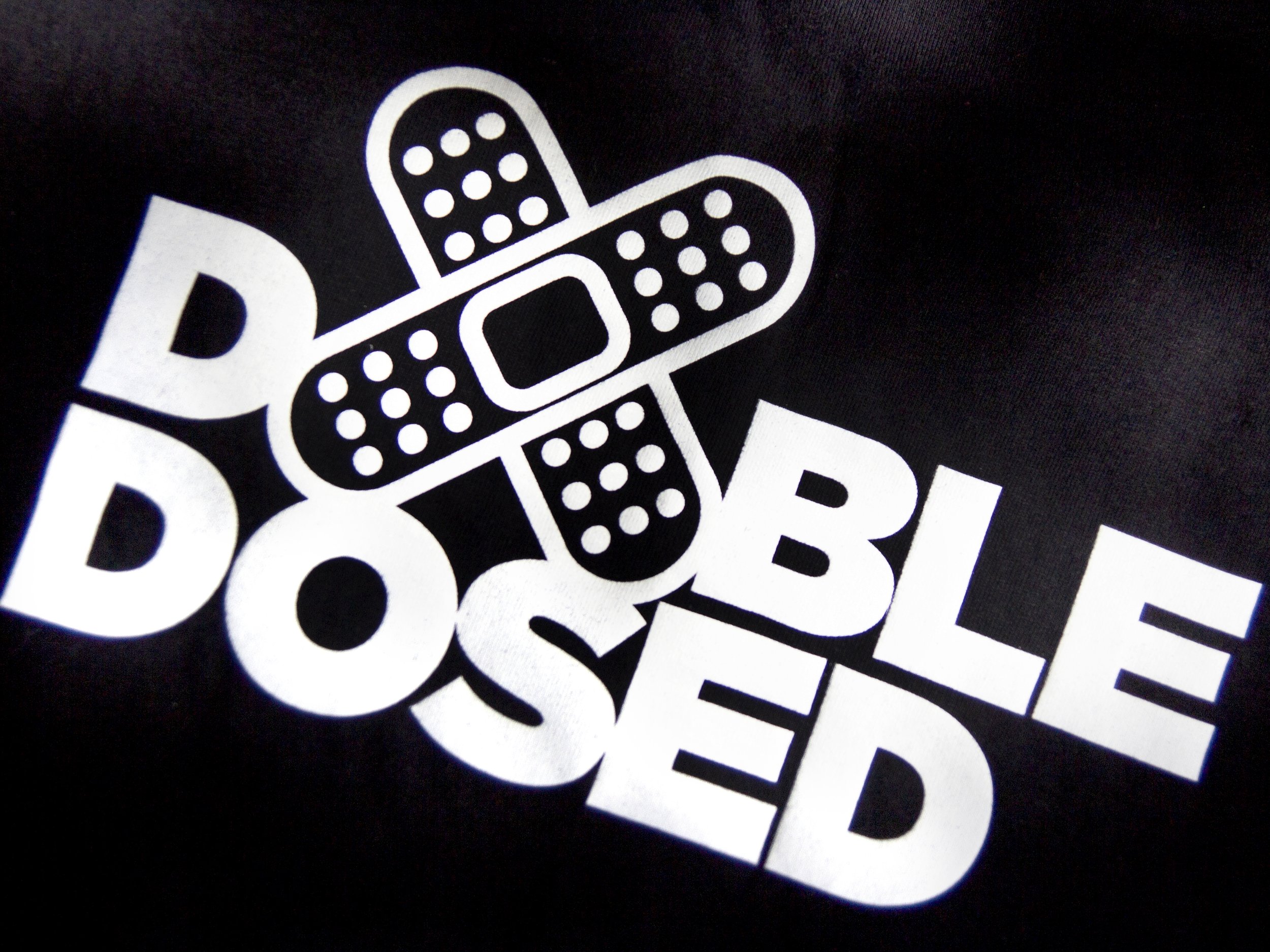
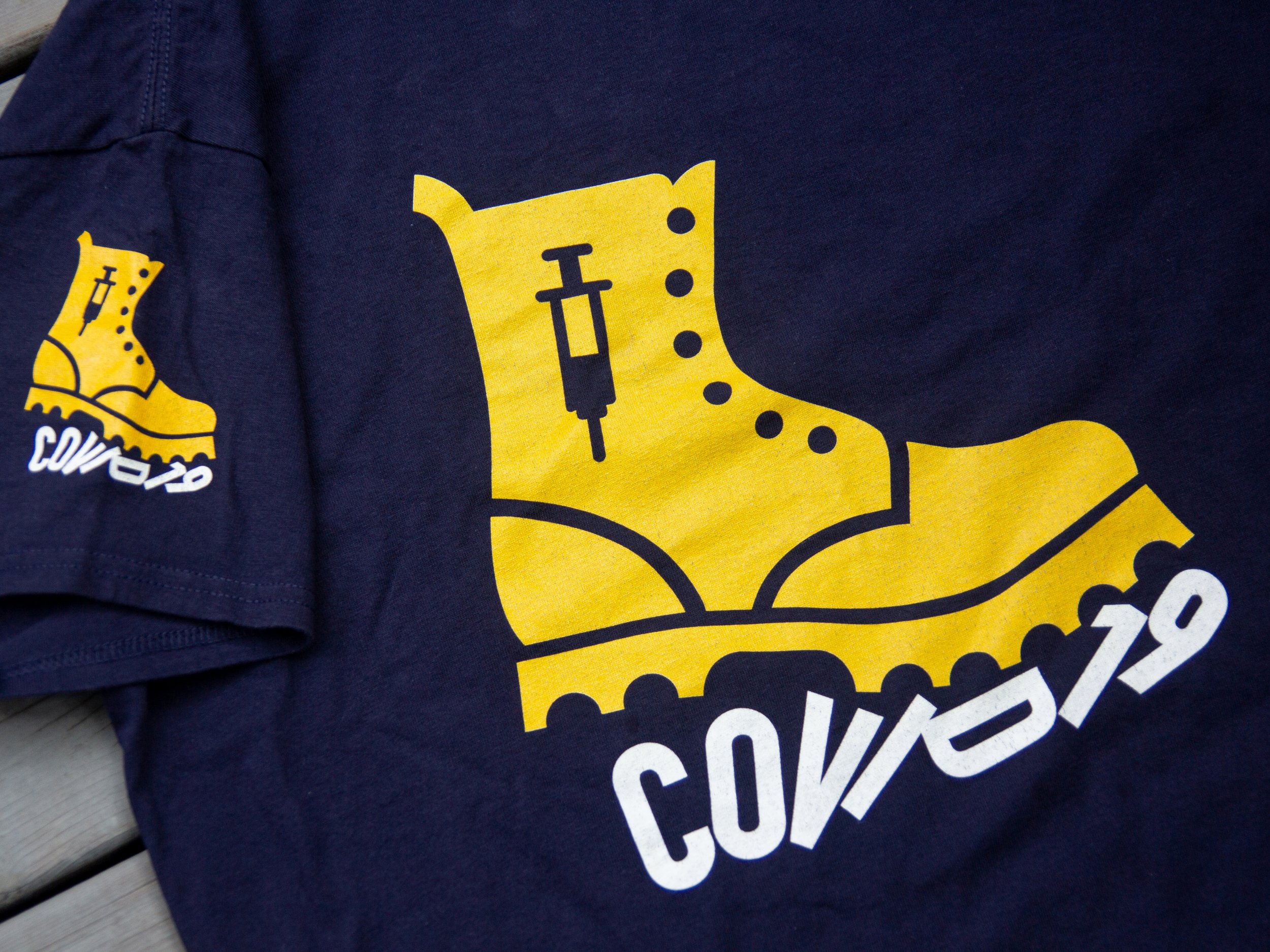
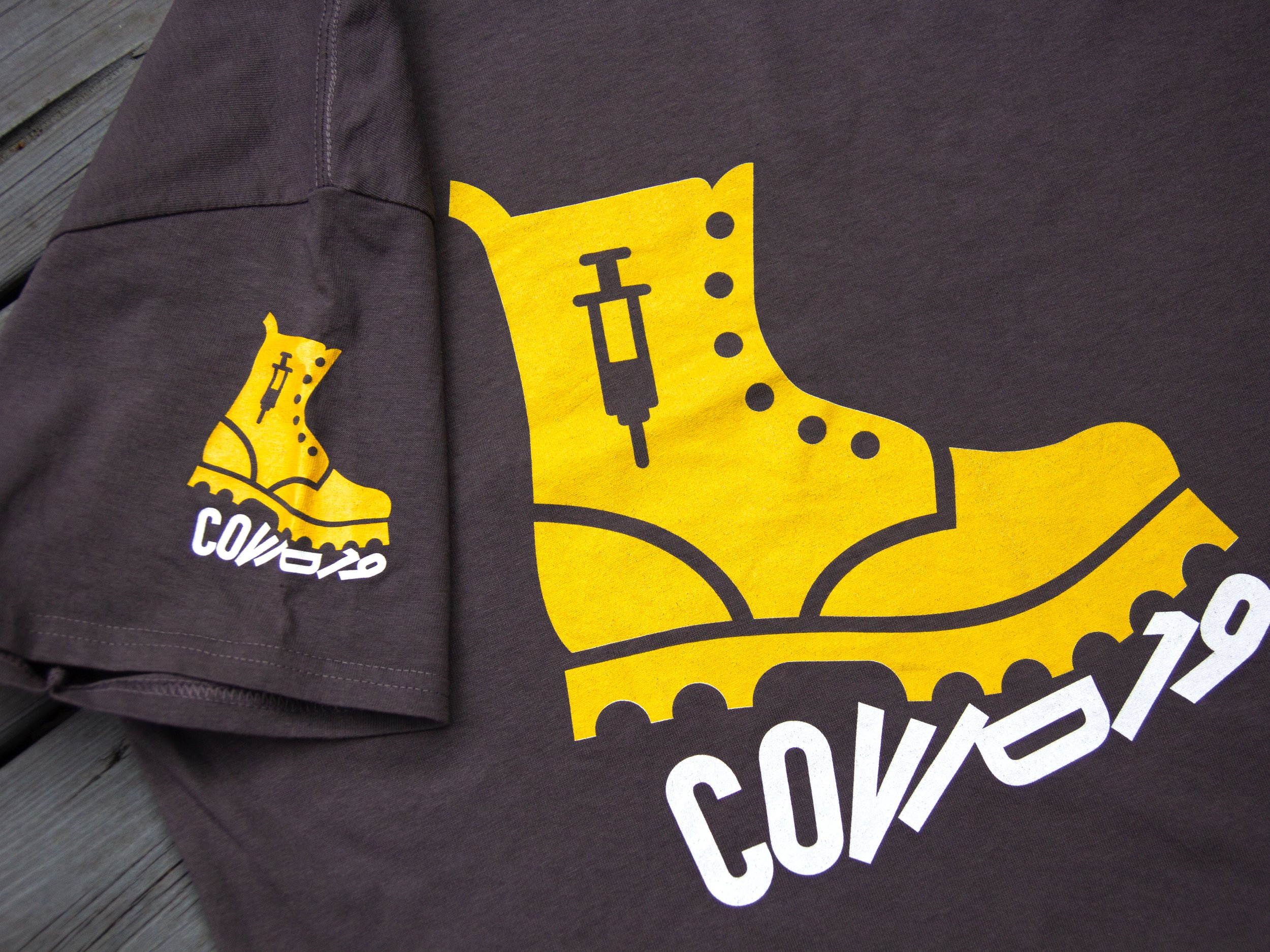
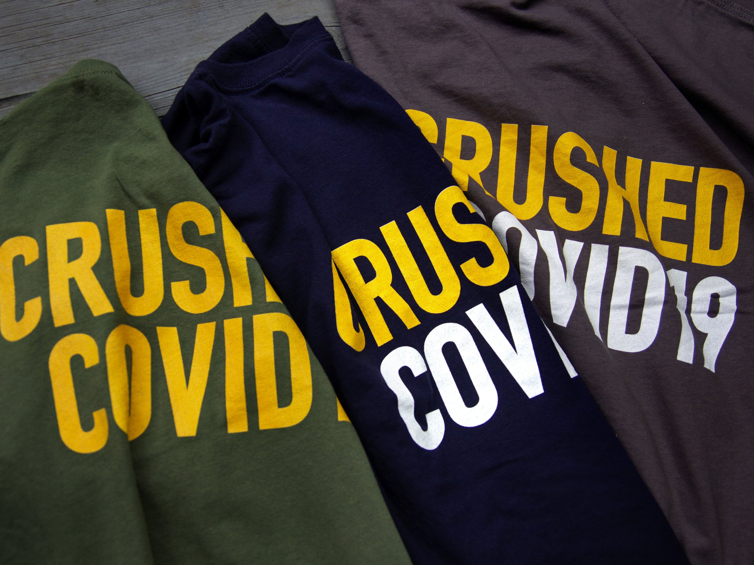
On my April 2021 launch post I looked at COVID-related communications through a design lens - commenting on public service efforts to communicate often complicated data in meaningful and effective ways. So, with COVID still active in our daily news cycle and with design always top-of-mind for me; I was inspired by a phone call from my mother. Like many people, she was thrilled to receive her COVID vaccinations over the past few months. We’re all doing our part to ‘flatten the curve’. So she called me, excited about her idea: COVID t-shirts! My design-driven mind turned out some ideas: a steamroller flattening the curve seemed too literal, a sports metaphor seemed too obvious. What about a heavy-duty, Timberland-style construction boot - not just flattening the curve, but crushing it? Add a simple type treatment. Done. Then I thought ‘big picture’: What do millions of us share in common in this truly global epidemic-crushing immunization experience? A simple bandage. Once jabbed, the pharmacist applies a good-old bandage and we’re good-to-go. Done. A couple of crossed bandages, subtly creating an ‘x’ for the injection spot creatively printed on the sleeve complete the message. And why not get double-dosed to carry the metaphor one step more? Researching websites with simple drag-and-drop interactive templates, I prototyped the designs on different cotton t-shirts from various sources. Really impressed with Oakville-based entripy.com. Great print quality on a Gildan 100% cotton shirt, printed DTG (direct-to-garment). Great service and customer support plus close attention to quality control. And they’re partners with some of Toronto’s top pro sports teams! I’m hoping to produce new t-shirts in the future - not COVID-related stuff though, it’s time for something bright and cheerful - so watch for them in a future blog post.
Resource:
Printing - www.entripy.com - printed DTG on Gildan 5000 Heavy Cotton T-shirt/100% cotton

Design Takes on COVID
Through the lens of design, information graphics can help us understand the pandemic
The Association of Registered Graphic Designers (RGD) recently hosted a webinar on the use of infographics in the pandemic, and asked: Are we getting a clear picture? RGD is the Ontario-based association of graphic design practitioners, educators and managers. Their mandate is to advance the value of design in business, create a community for design professionals to exchange experiences and knowledge, host virtual and in-person conferences, and to uphold professional design industry standards. It’s a great organization. Arlene Gould from the Toronto-based Design Industry Advisory Committee (DIAC) hosted the online chat.
Since the pandemic began we have been bombarded by data, with information changing daily, it’s hard to keep a clear picture of the state of the pandemic - data overload is not uncommon. Through the lens of design, information graphics can help us understand the crisis. Design can actually combat the pandemic.
Take for example the familiar image of the actual coronavirus: that achromatic gray sphere with those red S-protein spikes forming the corona, or crown. It was illustrated by Alissa Eckert and Dan Higgins for the CDC, tasked with creating the “beauty shot” to bring it to public attention. While the shape of the virus is correct, the colour is a bit more complicated. Virus visualization is challenging because viruses exist in a sub-microscopic realm where colour has no meaning. While the coronavirus interacts with light, at short wavelength light - like UV and x-ray light - it doesn’t actually have any colour. It really is an invisible killer. Embracing grayness in fact has advantages: it fits the science where light can’t actually reach at sub-microscopic levels and it just appears less threatening, hostile invader though it is. Absent vivid colour, we can reduce our anxiety and perhaps direct our efforts to actually reduce transmission.
Panelist Dr. Milena Radzikowska suggested that we have seen the emergence of a coronavirus identity: it has even been humanized as a party-crashing unwanted guest, or an alien invader. War metaphors are commonly used in headlines to describe our current situation. It makes sense - the virus is the enemy, the strategy is to flatten the curve, front-line workers are the soldiers, and we hunker down with stay-at-home orders. We can understand the situation, we can relate to it.
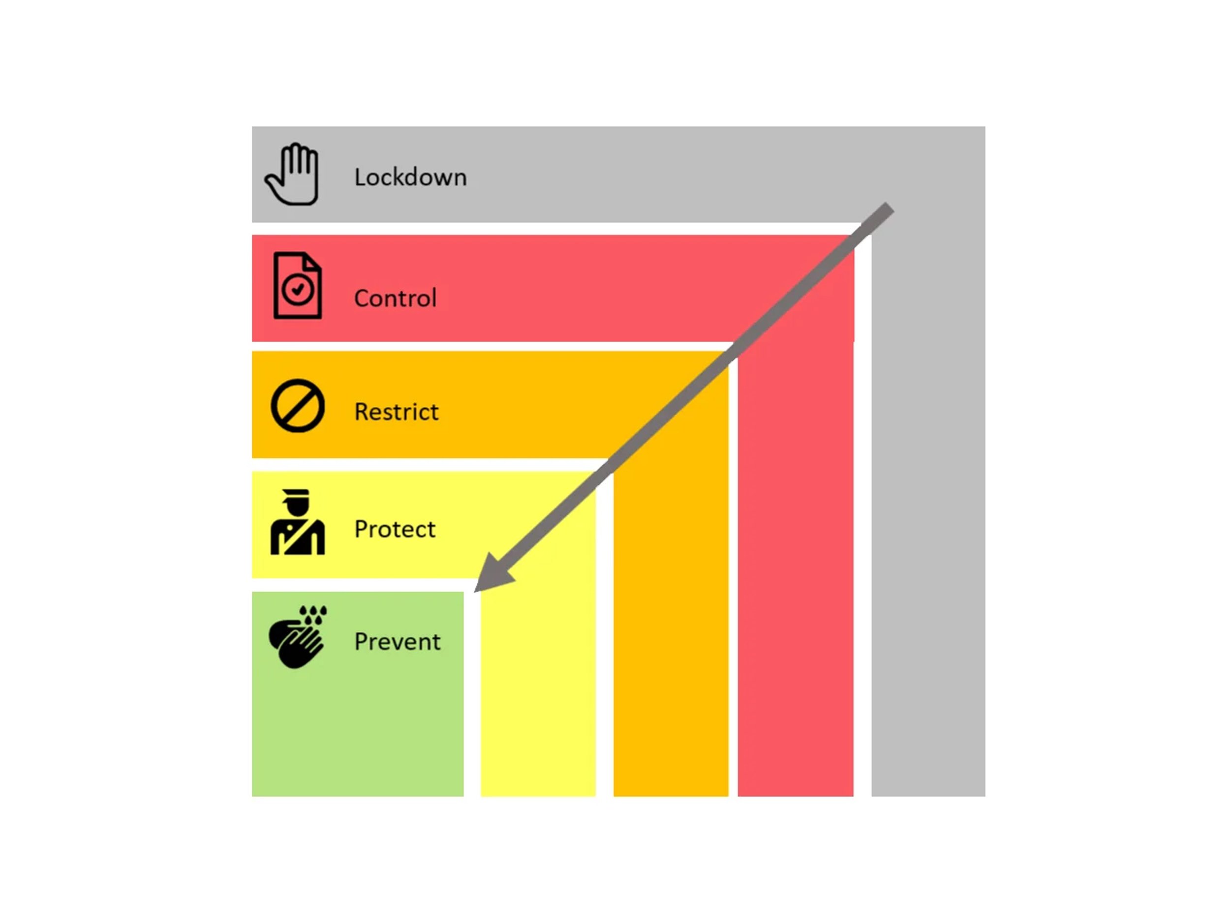
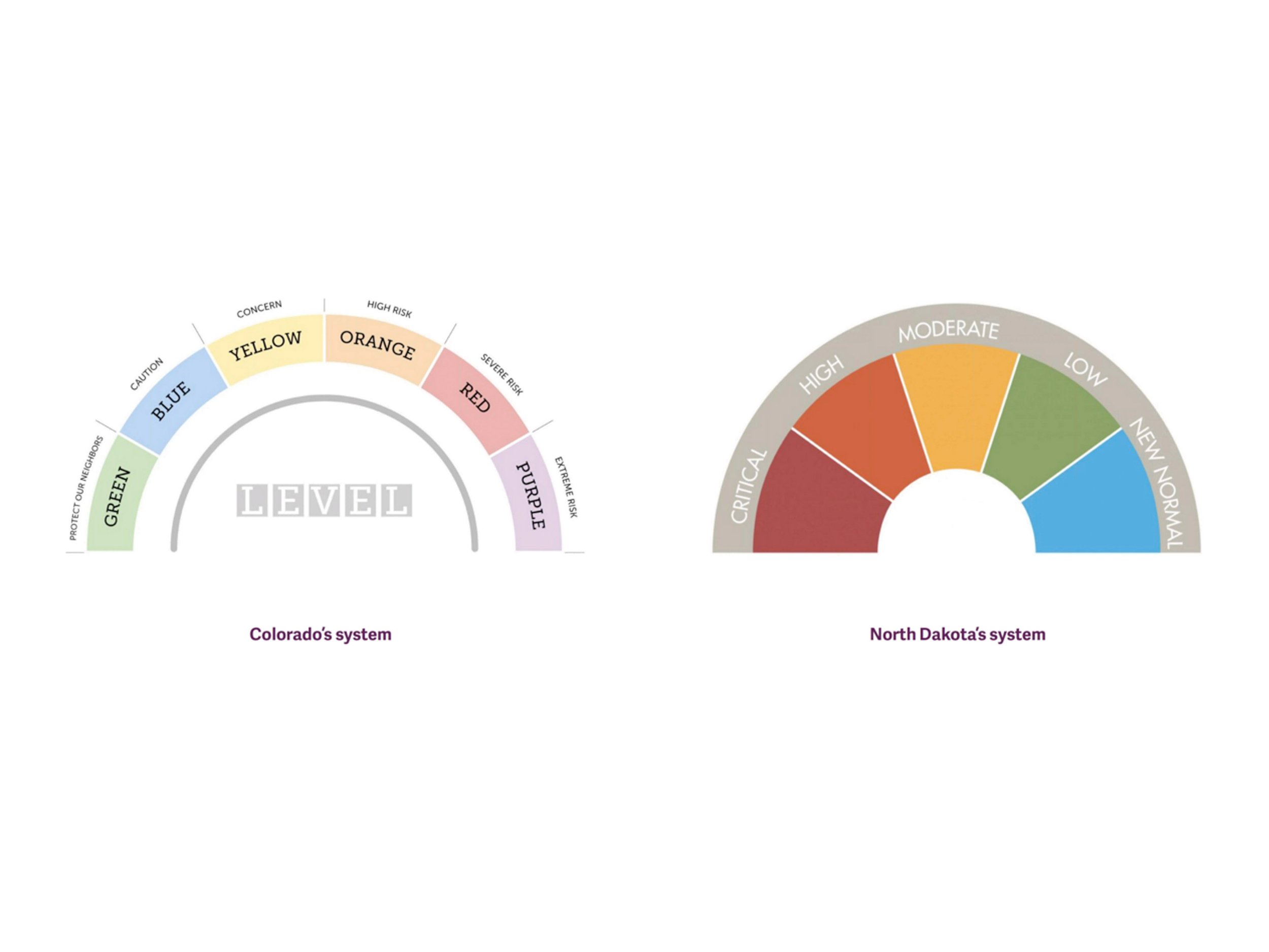
Panelist and designer Michelle Hopgood, RGD, spoke of the need for information literacy, developing the critical skills to locate, evaluate, and effectively use information. She commented on the patchwork solutions offered by public health agencies in Canada and the US to communicate risk levels. For example, an infographic from North Dakota features a colour dial/speedometer graphic hierarchy that features a ‘New Normal’ zone. It’s simply designed, but ‘New Normal’? That designation is bound to confuse. Ontario’s COVID response framework features a five-step colour-coded box ranging from green (Prevention) to gray (Lockdown). More gray again. She finds the framework lacks a sense of urgency, it employs a confusing colour palette, and generally lacks a sense of emotional attachment - it could be an infographic in any PowerPoint presentation, yet it is a critically important communications tool meant to provide guidance and clarity on the status of community health in the pandemic. As Matt Elliott observed in The Toronto Star recently, the colour-code system has effectively been tossed away. While standards make sense, he believes the provincial government has undermined its own system, changing the rules so frequently that guidelines no longer appear to be meaningful. Michelle Hopgood observed that now, more than ever, we need national guidelines on visualization of critically important information.
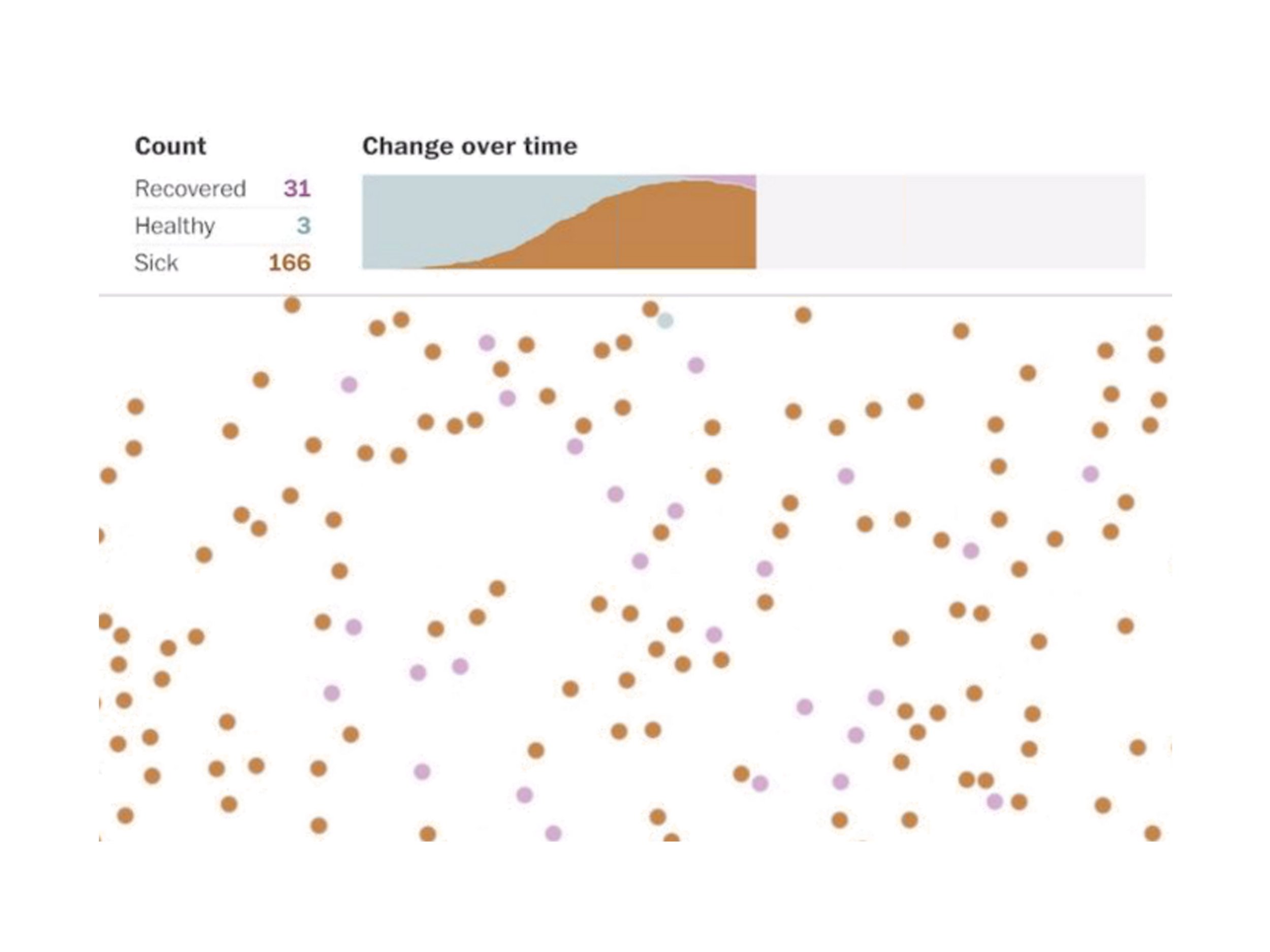
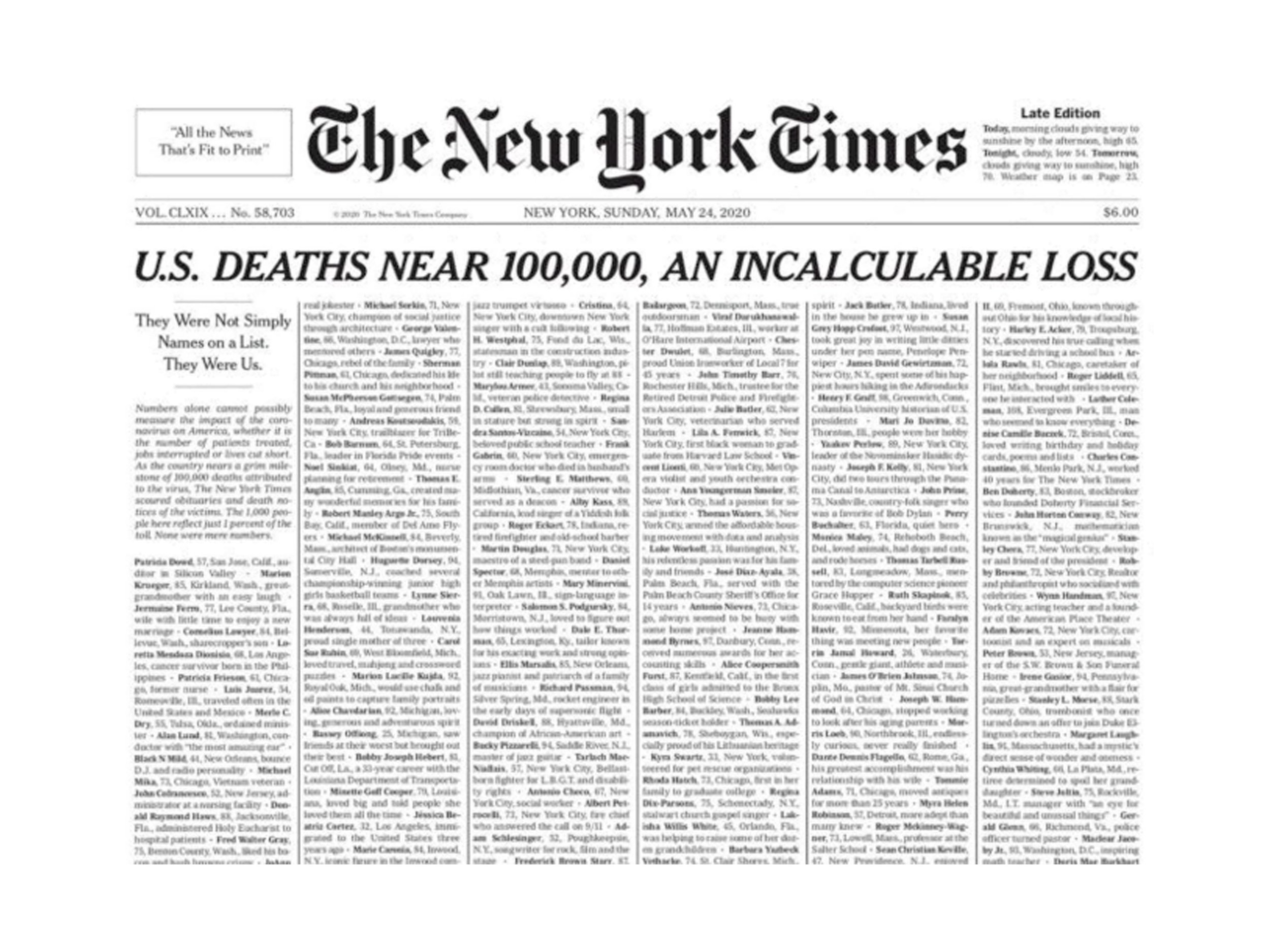
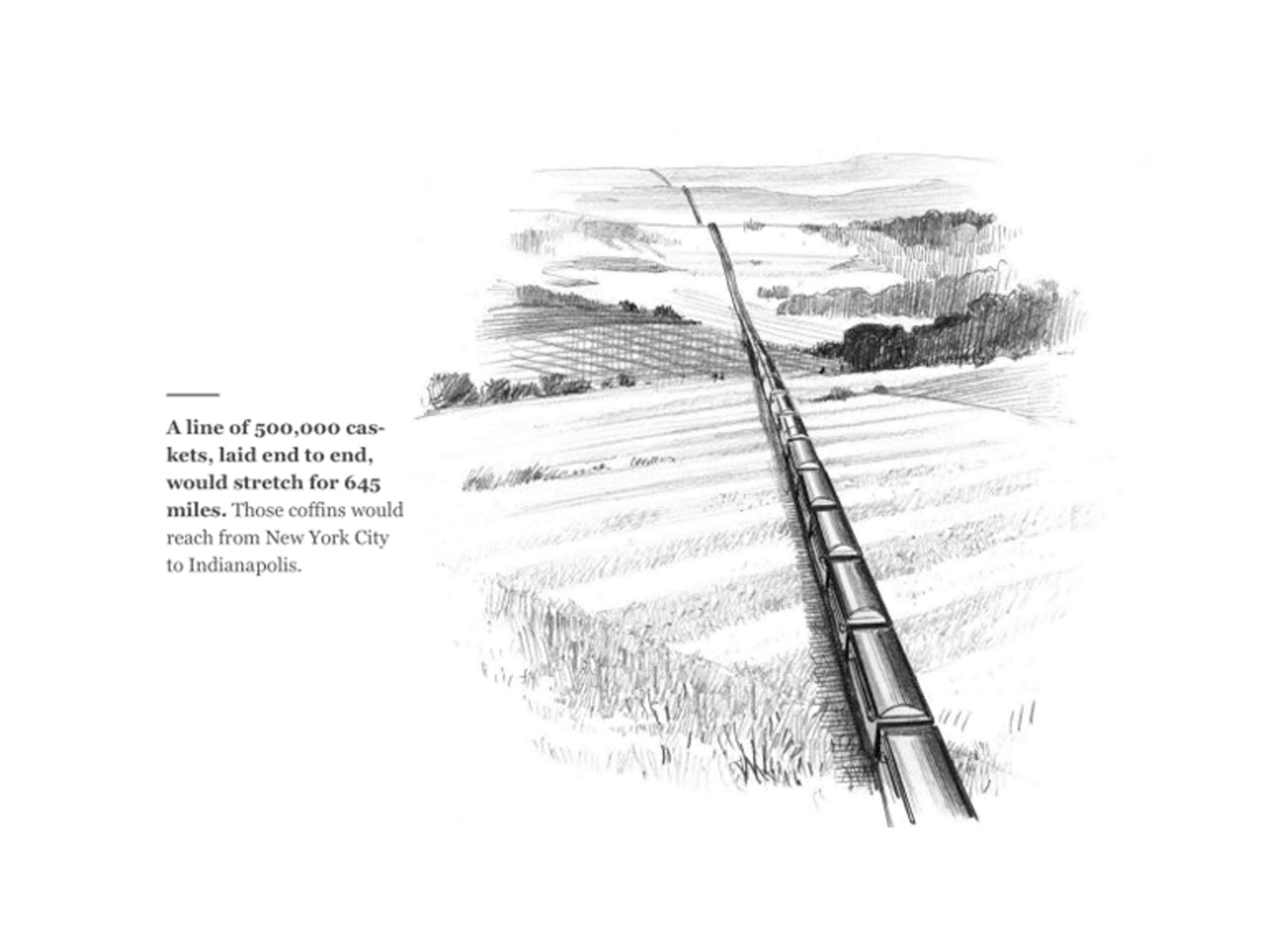
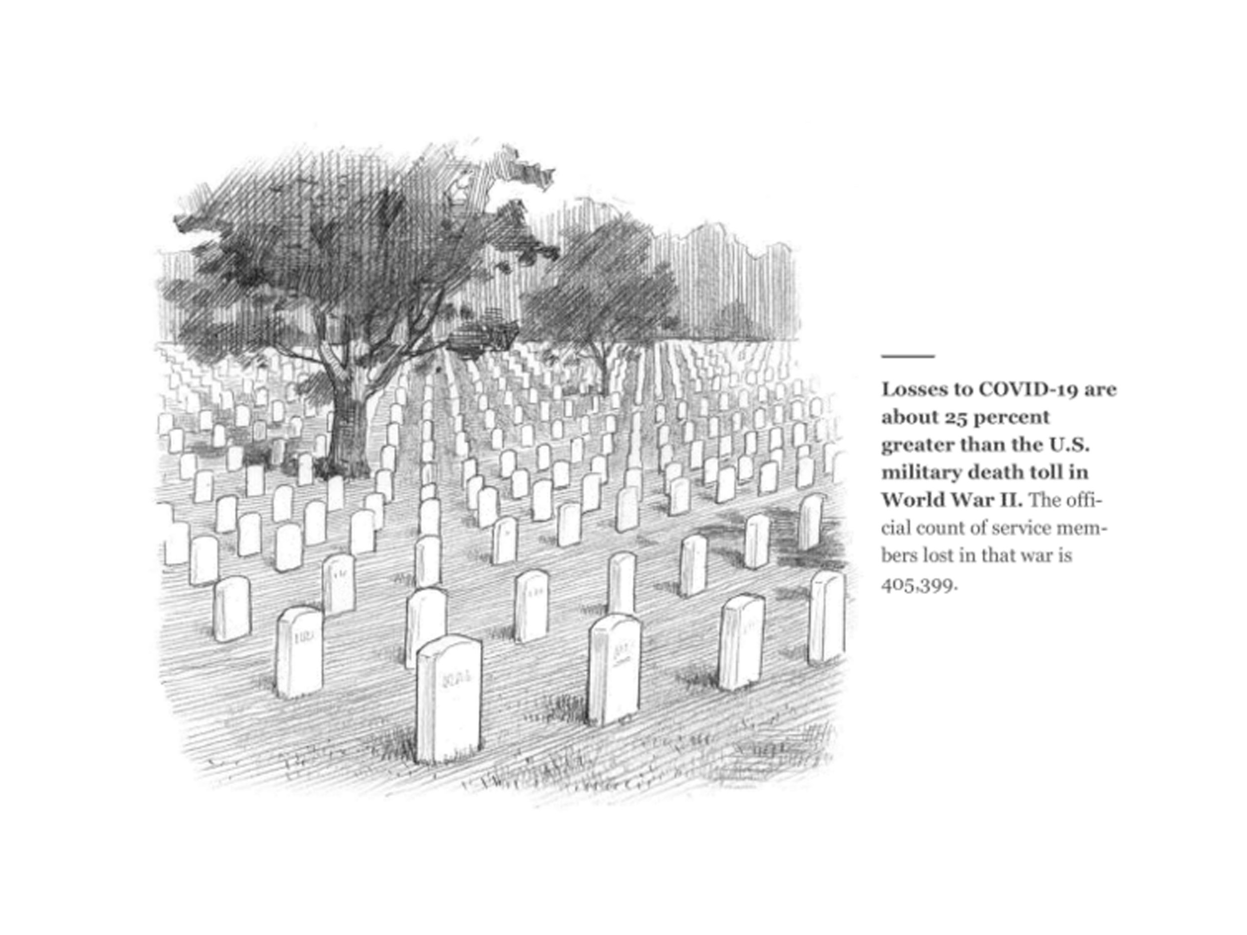
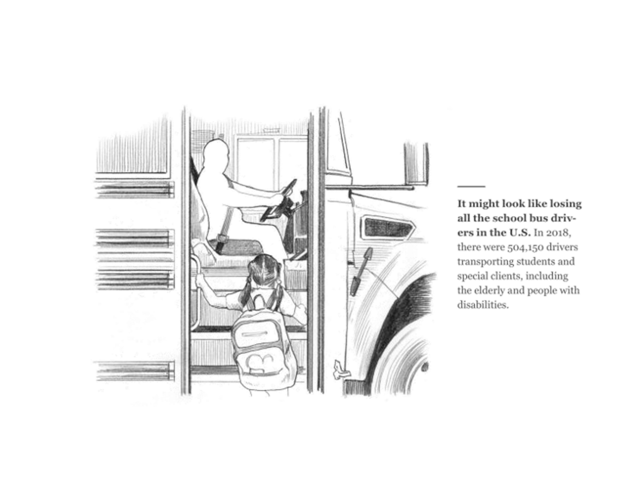
Motion designer, Julian Brown, RGD, offered striking examples that have attempted to overcome our COVID fatigue. The Washington Post produced a brilliant and effective infection simulator motion graphic that demonstrated the rising infection curve with shifting dots representing people in contact with each other; sick brown dots multiply as the curve rises while healthy blue dots diminish. It’s an effective demonstration of the power of interactivity and motion to convey a complicated data set. As the US approached 100,000 COVID deaths, the New York Times famously printed the names of lives lost on page one - six columns of tightly packed names, an incalculable loss. National Geographic depicted the crisis with simple, deeply meaningful, and beautifully rendered illustrations by Joe Mckendry: a line of caskets over 600 miles long, a vast military service cemetery, a school bus absent the driver. The series of illustrations effectively drafted a narrative, humanizing the data behind the science.
This was a really engaging and thoughtful webinar from RGD. The panelists all observed that while we may tend to forget, embedded in those graphs and data visualizations are the lives of people impacted by COVID: there is humanity in the numbers.


Sources:
phys.org/news/2020-03-scary-red-icky-green-coronavirus.html
www.forbes.com/sites/startswithabang/2020/04/15/no-the-covid-19-coronavirus-is-not-actually-red/?sh=51dd75595cbd
theconversation.com/war-metaphors-used-for-covid-19-are-compelling-but-also-dangerous-135406
www.nytimes.com/2021/04/02/style/coronavirus-safety-colors-states.html
www.washingtonpost.com/graphics/2020/world/corona-simulator/
www.nationalgeographic.com/science/graphics/what-500000-united-states-covid-deaths-look-like

The Brand Father
For Marty Neumeier, a brand is a gut feeling, an impression in the mind of a customer or user
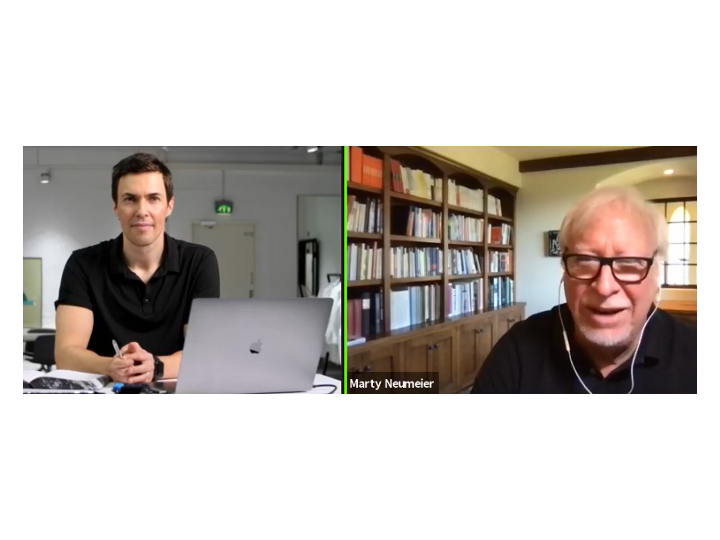
Brand strategist, podcaster, and founder of The Future Academy, Tobias Dahlberg interviews ‘The Brand Father’ Marty Neumeier
Marty Neumeier’s design career took off in the early, heady days of Silicon Valley; he found his niche in retail computer software packaging, designing solutions for tech’s biggest players: Adobe, Apple, HP, and Microsoft. He published design thinking magazine Critique. He’s the author of many design- and brand-focused books: essential reading for every designer. Find his bibliography below.
Never a dull question, and often misunderstood; How is branding actually defined? For Marty Neumeier, a brand is a gut feeling, an impression in the mind of a customer or user. “A brand is a result. It’s a user’s gut feeling about a product, service or company. It’s about what happens in people’s heads and their hearts.” he said in their interview. “A brand is a reputation; it’s in the hands of users. The brand is the user’s story, from their point-of-view. People decide who you are.” He said famously in The Brand Gap, “A brand is not what you say it is. It’s what they say it is.” It’s often easy to define brand by what it’s not: it’s not a logo - a logo is a symbol for a brand; it’s not a product either, or even a promise. We all create our own versions of brands, informed by our interactions and experiences with them; thus, they’re what we say they are. Confusing, yes, but fundamentally important to building a brand.
Experiences build brands; however, those experiences are not the brand itself. Tobias Dahlberg observed in their conversation that “Experience is an put, a means to an end.” Experience though is not enough - there has to be a purpose - to lead people, to offer a benefit, to make life better for users and customers. Every business decision should be based on this fundamental belief: Will this benefit the user? Challenging? Definitely. Building a brand is not easy, mistakes happen. For Marty Neumeier, businesses make mistakes, not users; traditional silos fail to come together, teams remain detached, communication fails. Users don’t need to know everything about a company , but just enough to build trust. The challenge for business is to be crystal clear about their purpose. He said “There’s no business without customers. And customers drive brands.” So, they must be attracted, cultivated, and rewarded. Business must be agile, they must know their relationship to the brand. It must become part of business culture. In fact, Marty Neumeier invented the new title at the boardroom table: chief brand officer, CBO. In their interview, he recalled that Steve Jobs understood this; he knew that everything was part of the brand; product design, operations, everything is guided by the brand vision. Yet still today, business schools fail to even include design and branding in their MBA programs. Creativity and strategy are separated by a void - the brand gap - the logic-driven, analytical marketers versus the visual, intuitive creative people. The rift between ‘logic’ and ‘magic’ is the brand gap, the author says. Marty Neumeier calls out designers to do battle, show business leaders how design can play a mayor role in filling the void.
What’s a small start-up to do? Place value in the brand. Solutions follow strategy. All businesses must focus on how to make users’ lives better. Small businesses are challenged just like big enterprises. They must keep it simple and start with purpose. What are they doing? Who are they doing it for? Marty Neumeier encourages them to take a step forward every day - it will be risky - and in a year great things can be accomplished.
When asked about the book writing experience Marty Neumeier responded by saying it’s daunting and doubtful. Writing is like every creative project; it’s complicated, much like building a business, in fact. He suggested: look for opportunity; know your idea; and do it joyfully. Make connections and little by little it will take shape. Unsurprisingly, brand strategy is like that too. A brand is a construct of connected pieces. You must look at your business from the customer’s perspective. It requires risk-taking, but it will build authenticity. Users read well-designed products and services as caring for the users themselves.
They concluded their online chat with news on Level C. Marty Neumeier and co-founder Andy Star established a professional certification masterclass in branding. It’s a five-tiered certification program based on The Brand Gap with live, deep dive remote workshops lead by Marty Neumeier himself. He guides attendees in mastering the art of branding to drive marketing, advertising, design, and business performance. It looks like a really exciting program.
Interested? Find more:
www.thefutureacademy.com
www.martyneumeier.com
www.levelc.org
Marty Neumeier Bibliography:
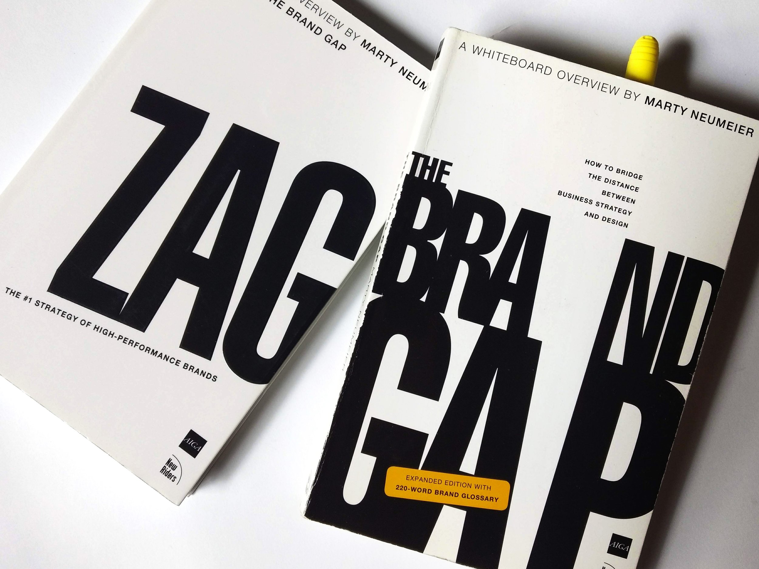
The Brand Gap: How to Bridge the Distance Between Business Strategy and Design
Zag: The Number One Strategy of High-Performance Brands
The Designful Company: How to Build a Culture of Nonstop Innovation
Metaskills: Five Talents for the Robotic Age
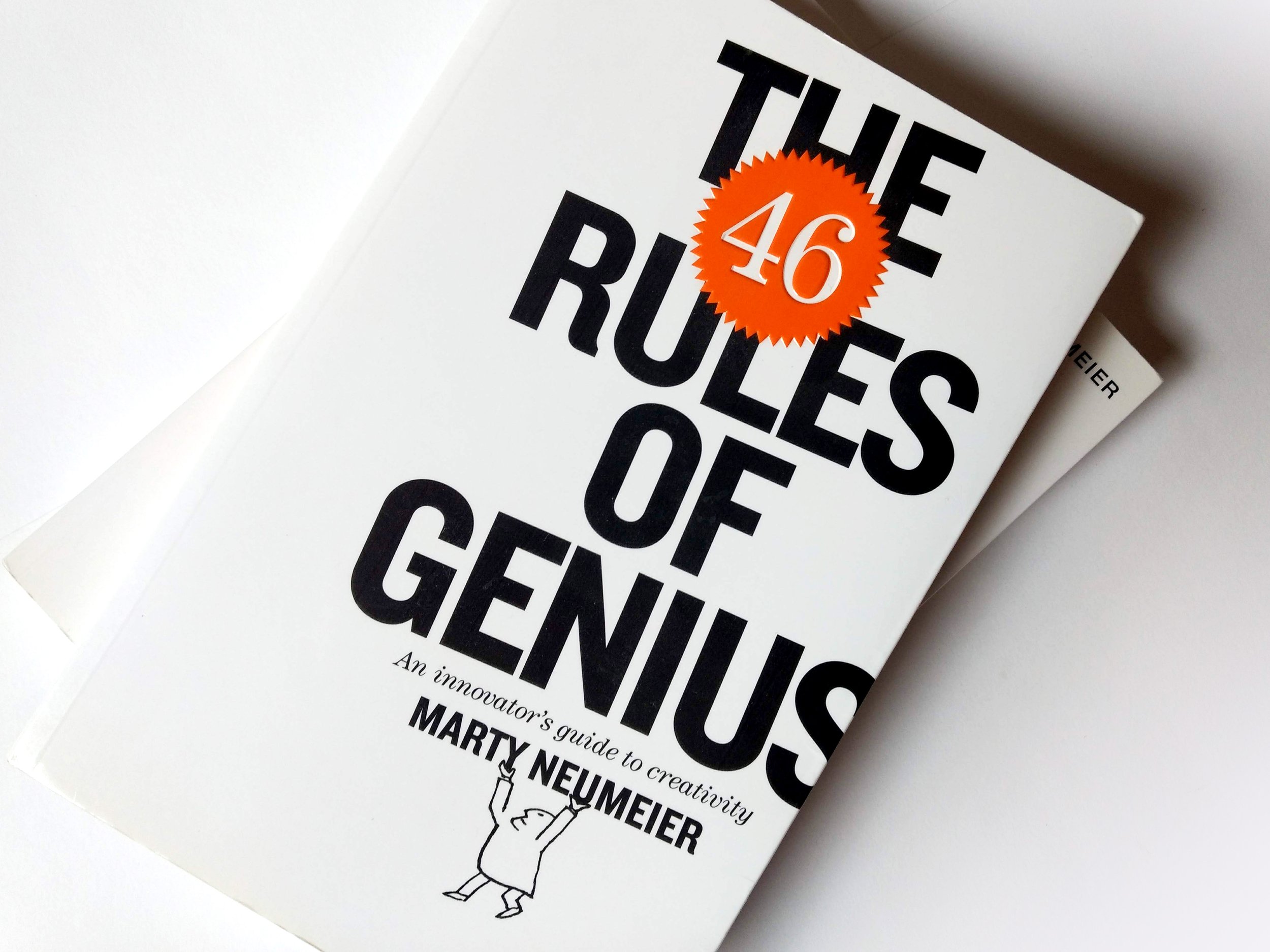
The 46 Rules of Genius: An Innovator's Guide to Creativity
The Brand Flip: Why Customers Now Run Companies and How to Profit From It
BRAND A-Z: An Interactive Dictionary of 1,000 Essential Brand Terms (ebook)
Scramble: How Agile Strategy Can Build Epic Brands in Record Time

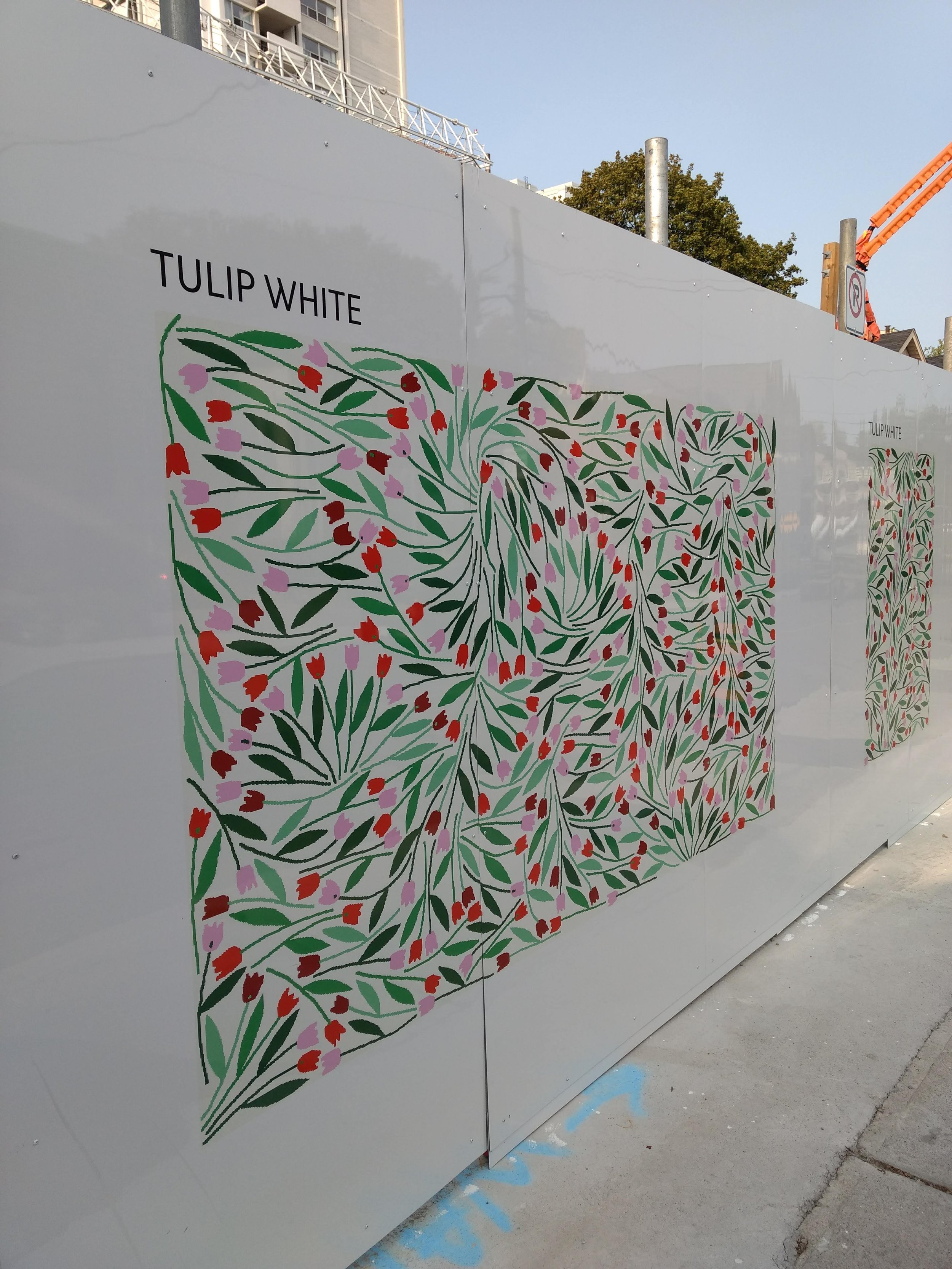
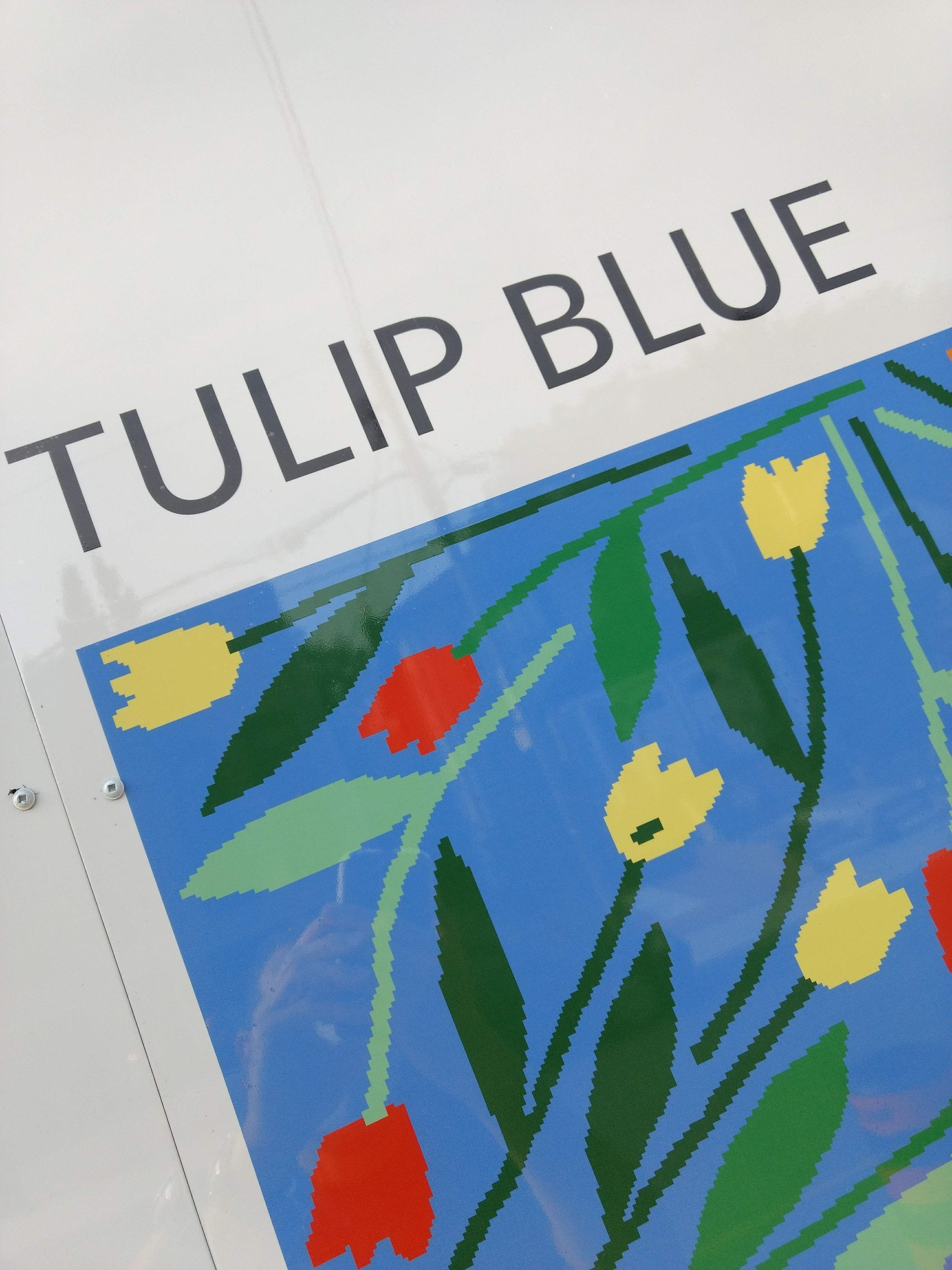
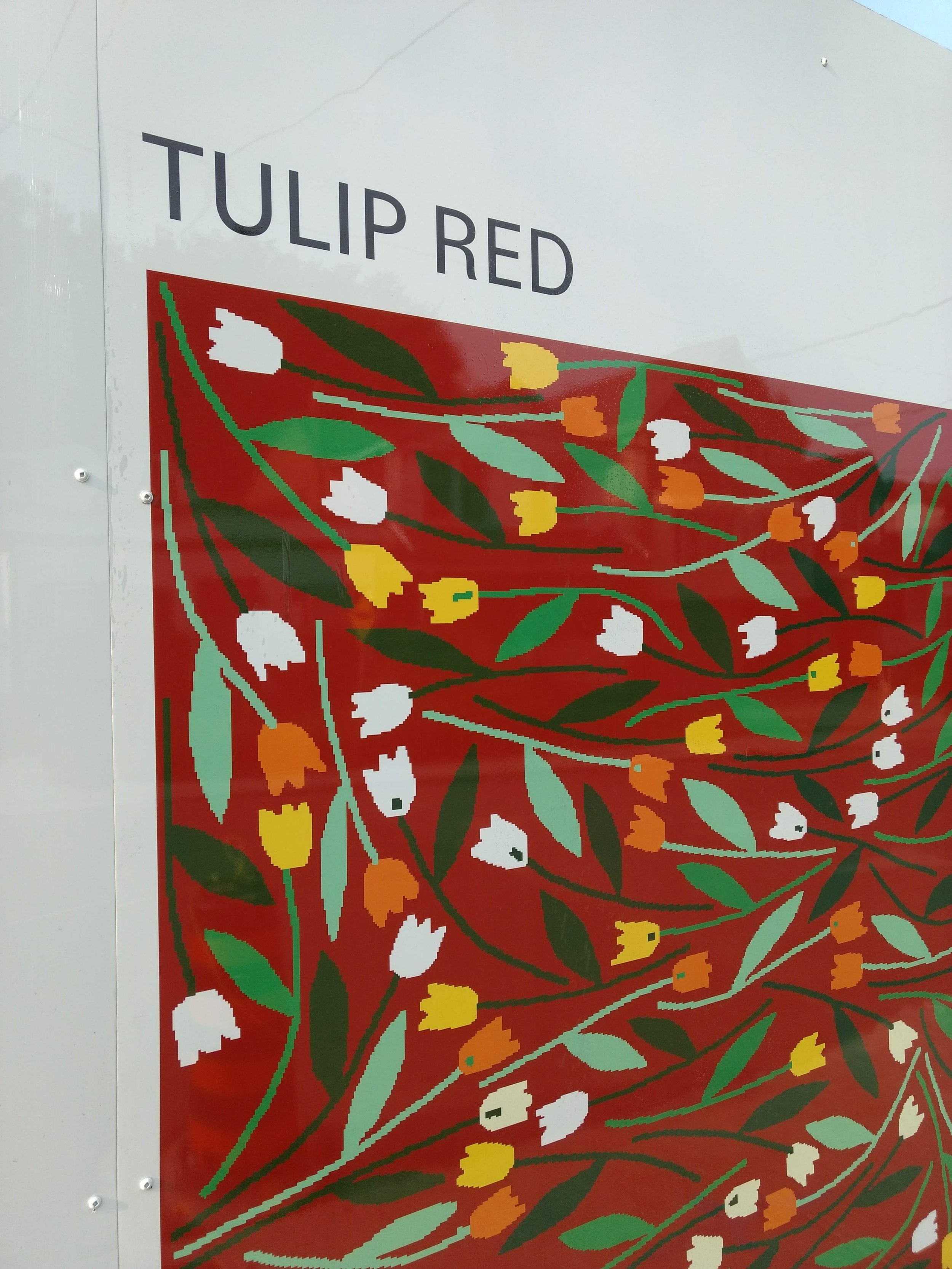
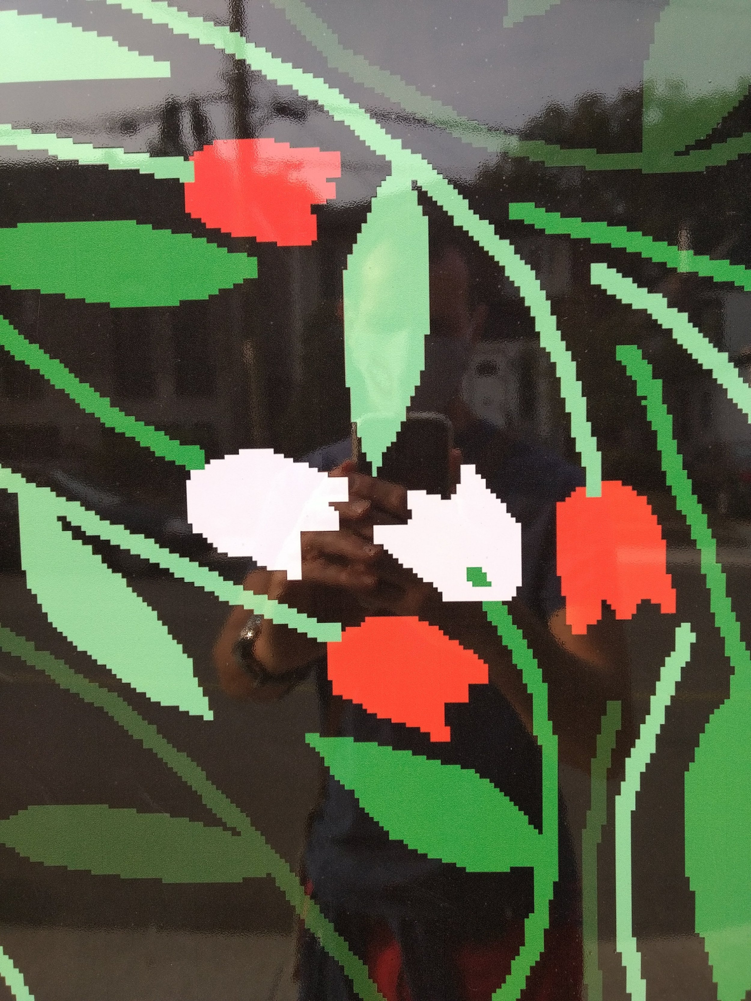
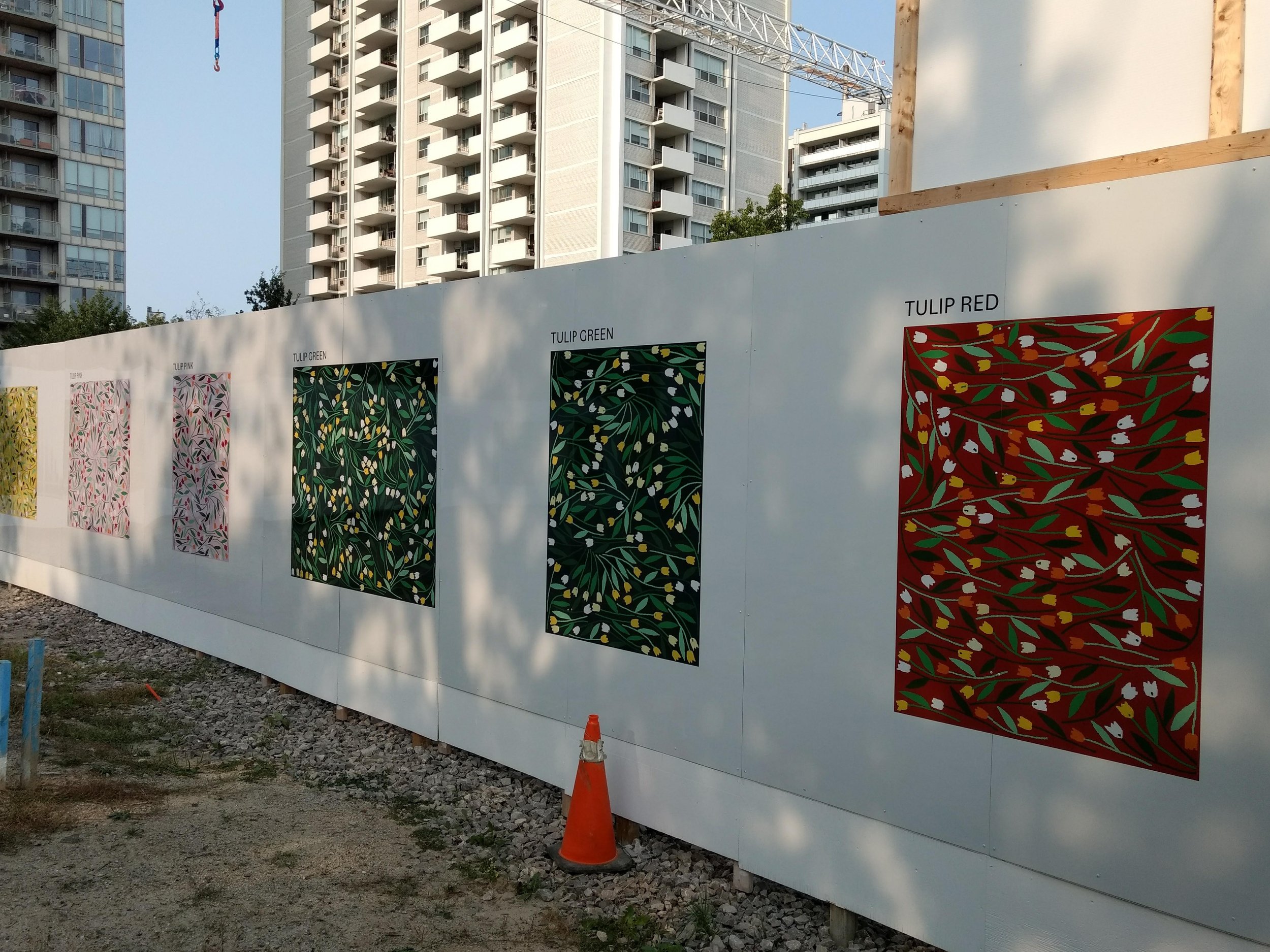
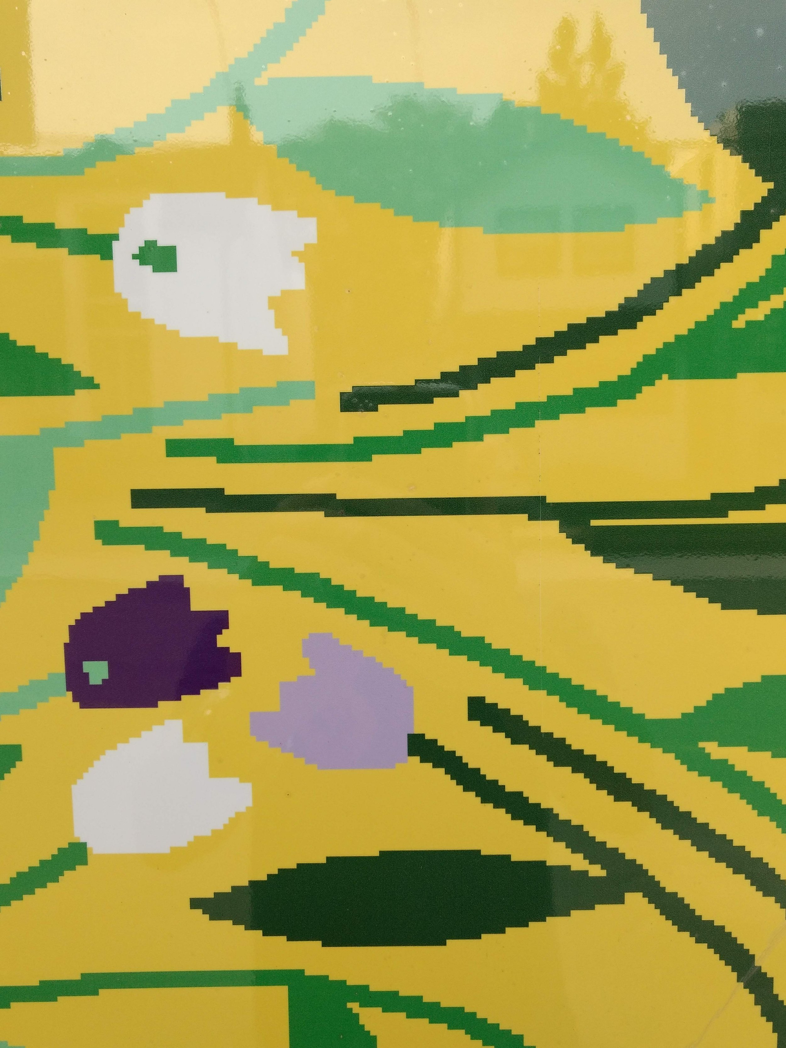
Digital Tulips in Bloom
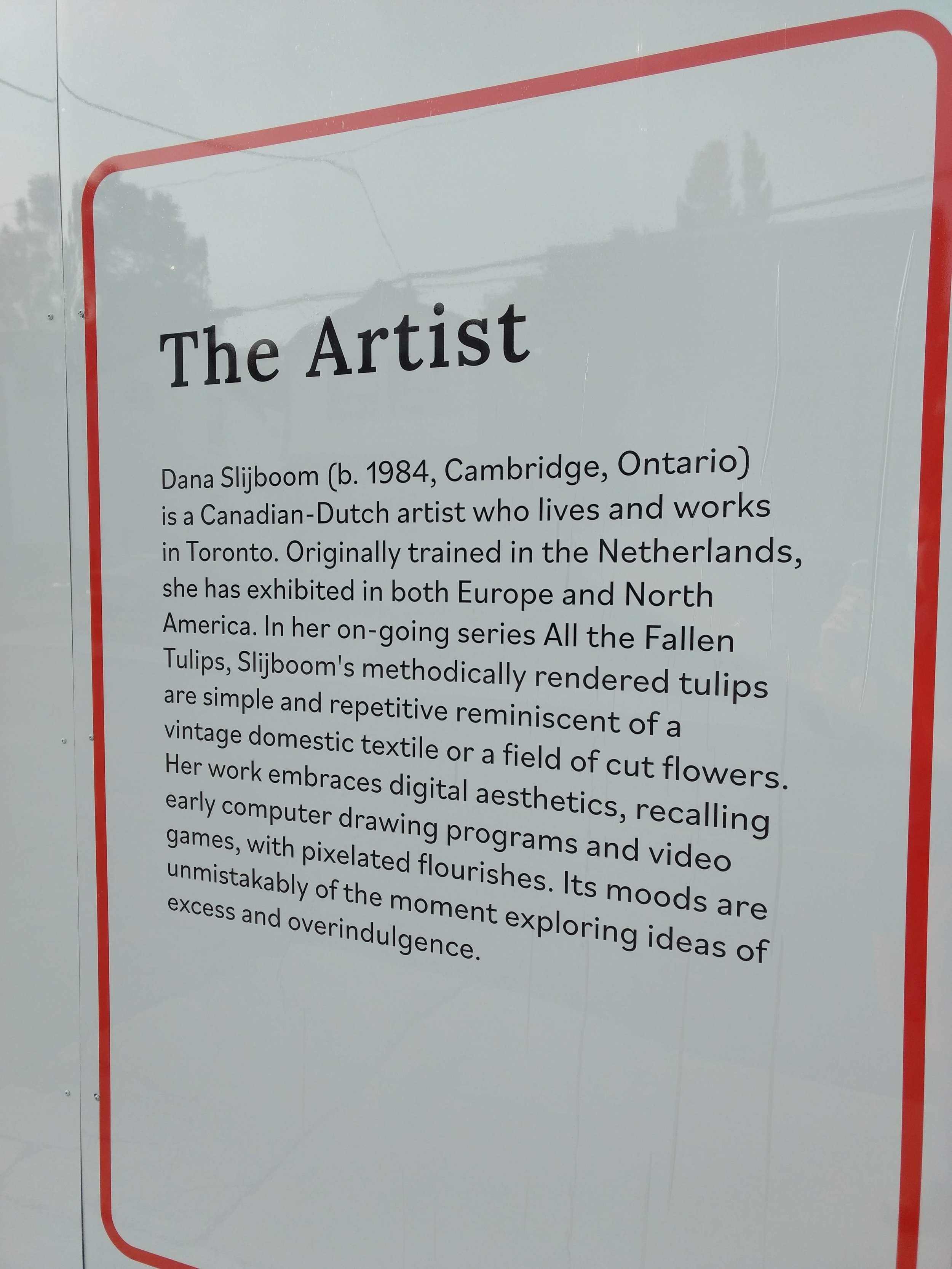
A striking open-air gallery of digitally inspired tulips
On a recent walk in my neighbourhood in North Toronto, I caught a glimpse of spring on a sunny autumn afternoon. Canadian-Dutch visual artist Dana Slijboom has installed a striking open-air gallery of digitally inspired tulips rendered on acrylic panels installed on the hoarding of a local condominium site. Typically covered in posters or sales-driven marketing imagery, this hoarding is clean and white, providing the canvas for the artist to express her intention. She clearly embraces digital aesthetics; the tulips appear like large-scale, vector-based illustrations, but look at them closely, they are rendered in jagged pixelated form - like a low-resolution photograph or a grainy video still. The technique is strictly linear and flat, but striking in its form and colour. It’s a delightful outdoor gallery; though temporary, it adds a bit of digitized beauty to a busy site.


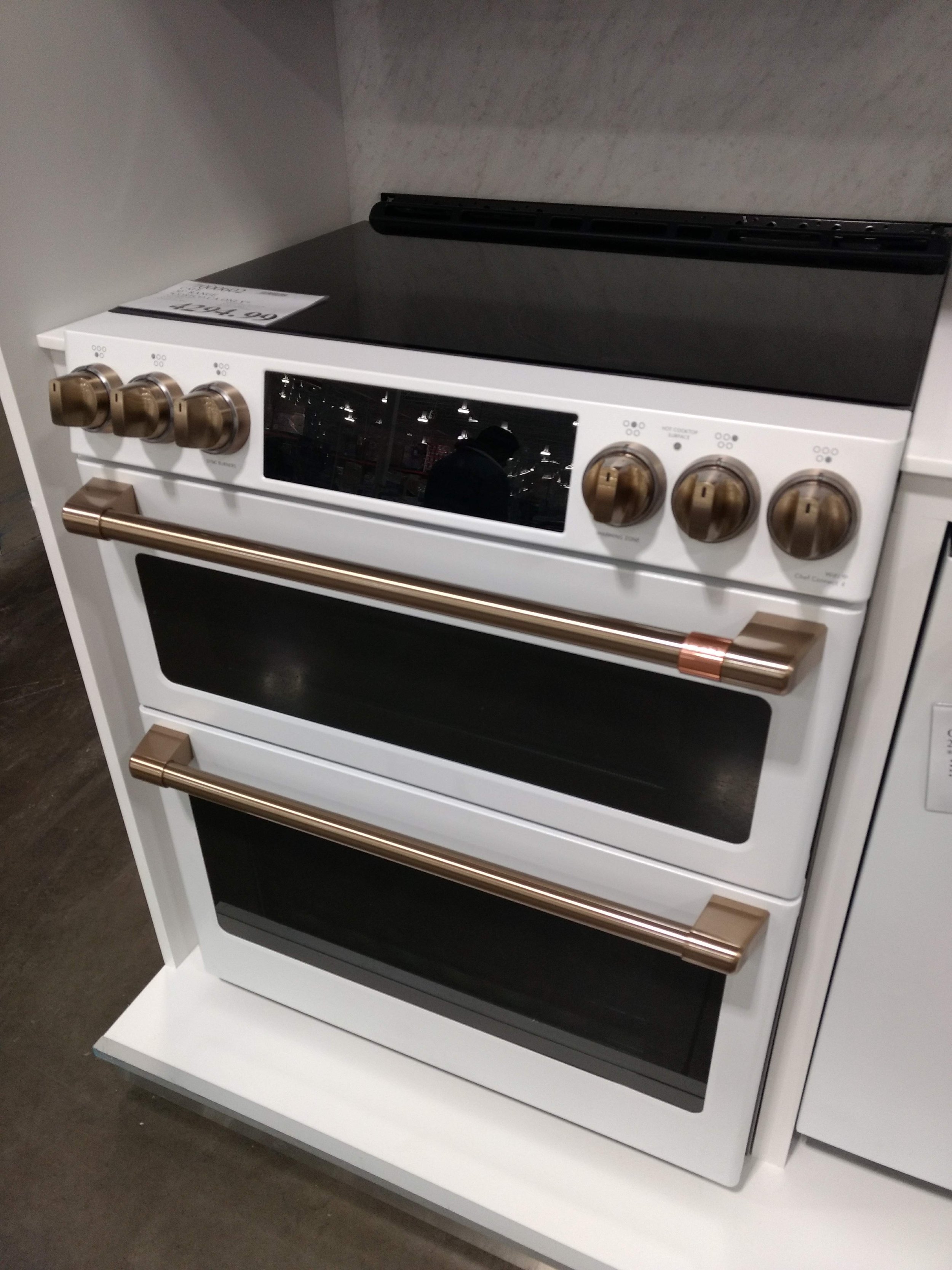
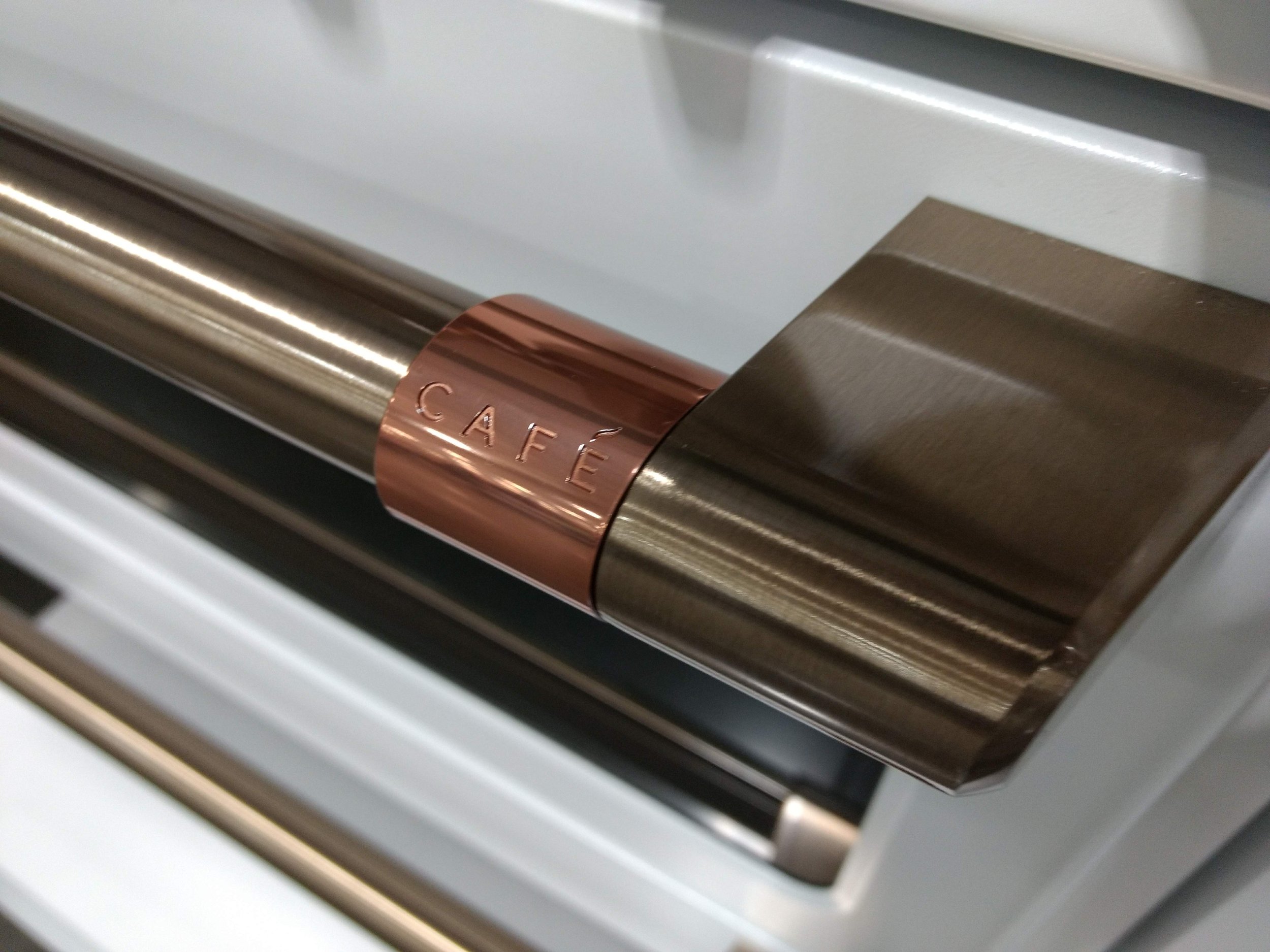
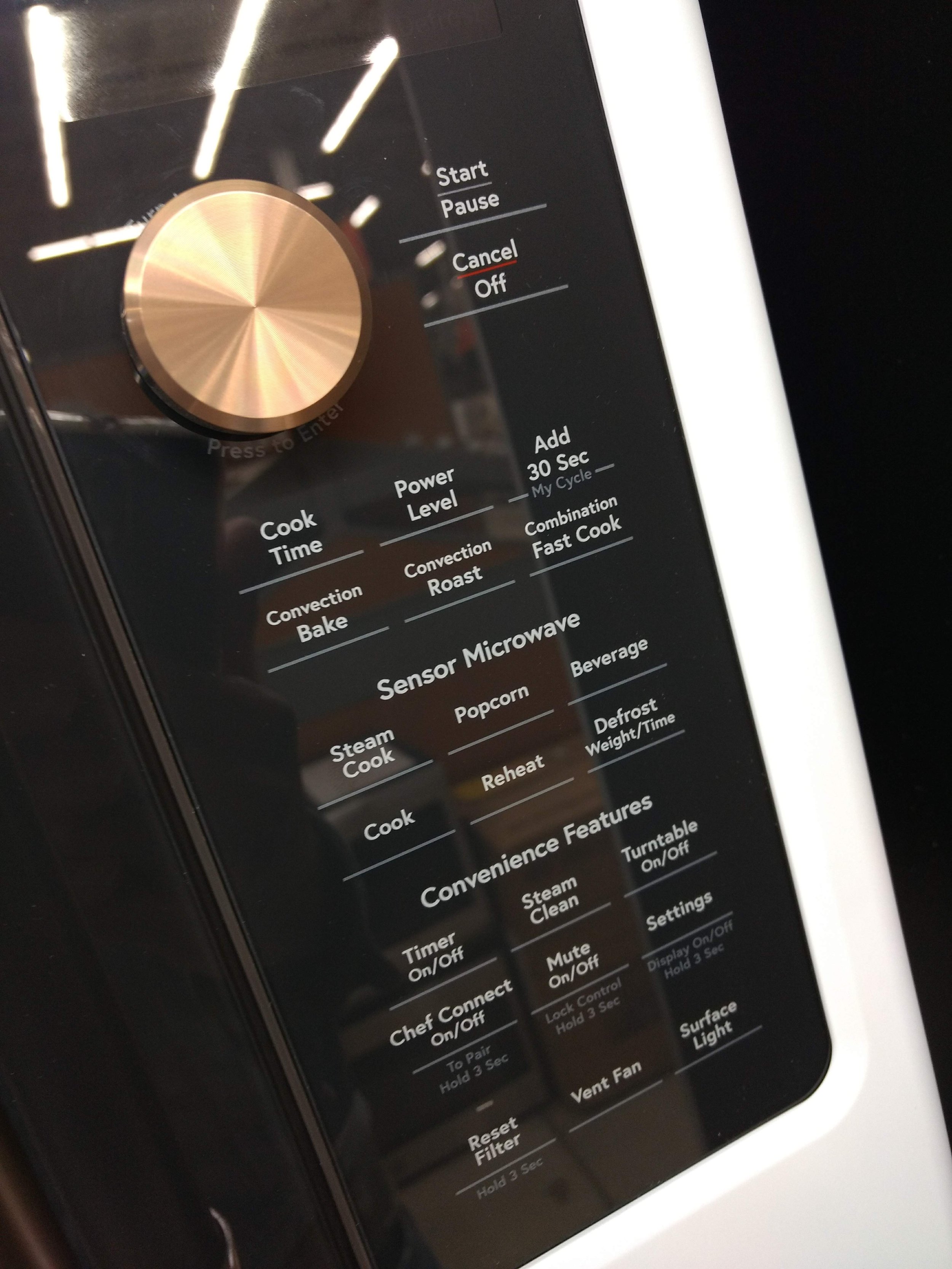
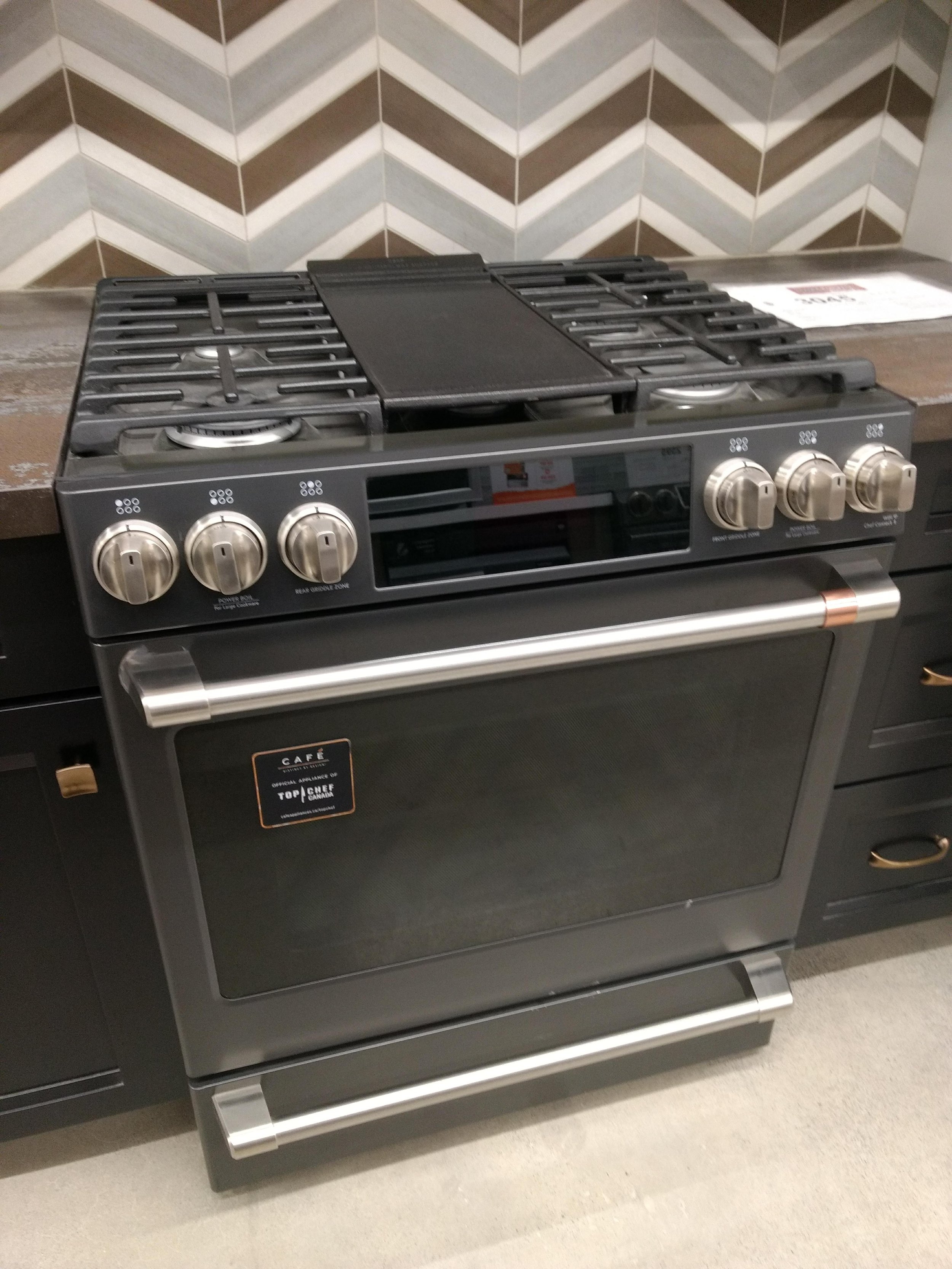
Fashionable Kitchen by Café
Fashion now dominates the kitchen
The GE Café Series - Distinct By Design - kitchen appliance collection appearing at Home Depot and other retailers like Costco, recently caught my attention. The Café website invites you to “Accessorize your kitchen like you do your outfits”; the home page features a stylish model fitted in a glam transparent acrylic jacket and tinted sunglasses. Fashion now dominates the kitchen. And it works. These are very cool and elegant home appliances; forget stainless steel and glossy white finishes; Home Depot’s demo kitchen features two finishes: matte white, and striking matte gunmetal . The Café Series mixes modern technology with a nod to tradition with brushed copper hardware finishes, bringing statement pieces to the heart of your home. As we’re all spending more time at home in these days of lockdowns and restricted gatherings, more time spent in the kitchen is a good thing; getting back to cooking with locally grown produce, exploring new flavours and ingredients with the most important people at our dinner tables, our loved ones.


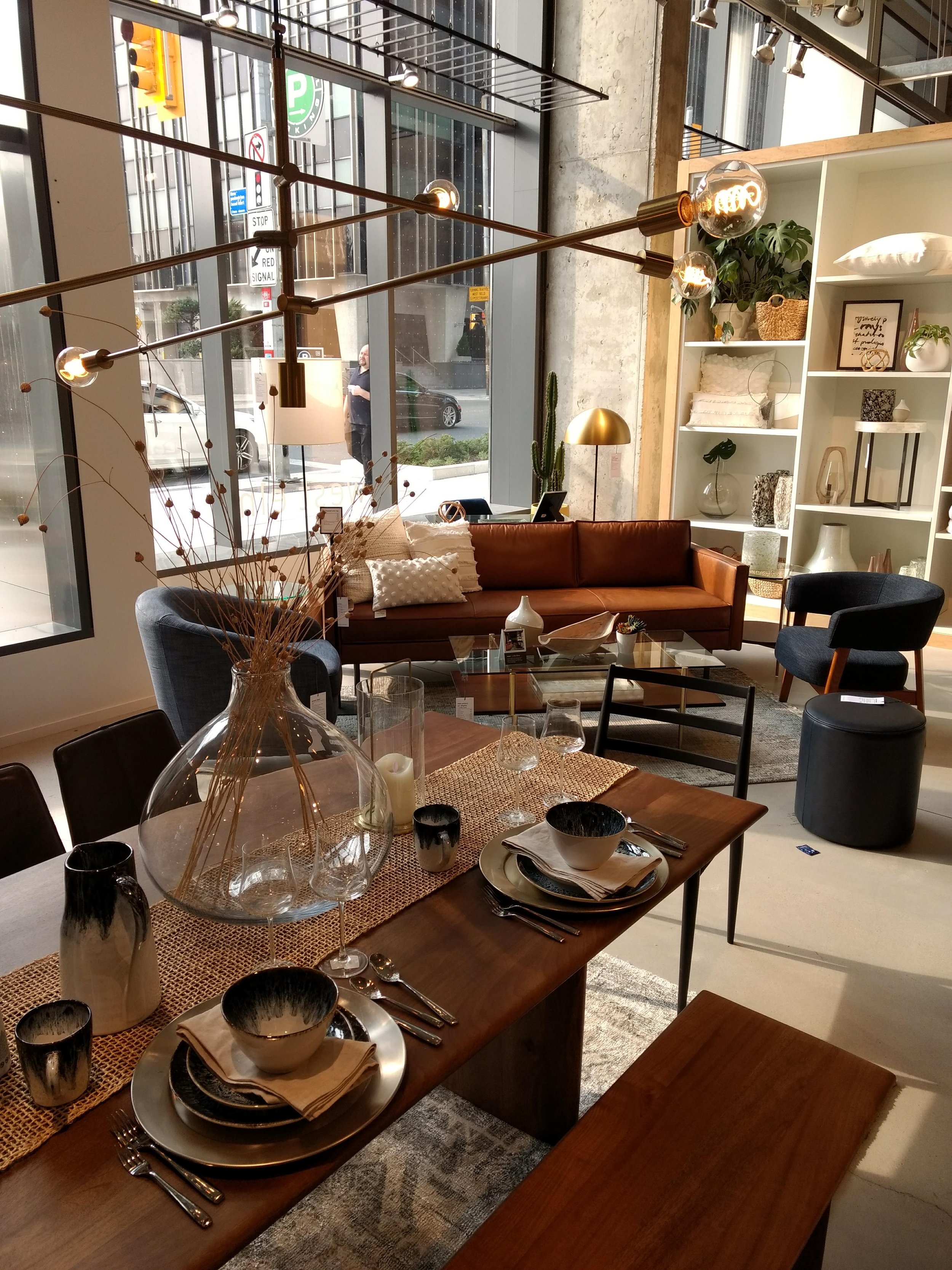
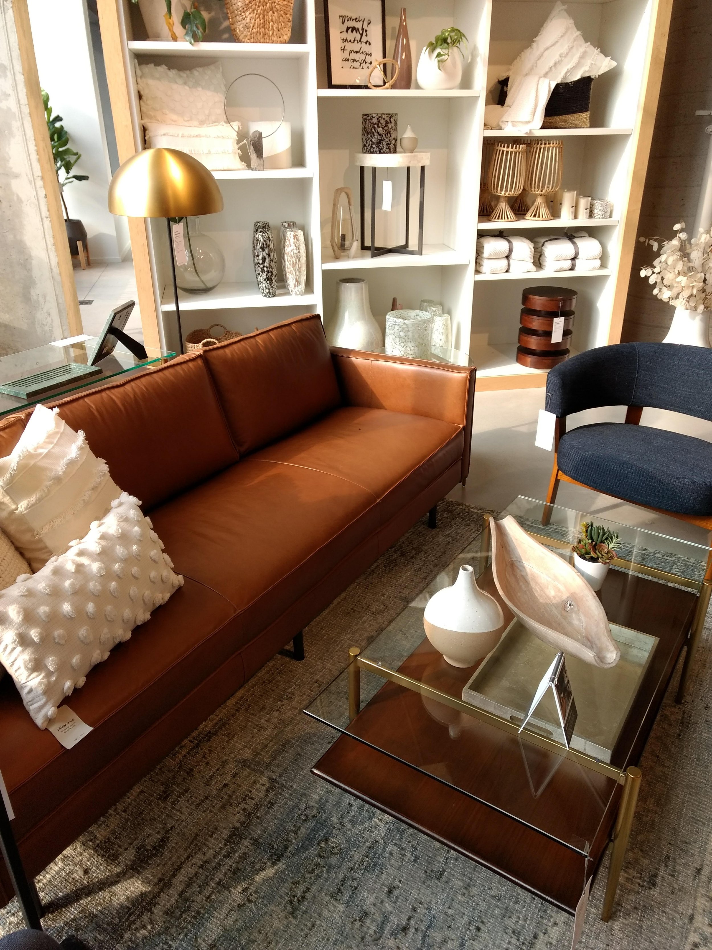
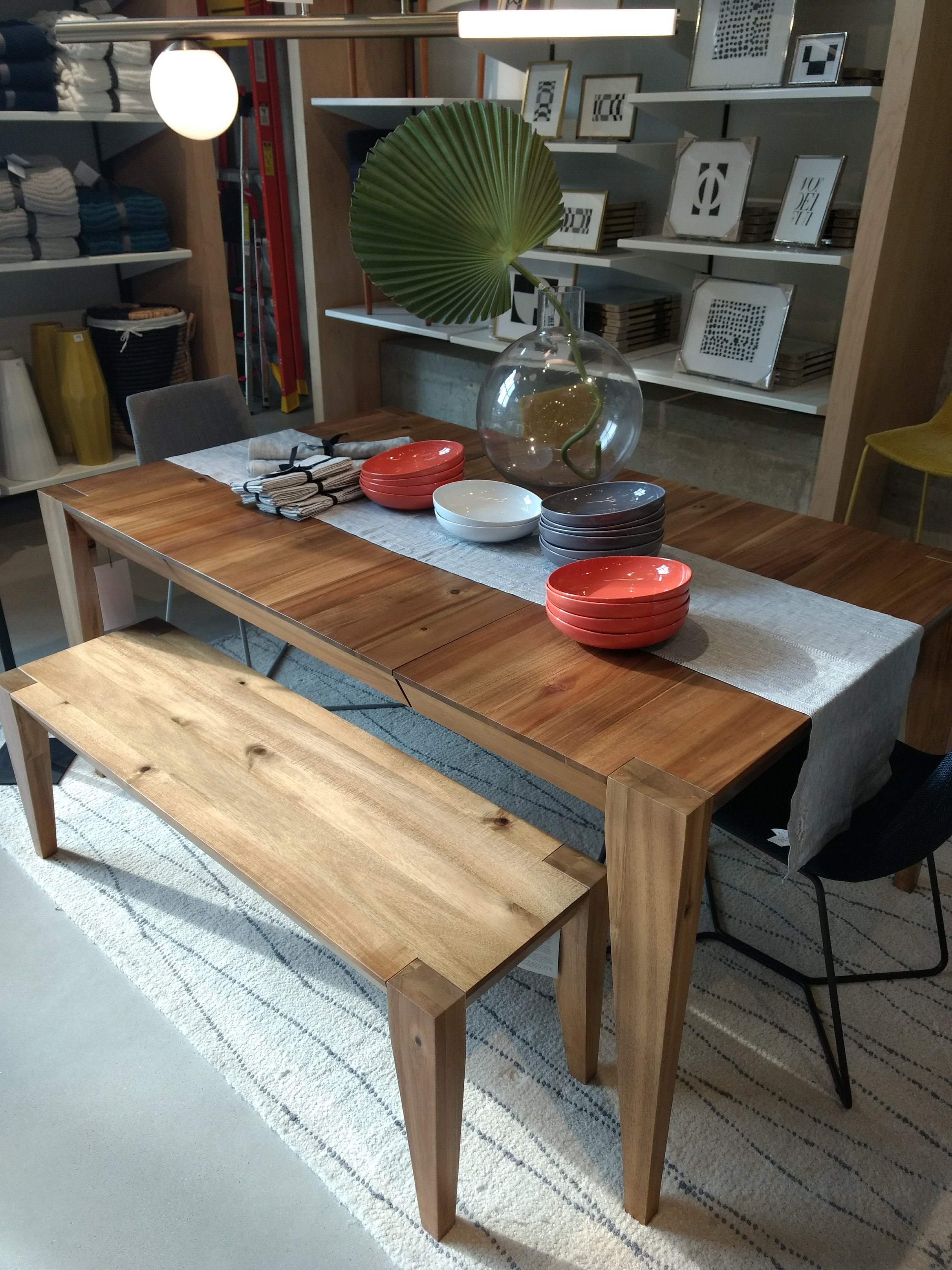
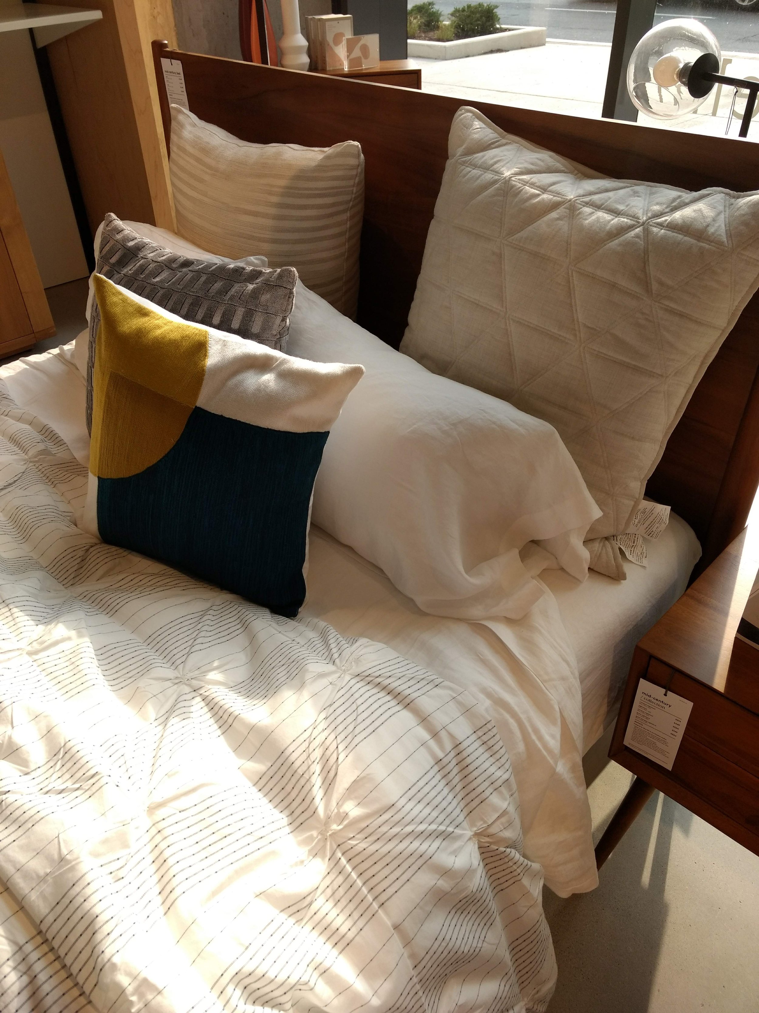
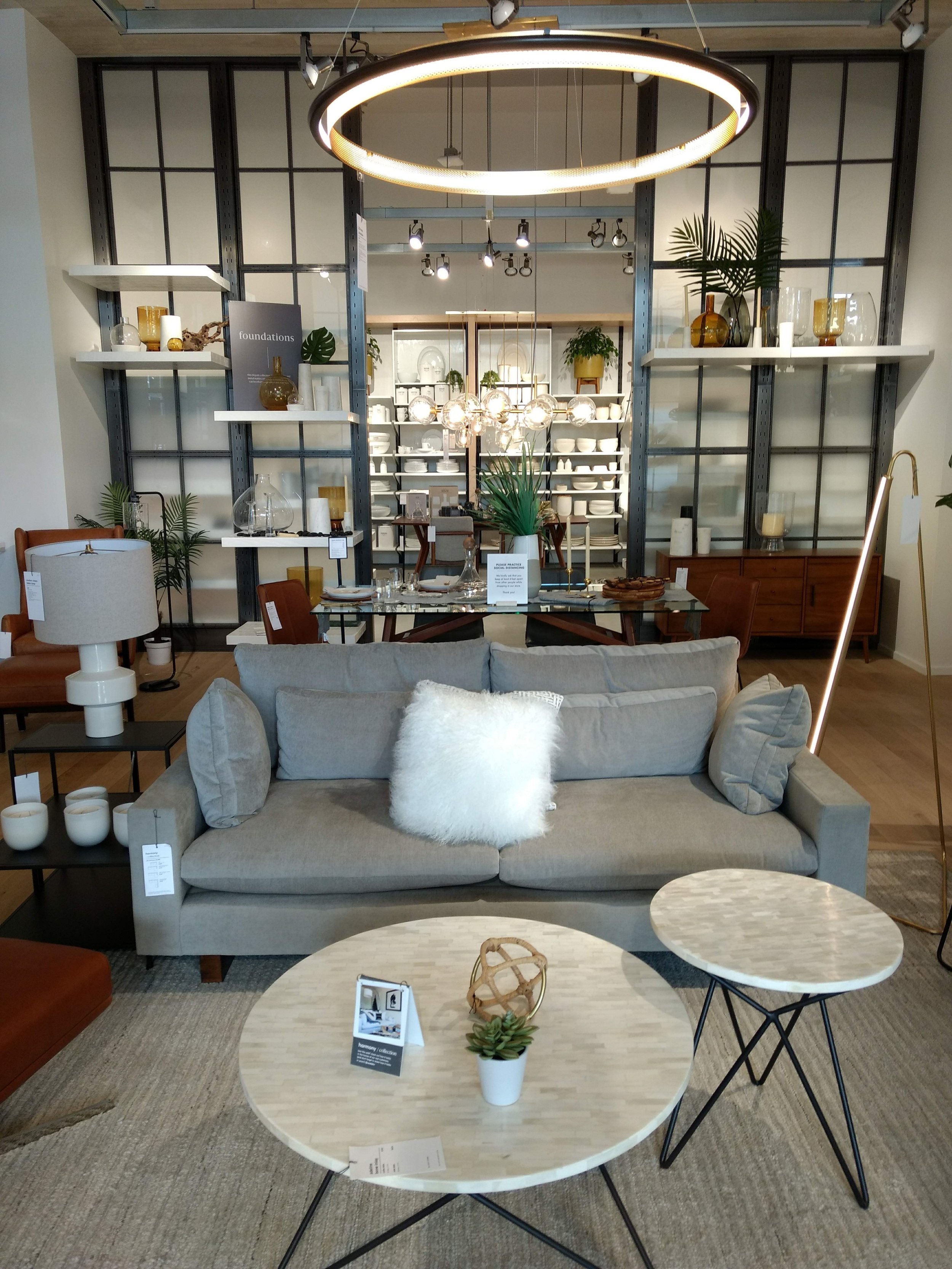
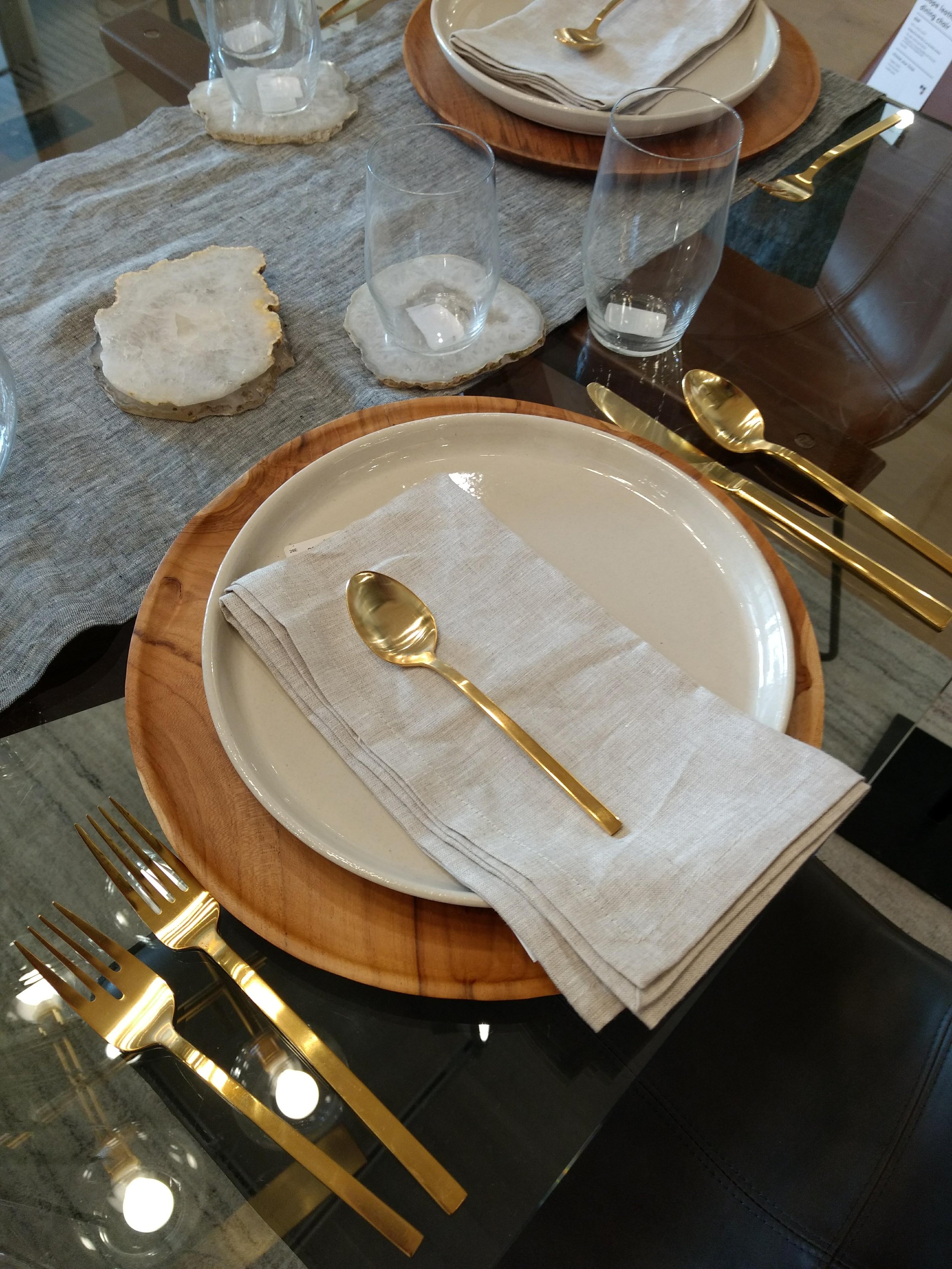
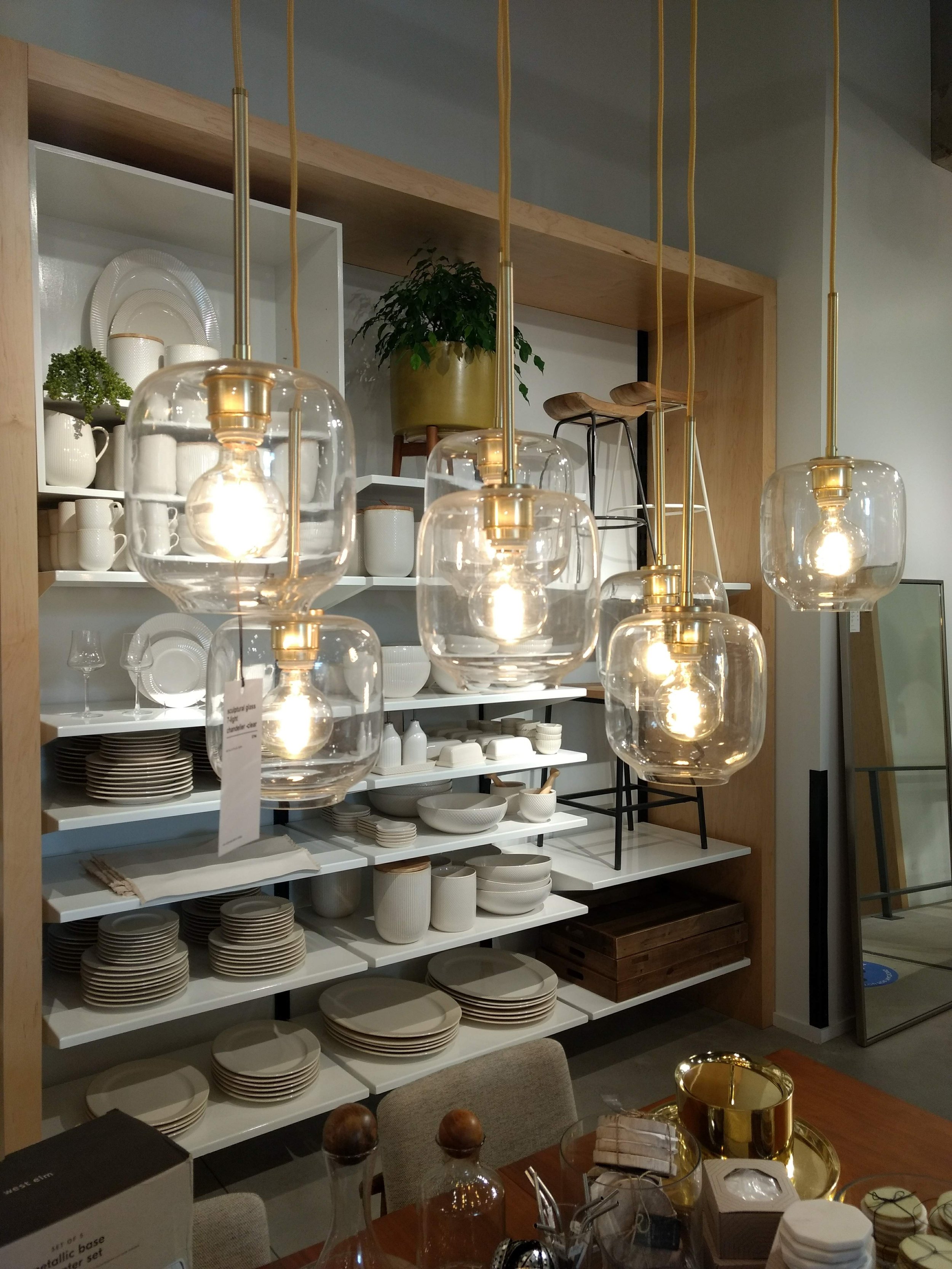
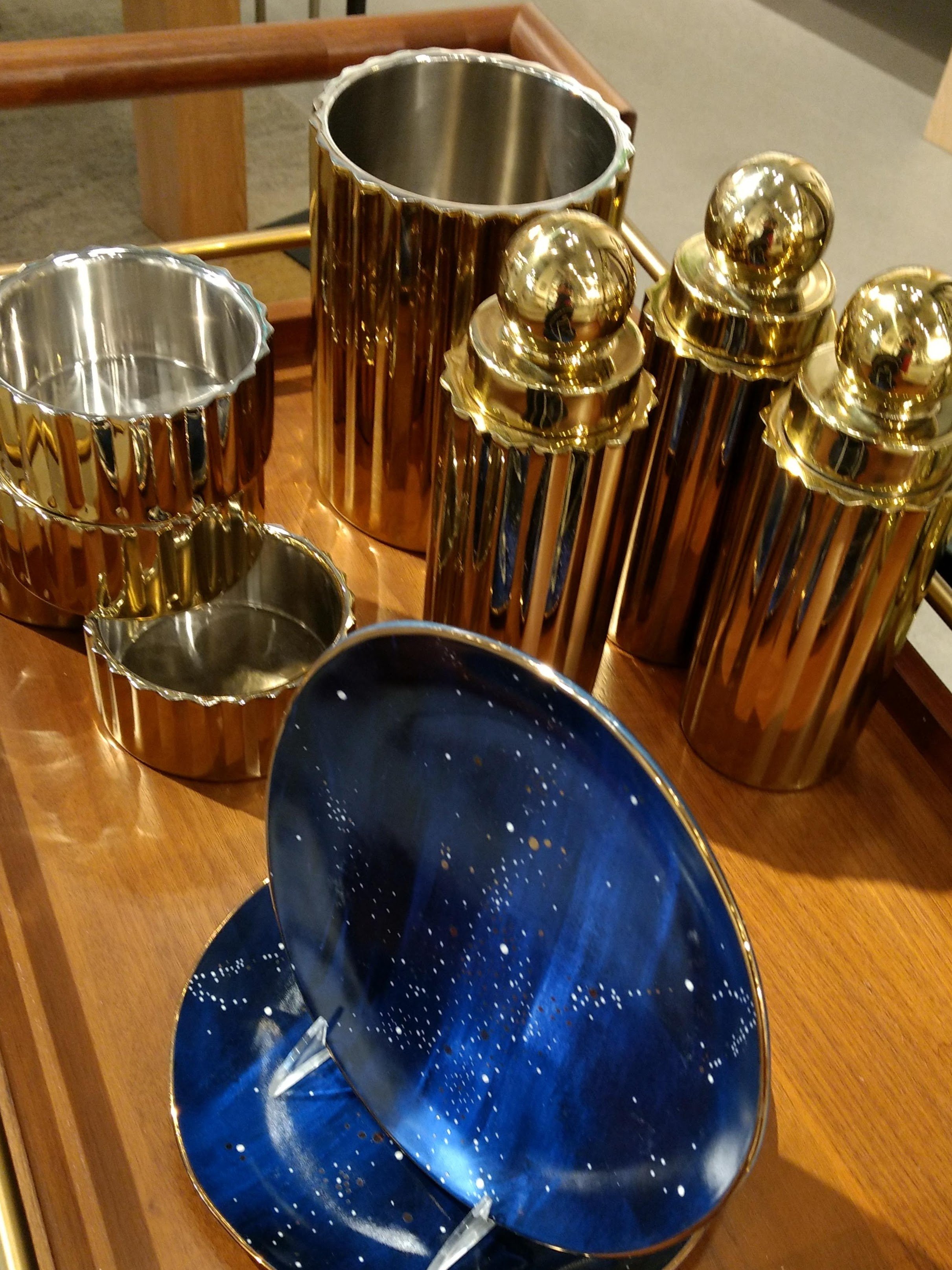
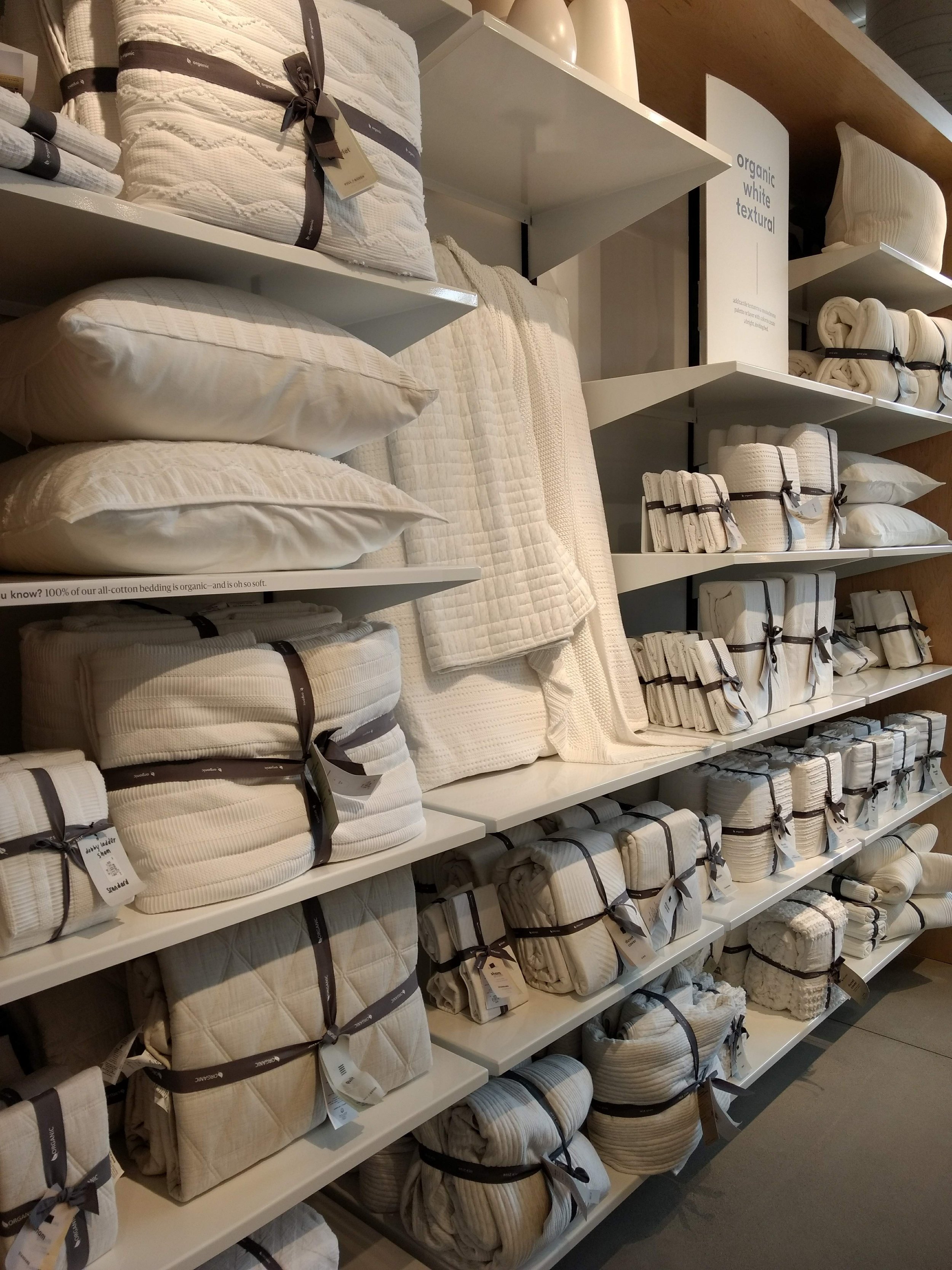
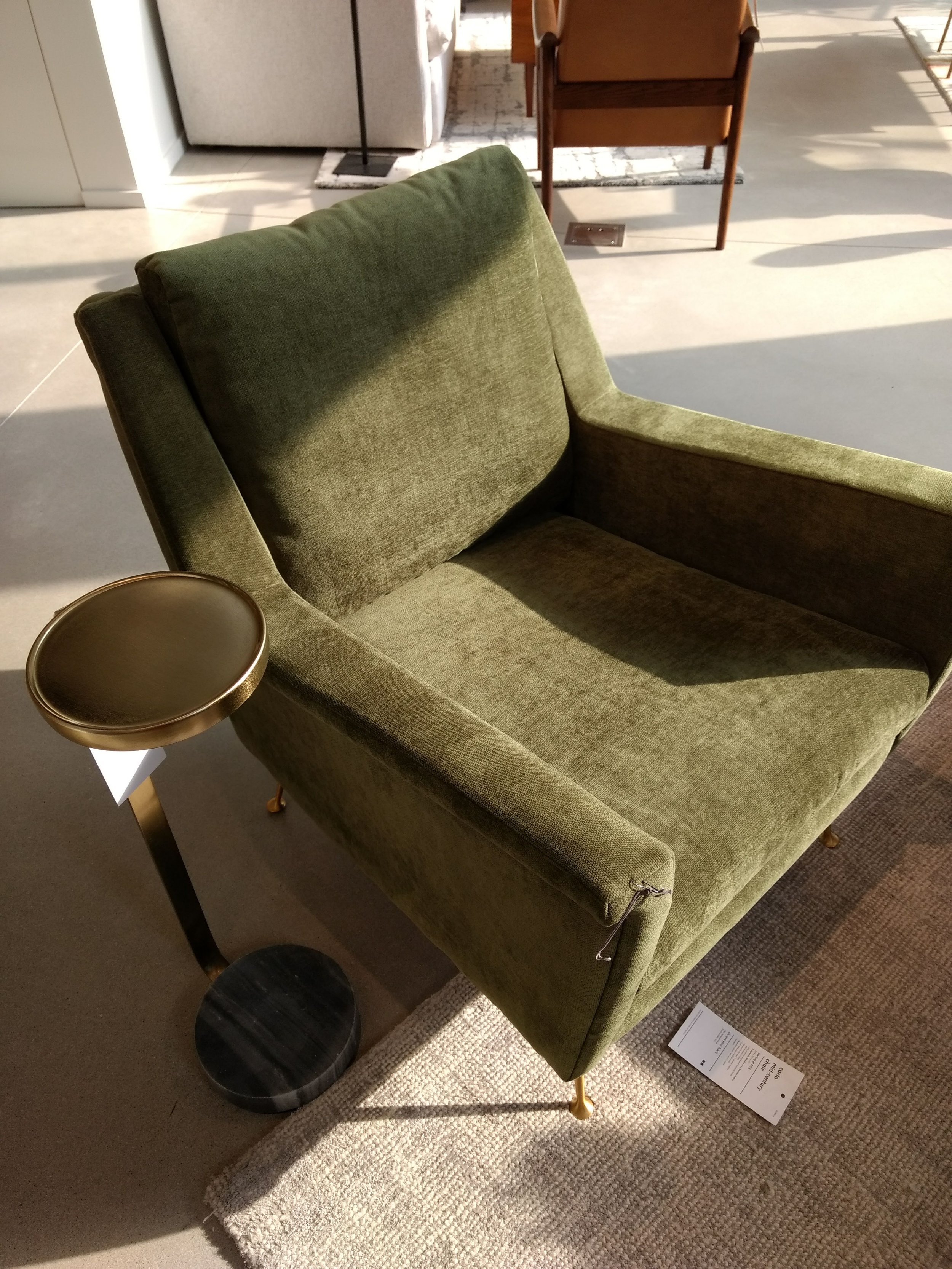
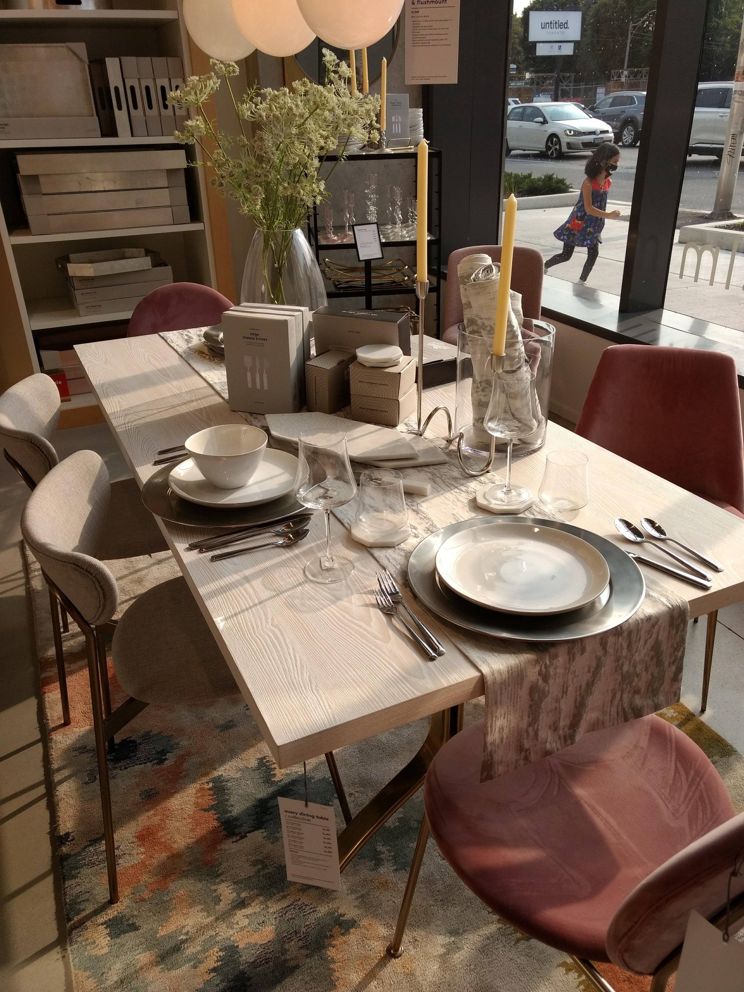
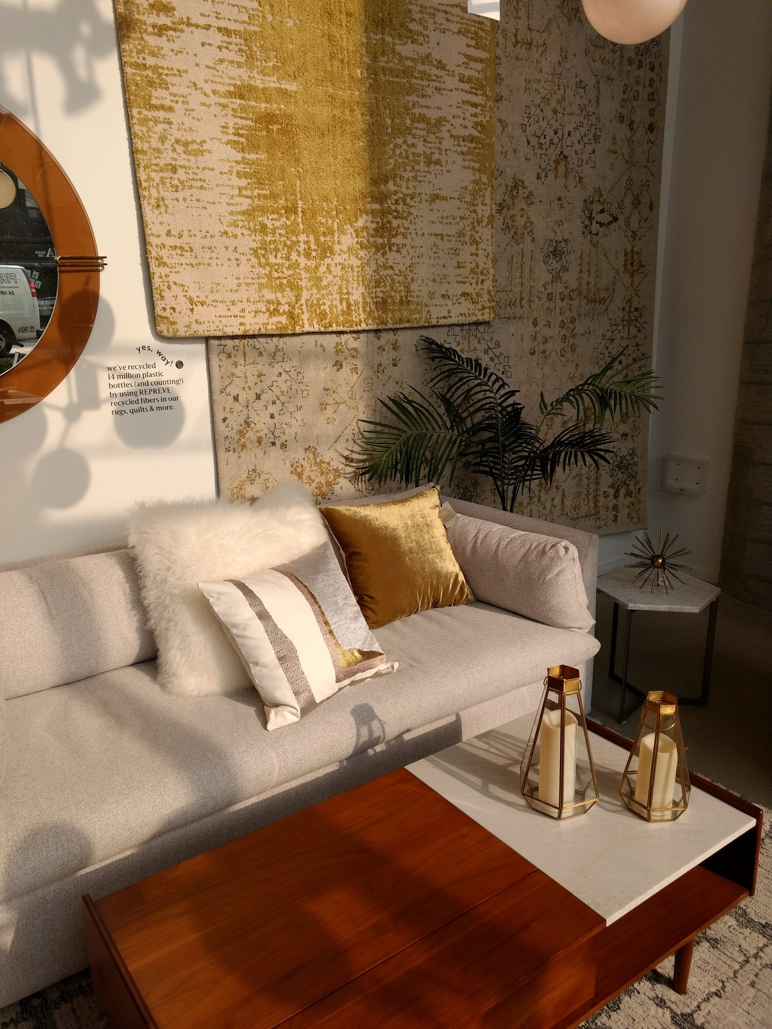
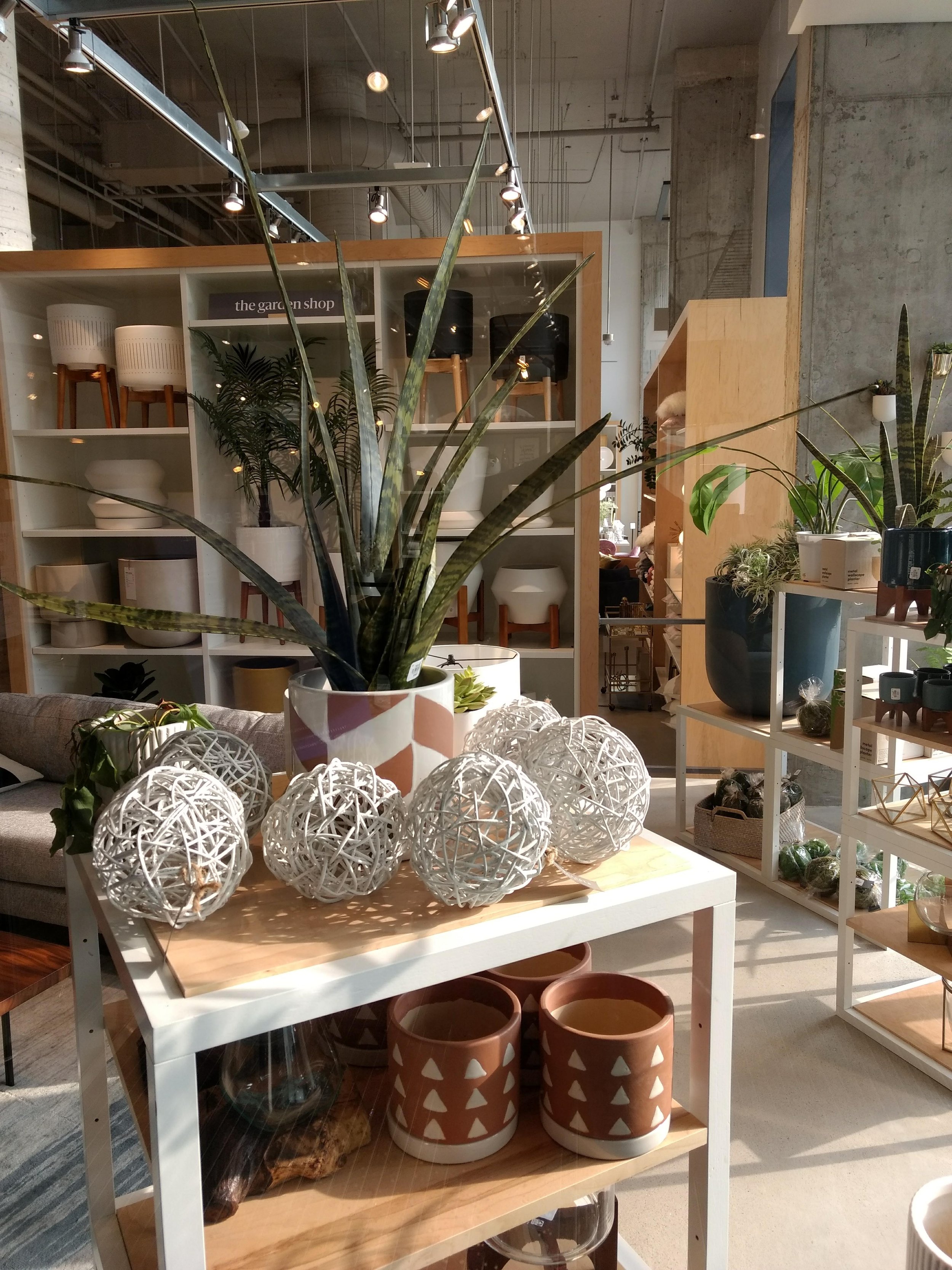
West Elm Cool
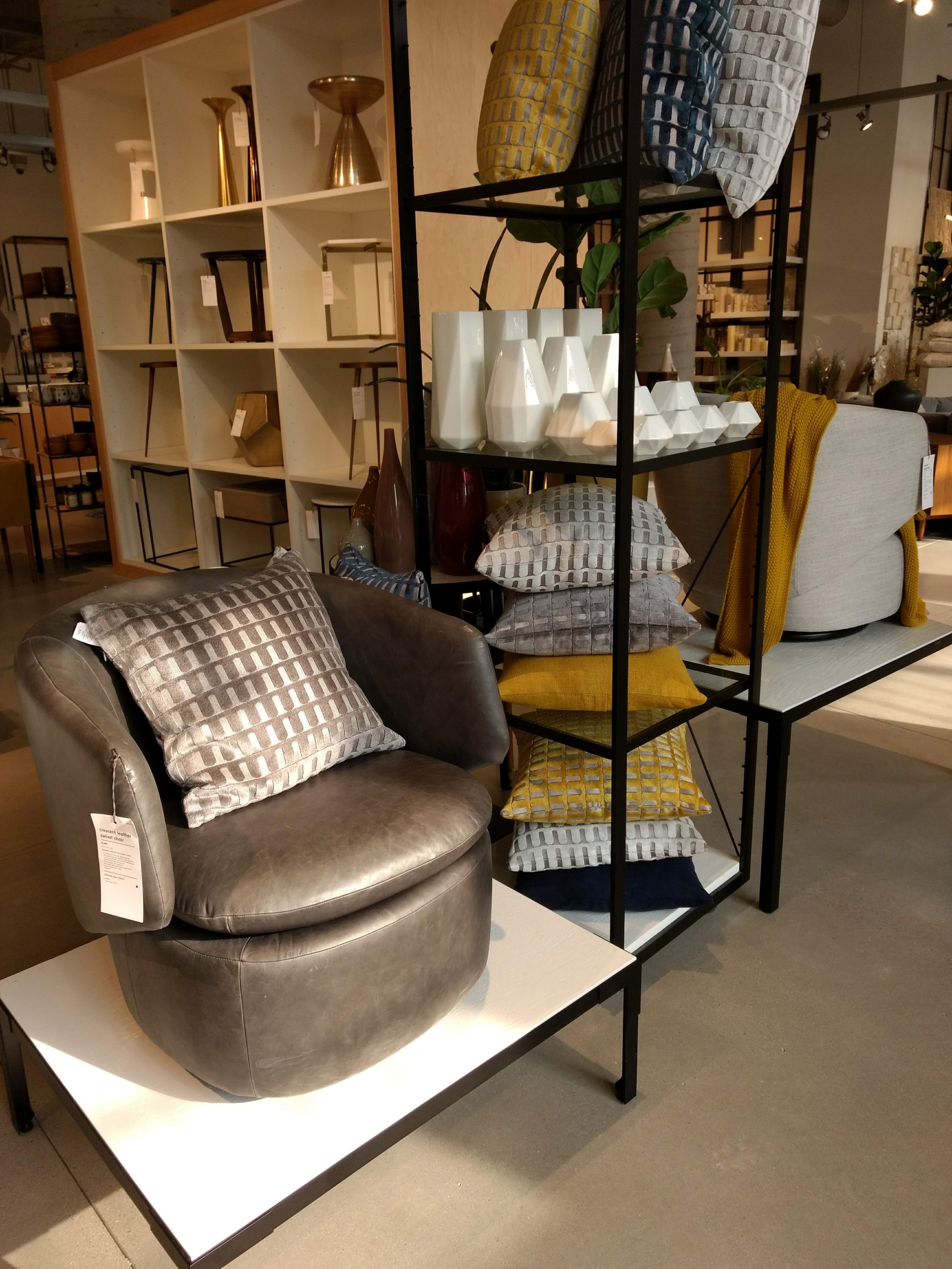
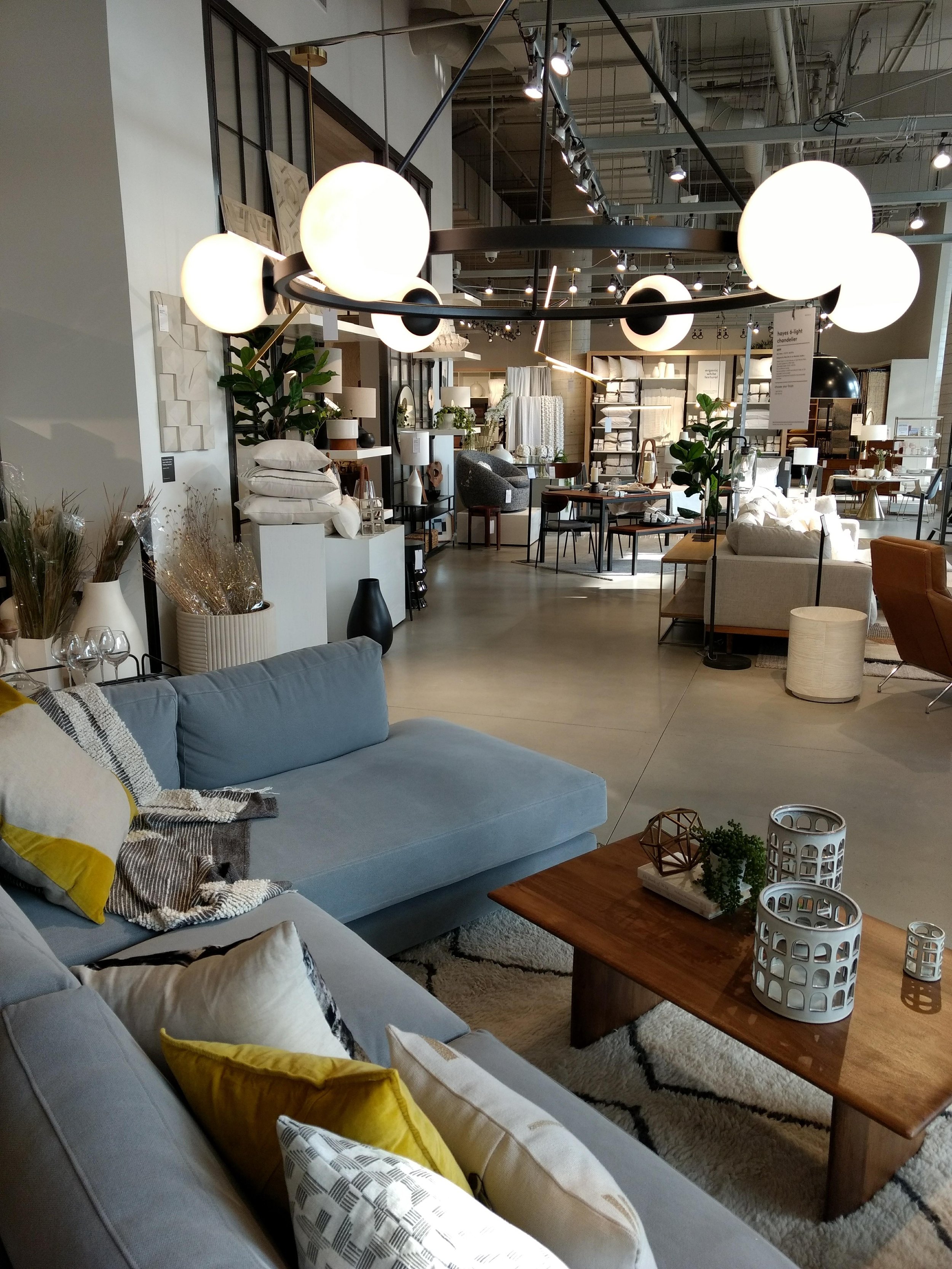
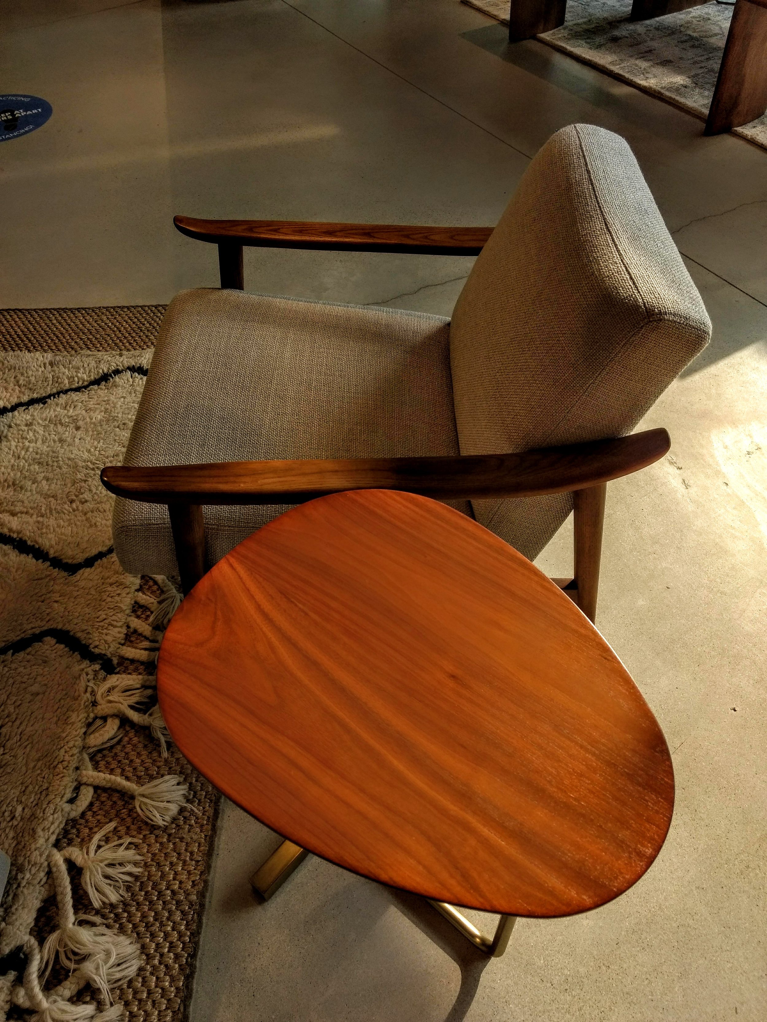
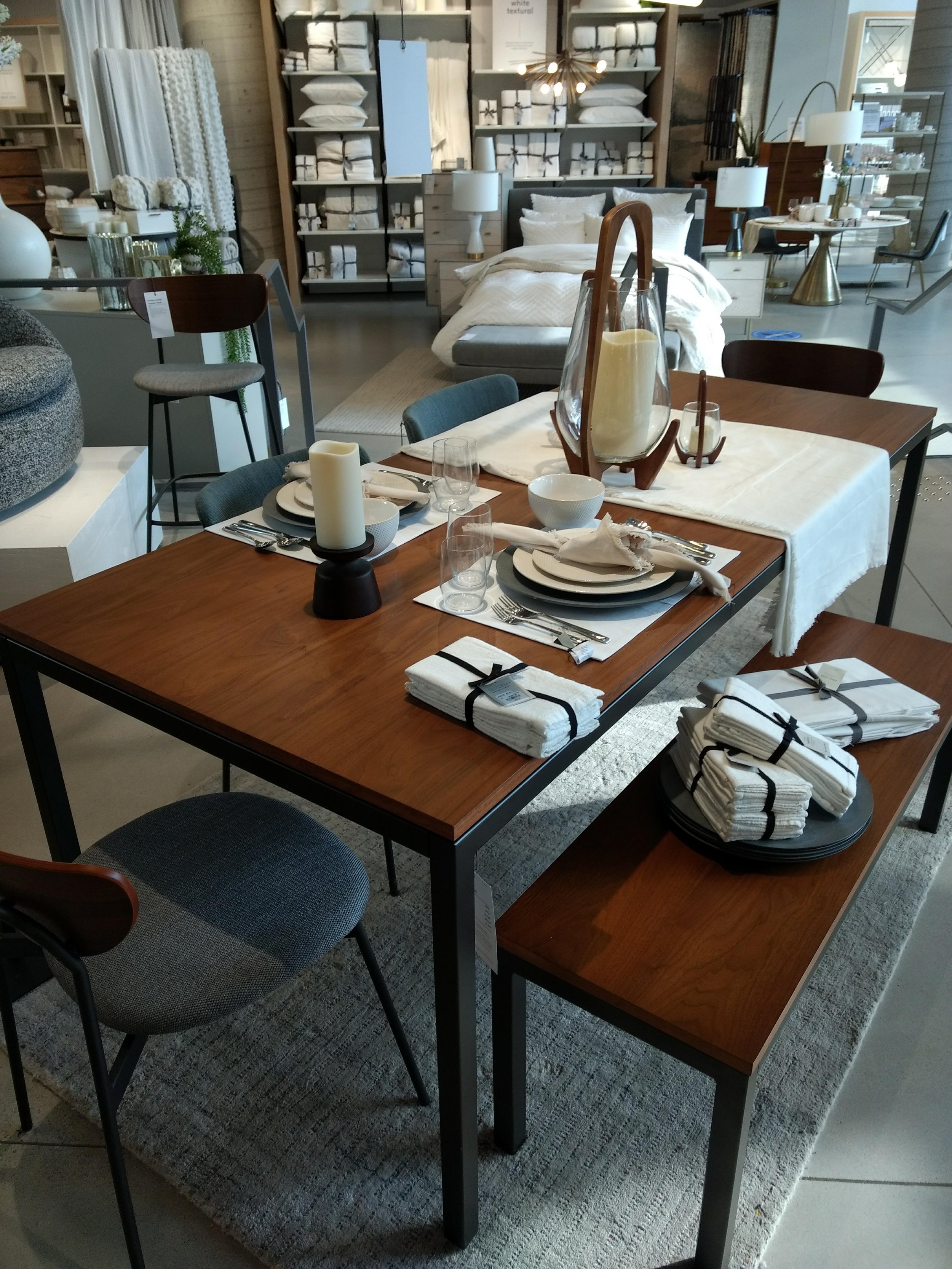
The vibe is thoroughly mid-century modern and casual
Home style brand West Elm just moved into my neighbourhood in the very cool architectsAlliance-designed Art Shoppe condos. The building is nearing completion with a new Farm Boy grocery store yet to open. West Elm is open now. The vibe is thoroughly mid-century modern and casual; furniture is sleek and small-scaled for the urban market. The Carlo Mid-Century Chair in distressed velvet is a personal fav. The lighting is cool too; the Champignon Chandelier wouldn’t be out of place in any condo. Corrogated barware on a sweet little bar cart is sharp too; Bond would be comfortable here. Mad Men’s Don Draper could easily slip into this place comfortably. Check it out.